TLDR
Bivariate data means data on two variables. In AP Statistics, you start by asking whether the variables appear related and whether that apparent relationship could be random variation.
For two categorical variables, compare conditional proportions in a two-way table or bar chart. For two quantitative variables, use a scatterplot and describe the direction, form, strength, and unusual features of the relationship.

Why This Matters for the AP Statistics Exam
Topic 2.1 sets up the whole unit on exploring two-variable data. On the AP exam, you may need to identify the right question for a dataset, describe an association, avoid causal claims from observational data, or decide whether an apparent pattern might be due to chance.
Types of Data
We start off things with a review of categorical and quantitative data. Categorical variables place individuals into groups or categories (e.g., class, yes/no). Quantitative variables take numeric values with meaningful units for which arithmetic operations make sense (e.g., height in cm). Some numbers are labels (like ZIP codes) and are categorical. We often summarize categorical data with proportions/percentages, but the data themselves are categories.
Identify the questions
When you look at two variables, first decide what you want to know.
- For two categorical variables: Are the variables associated or independent? Which group has a higher conditional proportion?
- For two quantitative variables: What is the direction (positive/negative), form (linear/curved), and strength of the relationship? Are there outliers or clusters?
- For all cases: Could any apparent pattern be due to chance?
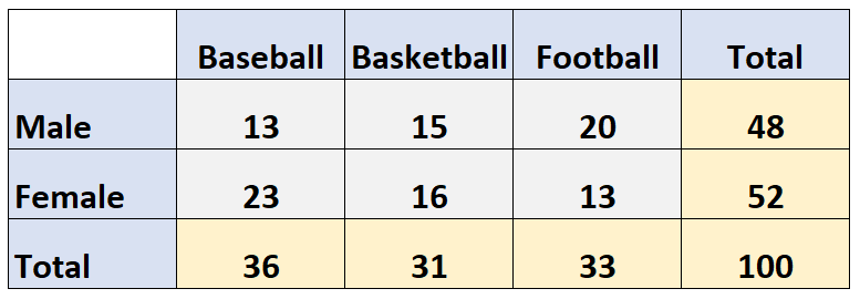
Bivariate Categorical Data
When we collect data, we will record data from two different variables at the same time. Sometimes we have two categorical variables such as “class” and “does homework on time,” for example. We will want to know whether certain classes, such as juniors, finish their homework on time more than compared to other classes.
Bivariate categorical data refers to data that consists of two categorical variables. To analyze and understand the relationship between these two variables, we can use various graphical and statistical techniques.
One way to visualize bivariate categorical data is with bar charts. Use side-by-side bar charts or segmented bar charts to compare conditional proportions across categories. Also use a two-way (contingency) table to organize counts, and a relative frequency bar chart to compare percentages. Note: Histograms are for quantitative variables grouped into numeric intervals, not for categorical data.
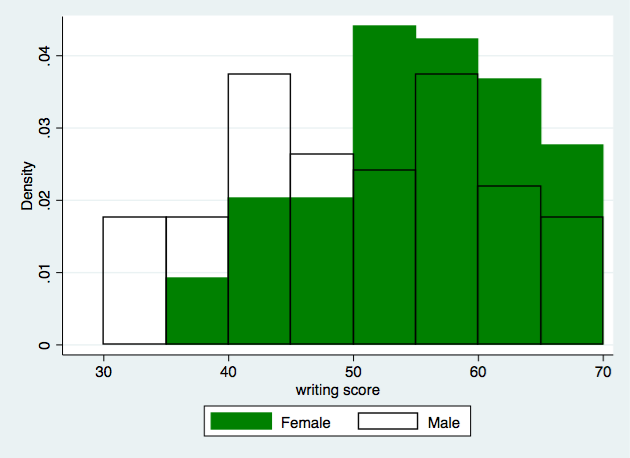
Another way is a relative frequency bar chart, which shows the percentage (proportion) in each category. For two categorical variables, compare conditional proportions using side-by-side or segmented bar charts. A “frequency” display shows counts, while “relative frequency” shows percentages. Histograms display quantitative data, not categorical data.
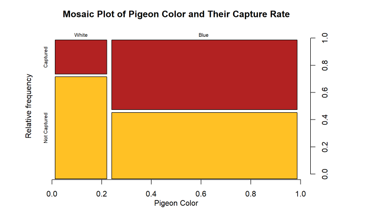
A mosaic plot is another way to visualize bivariate categorical data. It shows the proportions of data points that fall into different categories by dividing the plot into rectangles that are proportional to the proportions of the data. Mosaic plots can be useful for showing the relationship between two categorical variables and for comparing the proportions of data points in different categories.
Bivariate Quantitative Data
Other times, we’ll have two quantitative variables such as plant height and amount of fertilizer used and we’ll want to see whether more fertilizer is correlated with a taller plant. This type of data is usually represented using a scatterplot.
A scatterplot is a useful tool for visualizing the relationship between two quantitative variables. To create a scatterplot, we plot the values of one variable on the x-axis and the values of the other variable on the y-axis. This allows us to see if there is a pattern or trend in the data and to assess the strength and direction of the relationship between the two variables.
In the plant example, we could create a scatterplot of plant height and amount of fertilizer used to see if there is a relationship between these two variables. If we observe a positive relationship, it would suggest that using more fertilizer is correlated with taller plants. On the other hand, if we observe a negative relationship, it would suggest that using more fertilizer is correlated with shorter plants.
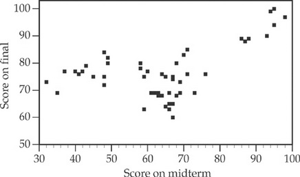
In addition to visualizing the relationship between two variables, we can also use statistical techniques such as correlation analysis to quantify the strength and direction of the relationship. We can quantify strength and direction (e.g., with correlation) and later in the course we will learn how to assess statistical significance. This can help us decide whether it is appropriate to use one variable to make predictions about the other.
How Can I Use This Data?
In both cases, we are trying to see whether the variables are related to each other. If we know that two variables are associated, then we may be able to predict the value of one variable from the other. For quantitative pairs with a roughly linear pattern, we will later use regression to make predictions. Association does not imply causation; without a well-designed experiment or additional context, we cannot conclude that one variable causes changes in another. Keep in mind that finding that two variables are not associated can also be just as strong of an analytical discovery as finding that they are associated.
Remember that the relationship between two variables can be positive, negative, or no relationship at all.
- A positive relationship means that as the value of one variable increases, the value of the other variable also tends to increase.
- A negative relationship means that as the value of one variable increases, the value of the other variable tends to decrease (and vice versa).
- No relationship means that there is no pattern or trend in the data and the two variables are not related to each other.
Finding that two variables are not associated is also a useful and important analytical discovery. This can help us rule out certain variables as potential factors that may be affecting the outcome of a study or experiment, and can help us narrow down the factors that may be contributing to the observed relationship between the variables.
Are apparent patterns real or random?
Apparent patterns and associations in data may be random, especially with small samples or when making many comparisons. When you see a pattern, ask:
- Could this be due to chance?
- How large is the sample?
- Is the pattern strong and consistent or could a few points be driving it? Later in the course, we will learn formal tools to assess whether patterns are stronger than we'd expect from random variation.
Vocabulary
The following words are mentioned explicitly in the College Board Course and Exam Description for this topic.Term | Definition |
|---|---|
association | The relationship between two variables where knowing the value of one variable provides information about the other variable. |
patterns | Recurring or observable regularities in data that may suggest a relationship between variables. |
relationships | Connections or associations between two or more variables in a dataset. |
Frequently Asked Questions
What is bivariate data?
Bivariate data records two variables for each individual or case. AP Statistics uses bivariate data to ask whether two variables appear related.
What is the difference between categorical and quantitative bivariate data?
Two categorical variables are usually summarized with two-way tables and conditional proportions. Two quantitative variables are usually graphed with a scatterplot.
How do you describe a relationship in a scatterplot?
Describe the direction, form, strength, and any unusual features. For example, a relationship might be positive, roughly linear, moderately strong, with one outlier.
What does association mean in statistics?
Association means the values of one variable tend to vary with the values of another variable. Association can help with prediction, but it does not automatically prove causation.
Can an apparent pattern in data be random?
Yes. AP Statistics emphasizes that apparent patterns and associations may be due to random variation, especially with small samples or many comparisons.
How does Topic 2.1 show up on the AP Statistics exam?
You may identify the right question for a two-variable dataset, describe an association, choose an appropriate display, or explain why causation is not justified.