📚AP Statistics Unit 1 Review
1.5 Graphical Representations for One Quantitative Variable
1.5 Graphical Representations for One Quantitative Variable
Unit & Topic Study Guides
Unit 1 – Exploring One–Variable Data and Collecting Data
Unit 2 – Probability, Random Variables, and Probability Distributions
Unit 3 – Inference for Categorical Data: Proportions
Unit 4 – Inference for Quantitative Data: Means
Unit 5 – Regression Analysis
AP Statistics Exam
Statistical Practices
Exam Skills
Quantitative variables are numerical, and they come in two types: discrete values you can count and continuous values measured on an interval. To show their distribution, you use graphs like histograms, stem-and-leaf plots, dotplots, frequency polygons, and cumulative graphs called ogives, each making the shape and spread of the data easier to see.
Why This Matters for the AP Statistics Exam
This topic gives you the visual tools you will use all year. Before you can describe a distribution's shape, center, and variability or compare two groups, you have to read and build the right graph. On the AP Statistics exam, you may need to recognize what a histogram, stemplot, dotplot, or ogive is showing, choose an appropriate display for a set of quantitative data, and pull information out of a graph to support a claim. Getting comfortable with these representations now sets you up for describing distributions, comparing groups, and later inference work.

Key Takeaways
- A discrete variable takes on a countable number of values; a continuous variable can take on infinitely many values that cannot be counted.
- Histograms group data into equal-width intervals (bins), and the bar height shows the count or proportion in each interval. Changing the interval width can change how the histogram looks.
- Stem-and-leaf plots split each value into a stem and a leaf, so they keep the individual data values visible.
- Dotplots show each observation as a dot stacked above its value, which works well for small data sets.
- A cumulative graph (ogive) shows the number or proportion of data less than or equal to each value, which helps with position and percentiles.
- Histograms have no gaps between bars unless the data actually has a gap; that empty space means no values fall in that interval.
Discrete vs. Continuous Quantitative Variables
Quantitative variables are variables that can be measured or counted and have a numerical value. They split into two types:
- A discrete variable can take on a countable number of values. The number of values may be finite or countably infinite, like the counting numbers. Examples include the number of children in a family or class, the number of cars in a parking lot, and the number of votes a candidate receives in an election.
- A continuous variable can take on infinitely many values, but those values cannot be counted. No matter how small the interval between two values, you can always find another value between them. Height is a good example, since there are infinitely many possible values between any two heights. Other examples include the length of a piece of wood, the time it takes to run a marathon, and the temperature of a room.
This topic focuses on how to organize and display quantitative data. A frequency table can get complicated for quantitative data, especially with large data sets, and you will not be asked to build one from scratch. Programs like Microsoft Excel and your TI calculator can make one in seconds. The main displays here are histograms, frequency polygons, ogives, stem-and-leaf plots, and dotplots.
Choosing a Graph for Quantitative Data
| Display | Best for | What to watch |
|---|---|---|
| Dotplot | Small data sets where individual values matter | Stack repeated or nearly identical values clearly |
| Stemplot | Small or moderate data sets where exact values matter | Include a key so the stems and leaves are readable |
| Histogram | Larger quantitative data sets grouped into intervals | Bin width can change the apparent shape |
| Ogive | Cumulative counts, proportions, percentiles, or medians | Read "less than or equal to" values from the graph |
Histograms
A histogram is a graphical representation of a distribution of data, where the data is divided into intervals called bins. The bins come from dividing the range of the data into equal-width intervals, and the height of each bar shows the number or proportion of observations that fall within that interval. The width of the bars represents the interval width, and the x-axis represents the values of the data.

Unlike bar graphs, there is no space between histogram bins. If there is a space, that indicates an actual gap in the data with no values. The height of each bin represents the frequency for that interval. Always check that you are working with quantitative data before choosing a histogram.
Frequency Polygons
Frequency polygons display the distribution of quantitative data using lines that connect points at the midpoints of each bin. It is similar to a histogram, but instead of bars, it uses connected line segments to show the frequencies.
To create a frequency polygon, first build a frequency table that shows the number of observations for each value or interval in the data. The x-axis represents the values or intervals, and the y-axis represents the frequencies. Then plot a point at the top of each interval and connect the points with line segments.

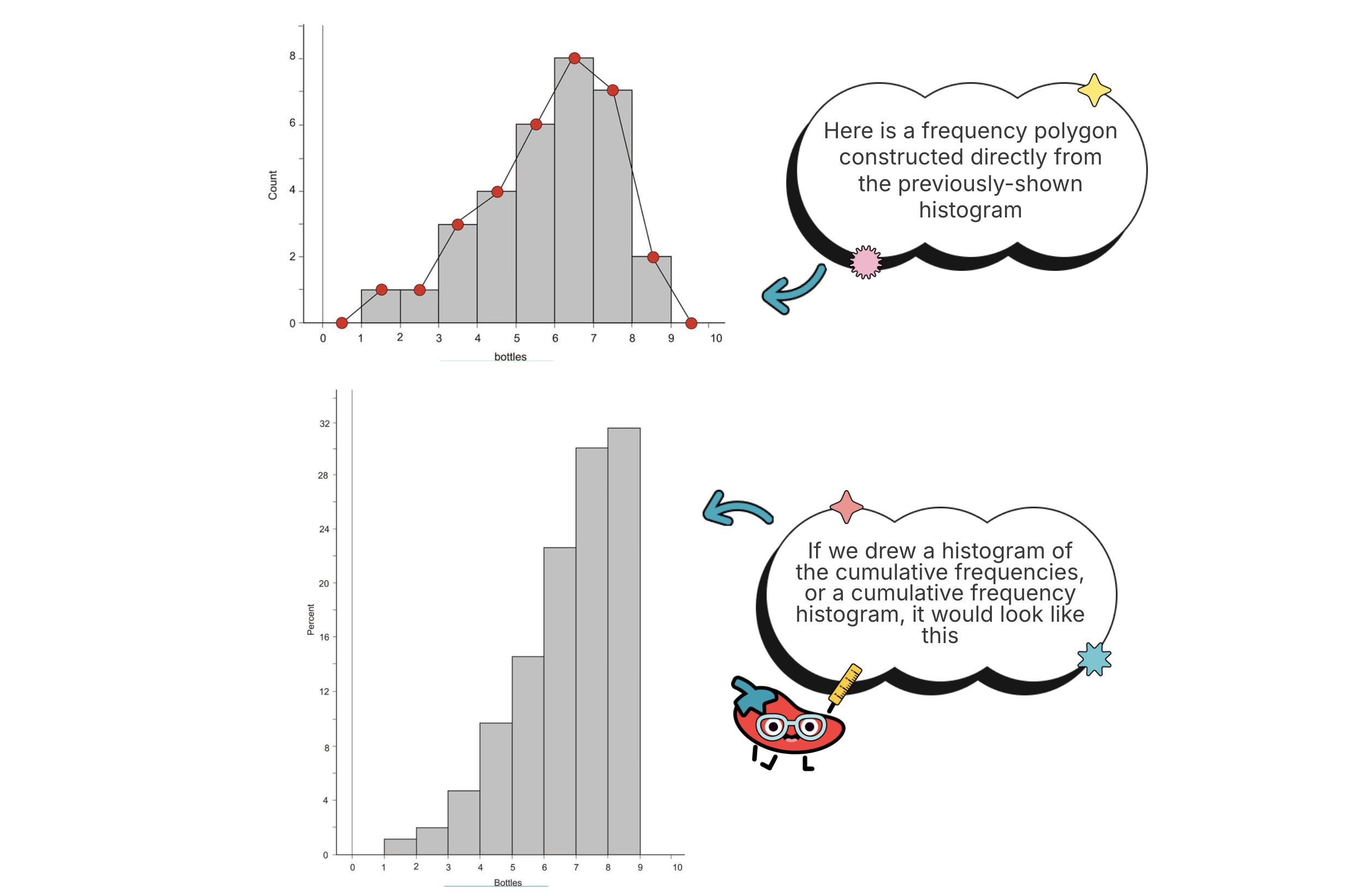
Cumulative Graphs (Ogives)
A cumulative graph, also known as a cumulative frequency plot or an ogive, is a graphical representation of a cumulative distribution. It shows the number or proportion of a data set that is less than or equal to a given value. The cumulative frequency adds up the frequencies class by class. Ogives help you find the position of data, so you can see how many values are below or above a certain point.
To create a cumulative graph, first build a cumulative frequency table that shows the number or proportion of observations less than or equal to each value or interval. The x-axis represents the values or intervals, and the y-axis represents the cumulative frequencies. Then plot the points and connect them with a line.
Here is an example of a frequency table and its corresponding cumulative frequencies:
| Number of Plastic Beverage Bottles per Week | Frequency | Cumulative Frequency |
|---|---|---|
| 1 | 1 | 1 |
| 2 | 1 | 2 |
| 3 | 3 | 5 |
| 4 | 4 | 9 |
| 5 | 6 | 15 |
| 6 | 8 | 23 |
| 7 | 7 | 30 |
| 8 | 2 | 32 |
Stem-and-Leaf Plots (Stemplots)
Stem-and-leaf plots are a simple graphical representation of a distribution of a quantitative variable. They are similar to histograms in that they show the distribution, but they differ because they preserve the individual values of the data. A histogram relies on grouped data, so it hides the individual values inside the bins.
To create a stem-and-leaf plot, split each data value into a "stem" (the first digit or digits) and a "leaf" (usually the last digit). The stems represent the larger place value of each number, and the leaves represent the last digit. Then arrange the stems on the left and the leaves on the right. Whenever you make a stemplot, include a key so the reader knows how to read it with the correct context in mind.
Here is an example of how to create a stem-and-leaf plot for the data values 23, 28, 35, 40, 45, 65, 68, 69, and 84:
</>Code2 | 3 8 3 | 5 4 | 0 5 6 | 5 8 9 8 | 4
In this example, the stem "2" represents the values 20-29, and the leaf "3" represents the value 23. Similarly, the stem "4" represents the values 40-49, and the leaf "5" represents the value 45.
TIP: Turn the stem-and-leaf plot on its side to spot unusual features in the data, like skew or gaps.
Dotplots
Dotplots are similar to stemplots, but this time each observation is represented by a dot. The position of each dot on the horizontal axis corresponds to the data value of that observation, and dots are stacked on top of each other when values are nearly identical. This is a great display if you want a quick look at the data without writing out digits.
Dotplots are simple and quick to make, and they are the first choice when you are working with a small set of data.
To create a dotplot, plot a dot for each data value on the horizontal axis, with the position of the dot corresponding to the value. You can also use different symbols or colors to distinguish between different groups of data.
For example, a pediatrician might want to see how a sample of 14 children spend their time during the day on exercise versus recreational activities like video games. Dotplots for both activities might look similar to the diagrams below:

How to Use This on the AP Statistics Exam
MCQ
- Be ready to identify which display is shown and read values off it. For a histogram, the bar height gives a count or proportion for an interval, not for a single value.
- For an ogive, read the y-value at a given x to find how many or what proportion of values fall at or below that point. This is how you estimate percentiles and medians from a cumulative graph.
- Stemplots keep individual values, so you can read exact data points and find things like the minimum, maximum, or specific observations.
Free Response
- If asked to choose a display, match it to the data. Dotplots and stemplots work well for small data sets and keep individual values; histograms handle larger data sets by grouping into bins.
- Label your axes and include a key on a stemplot. Clear, complete graphs are important for clear exam work.
- When you read a graph to support a claim, tie your statement back to the context and the variable, including units when they are given.
Common Trap
- Do not confuse a histogram with a bar graph. Histograms display quantitative data with touching bars; bar graphs display categorical data with gaps between bars.
- Remember that changing the bin width on a histogram can change its appearance, so the same data can look different depending on the intervals chosen.
Common Misconceptions
- A gap between histogram bars means nothing. A gap actually signals that no data values fall in that interval, which is a real feature of the distribution worth noting.
- Histograms and bar graphs are the same. Histograms are for quantitative data and have no space between bars unless there is a gap; bar graphs are for categorical data and always have spaces between bars.
- A stemplot is just a sideways histogram with no extra info. Stemplots actually keep every individual data value, so you can read exact observations, while a histogram only shows grouped counts.
- Discrete just means small and continuous just means large. The difference is whether the values are countable. Number of cars is discrete no matter how large the count; height is continuous because you can always find a value between any two heights.
- The bar height on a histogram is the value of a single data point. The height shows how many (or what proportion of) observations fall within an interval, not the size of one observation.
Related AP Statistics Guides
- Unit 1 Overview: Exploring One-Variable Data and Collecting Data
- 1.1 Introducing Statistics: What Can We Learn from Data?
- 1.3 Representing a Categorical Variable with Tables
- 1.8 Graphical Representations of Summary Statistics
- 1.9 Comparing Distributions of a Quantitative Variable
- 1.4 Representing a Categorical Variable with Graphs
Vocabulary
The following words are mentioned explicitly in the AP® course framework for this topic.Term | Definition |
|---|---|
continuous variable | A variable that can take on infinitely many values that cannot be counted, with infinitely many possible values between any two given values. |
cumulative graph | A graph that represents the number or proportion of a data set that is less than or equal to a given number. |
discrete variable | A variable that can take on a countable number of values, which may be finite or countably infinite. |
dotplot | A graph that represents each observation as a dot, with position on the horizontal axis corresponding to the data value, with nearly identical values stacked vertically. |
histogram | A graph where the height of each bar represents the number or proportion of observations within an interval, with the ability to alter interval widths to change the appearance. |
interval | A range of values between two boundaries, used to represent a set of outcomes in a normal distribution. |
leaf | In a stem and leaf plot, usually the last digit of a data value. |
quantitative variable | A variable that is measured numerically and can take on a range of values, allowing for mathematical operations and statistical analysis. |
stem | In a stem and leaf plot, the first digit or digits of a data value. |
stem and leaf plot | A graphical representation where each data value is split into a stem (first digit or digits) and a leaf (usually the last digit). |
Frequently Asked Questions
What graphs represent quantitative data in AP Statistics?
Common graphical representations of quantitative data include histograms, dotplots, stemplots, frequency polygons, and cumulative graphs called ogives.
When should I use a histogram?
Use a histogram for quantitative data, especially larger data sets where values are grouped into equal-width intervals. The height of each bar shows the count or proportion in that interval.
What is the difference between a histogram and a bar graph?
A histogram displays quantitative data with touching bars, except where there is a real gap in the data. A bar graph displays categorical data and usually has spaces between bars.
When should I use a dotplot?
Use a dotplot for a small quantitative data set when you want to keep individual observations visible. Repeated or nearly identical values are stacked above the same location.
What is an ogive in statistics?
An ogive is a cumulative graph showing the number or proportion of data values less than or equal to each x-value. It is useful for percentiles, medians, and cumulative position.
What is the difference between discrete and continuous variables?
A discrete variable takes countable values, such as number of students. A continuous variable can take infinitely many values in an interval, such as height or time.