📚AP Statistics Unit 1 Review
1.4 Graphical Representations for One Categorical Variable
1.4 Graphical Representations for One Categorical Variable
Unit & Topic Study Guides
Unit 1 – Exploring One–Variable Data and Collecting Data
Unit 2 – Probability, Random Variables, and Probability Distributions
Unit 3 – Inference for Categorical Data: Proportions
Unit 4 – Inference for Quantitative Data: Means
Unit 5 – Regression Analysis
AP Statistics Exam
Statistical Practices
Exam Skills
Bar graphs display counts (frequencies) or proportions (relative frequencies) for categorical data, with the height or length of each bar matching the count or proportion in that category. You should be able to build these graphs, read them to make claims in context, and use them to compare two or more groups on the same categorical variable.
Why This Matters for the AP Statistics Exam
Categorical graphs show up across the AP Statistics exam, in both multiple-choice questions and free-response questions. You are expected to do three things with them: represent categorical data graphically, describe what a graph shows using the context of the data, and compare two or more sets of categorical data.
This topic builds the habit of always tying numbers and bars back to context. That same habit, describing what you see and justifying claims with evidence, carries through later units when you analyze two-variable data and run inference procedures. Getting comfortable now with reading bars and proportions makes those harder topics easier.

Key Takeaways
- Bar charts display either frequencies (counts) or relative frequencies (proportions) for categorical data.
- The height or length of each bar equals the count or proportion in that category, and bars have equal width with gaps between them.
- When you describe a categorical graph, use context: name the variable, the categories, and what the bars reveal.
- Frequency tables, bar graphs, and other representations let you compare two or more data sets on the same categorical variable.
- There are many ways to represent categorical data beyond a basic bar chart, including relative-frequency bar graphs and segmented or side-by-side bar graphs.
- Watch for misleading graphs, especially a vertical axis that does not start at zero, which can exaggerate differences.
Bar Graphs
Bar charts (or bar graphs) display frequencies (counts) or relative frequencies (proportions) for categorical data. The height or length of each bar corresponds to either the number or the proportion of observations falling within each category.
To build a bar graph, decide on your categories first. Each category gets its own bar. All bars have the same width, and there is a gap between adjacent bars so they read as separate categories rather than a continuous scale.
Step by step:
- Determine the categories you want to include in the graph.
- Count the number of observations in each category.
- Mark the frequencies (or proportions) on the vertical axis and the categories on the horizontal axis.
- Draw the bars, with the height of each bar representing the count or proportion of the corresponding category.
- Add a title and axis labels so the graph is easy to interpret.
Choose a consistent scale for the vertical axis, and start it at zero so the bar heights honestly reflect the data. If you are comparing more than one group, add a legend.
You can build the same graph using counts or using relative frequencies (proportions). Relative-frequency bar graphs are useful when groups have different total sizes, because proportions put everyone on the same scale.
Comparing Groups With Bar Graphs
A big reason categorical graphs matter is comparison. Bar graphs, frequency tables, or other representations can be used to compare two or more data sets on the same categorical variable.
Two common comparison layouts:
- Side-by-side (clustered) bar graphs place bars for each group next to each other within each category, so you can compare counts or proportions directly.
- Segmented (stacked) bar graphs stack categories within a single bar for each group. When the bars are scaled to the same total (proportions adding to 100%), they make it easy to compare the share each category takes up across groups.
When you compare, use proportions if the groups have different totals. Comparing raw counts across groups of different sizes can be misleading, since a larger group will tend to have taller bars everywhere.
Describing a Categorical Graph
Reading a graph is just as important as building one. A graphical representation of a categorical variable reveals information you can use to justify claims about the data in context.
When you describe a categorical graph, mention:
- The variable and what the categories are.
- Which category appears most often (the mode) and which appear least.
- How the categories compare in size, using counts or proportions.
- Anything notable, like one category clearly leading or several categories being about equal.
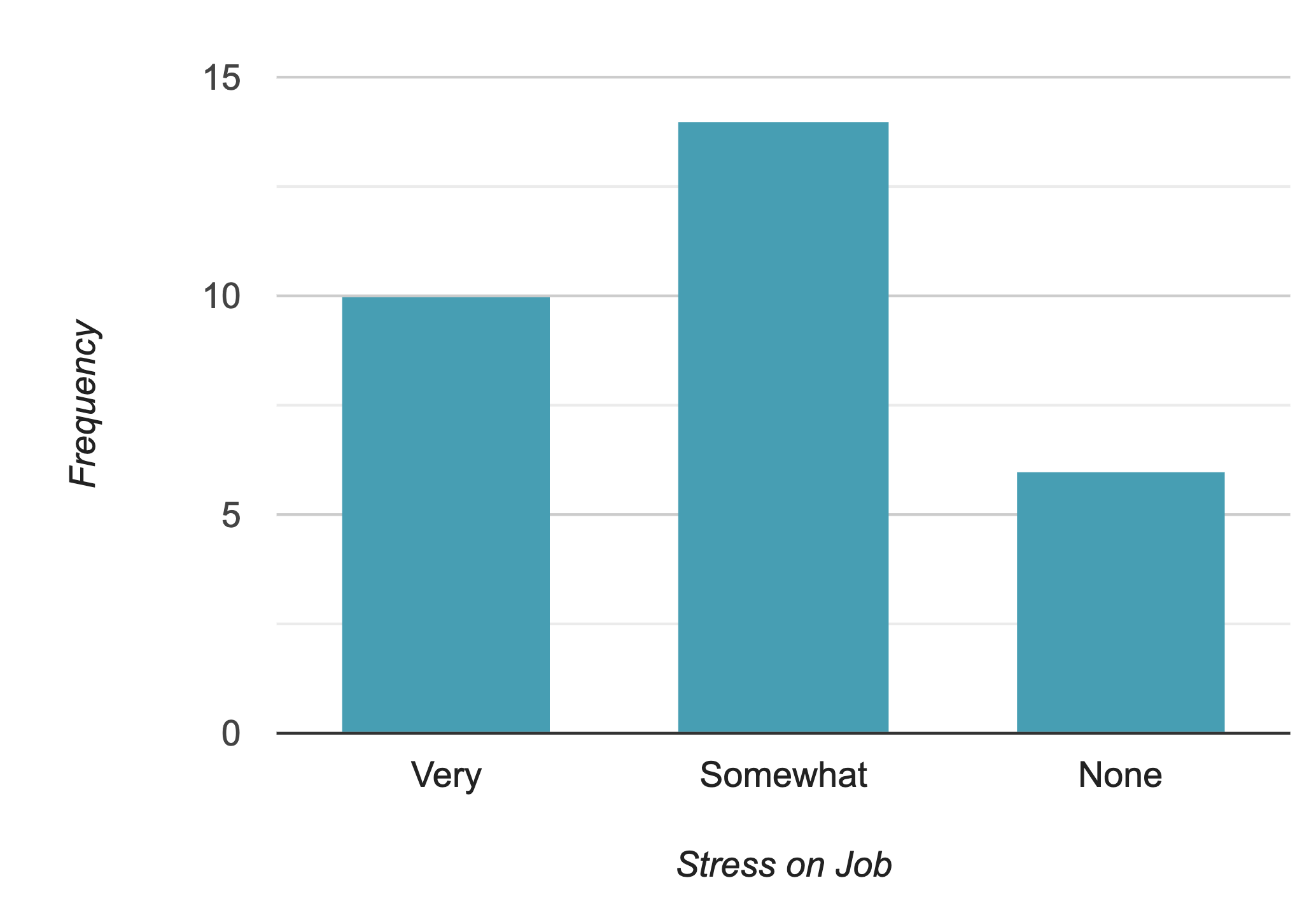
Always state these in context. Instead of "the tallest bar is about 40," say "about 40% of workers reported high stress on the job, the most common response."
Pie Charts and Other Representations
There are many additional ways to represent counts or proportions for categorical data. A pie chart is a circular graph divided into slices, where each slice's size is proportional to the share of the whole that category represents.

Pie charts work best for showing relative proportions when you have only a few categories. They are weaker at showing precise values or small differences. If you need to compare many categories or read exact values, a bar chart is usually the clearer choice.
Quick guide for choosing:
- Use a bar graph when you have many categories, or when several categories are close in size and you need to compare them precisely.
- Use a pie chart only when a few clearly different proportions tell the story, and the slices are easy to tell apart.
- Whatever you pick, keep the area honest. A slice or bar should represent its share without visual distortion.
How to Use This on the AP Statistics Exam
MCQ
- Read whether a bar graph shows counts or proportions before answering. The axis label tells you.
- Identify the most common category (mode) and compare category sizes quickly.
- Watch for a vertical axis that does not start at zero, which exaggerates differences between bars.
Free Response
- When asked to make a graph, label both axes, title it, and use a consistent scale starting at zero.
- When asked to describe, name the variable and categories and report what the bars show in context.
- When asked to compare two or more groups, use proportions if the group totals differ, and state the comparison clearly (for example, "Group A had a higher proportion in the 'agree' category than Group B").
Common Trap
If a question gives you raw counts for groups of different sizes, comparing counts directly can mislead you. Convert to relative frequencies so the comparison is fair.
Common Misconceptions
- Bars must touch like a histogram. No. Bar graphs show categories, so bars have gaps between them. Touching bars are for quantitative data in a histogram.
- A bar graph always shows counts. It can show counts or proportions. Always check the vertical axis label.
- Taller bars always mean "more important" or "more" in a fair sense. If groups have different totals, raw counts can mislead. Use proportions to compare fairly.
- Pie charts are always a good choice. They struggle with many categories or small differences. A bar graph is often clearer.
- A truncated axis is fine if it fits the data. Starting the vertical axis above zero exaggerates differences between bars and can give a false impression of size. Start at zero unless there is a clear, labeled reason not to.
- Describing a graph means just reading off numbers. You need to interpret in context: name the variable, the categories, and what the pattern means.
Related AP Statistics Guides
- Unit 1 Overview: Exploring One-Variable Data and Collecting Data
- 1.1 Introducing Statistics: What Can We Learn from Data?
- 1.3 Representing a Categorical Variable with Tables
- 1.8 Graphical Representations of Summary Statistics
- 1.9 Comparing Distributions of a Quantitative Variable
- 1.6 Describing the Distribution of a Quantitative Variable
Vocabulary
The following words are mentioned explicitly in the AP® course framework for this topic.Term | Definition |
|---|---|
bar chart | A graph that displays frequencies or relative frequencies for categorical data using rectangular bars, where the height or length represents the count or proportion in each category. |
bar graph | A graphical representation using rectangular bars to display the frequency or count of categories in a categorical variable. |
categorical data | Data that represents categories or groups rather than numerical measurements, such as colors, types, or classifications. |
frequencies | The count or number of observations falling within each category of categorical data. |
frequency table | A table that displays the number of cases or observations falling into each category. |
graphical representations | Visual displays such as bar charts, pie charts, or other graphs used to present data in a visual format. |
relative frequency | The proportion of observations in a category, expressed as a decimal, fraction, or percentage of the total. |
Frequently Asked Questions
What graph should you use for categorical data in AP Statistics?
Use a bar graph, relative-frequency bar graph, segmented bar graph, side-by-side bar graph, frequency table, or circle graph. Bar graphs are the most common because they clearly show counts or proportions for categories.
How do you make a bar graph for categorical data?
List the categories, count or calculate the proportion in each category, choose a scale that starts at zero, then draw equal-width bars with gaps between categories. Label the axes and title the graph in context.
What is the difference between frequency and relative frequency?
Frequency is the count in a category. Relative frequency is the proportion or percent of the total in that category. Relative frequencies are especially useful when comparing groups with different total sizes.
When should you use a relative-frequency bar graph?
Use a relative-frequency bar graph when you want to compare categories by proportions or compare groups with different sample sizes. It prevents larger groups from looking more important just because they have more observations.
How do you compare categorical data from two groups?
Use side-by-side or segmented bar graphs and compare proportions in context. Name the variable, identify the categories, and describe which categories are higher, lower, or similar across groups.
What is a common mistake with categorical graphs?
A common mistake is comparing raw counts when group sizes are different. Use proportions or relative frequencies when totals differ, and watch for misleading axes that do not start at zero.