📚AP Statistics Unit 1 Review
1.8 Graphical Representations of Summary Statistics
1.8 Graphical Representations of Summary Statistics
Unit & Topic Study Guides
Unit 1 – Exploring One–Variable Data and Collecting Data
Unit 2 – Probability, Random Variables, and Probability Distributions
Unit 3 – Inference for Categorical Data: Proportions
Unit 4 – Inference for Quantitative Data: Means
Unit 5 – Regression Analysis
AP Statistics Exam
Statistical Practices
Exam Skills
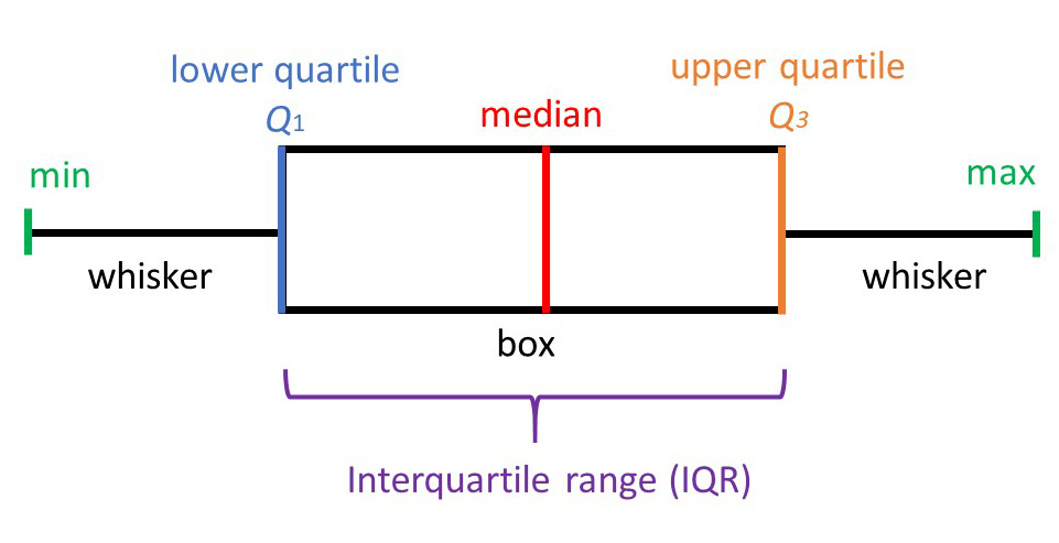
In AP Statistics, a five-number summary gives the minimum, Q1, median, Q3, and maximum for a quantitative data set. A boxplot turns those five summary statistics into a graph, with the box showing the middle 50% of the data and the whiskers extending to the most extreme non-outlier values.
This topic connects measures of center and spread to visual displays. You should be able to build a boxplot from summary statistics, identify possible outliers with the 1.5 x IQR rule, and describe skew by comparing the median, box, whiskers, mean, and median.
Five Number Summaries
A five number summary provides a concise summary of a dataset. It consists of the minimum value, the first quartile (Q1), the median, the third quartile (Q3), and the maximum value of a dataset.
Remember that quartiles divide the data into four equal sections. One quarter of the data lies below the lower quartile, Q1, while another quarter of the data lies above the upper quartile, Q3. The quartiles border the middle half of the data.
For example, consider the following dataset of 10 numbers:
5, 7, 8, 9, 10, 12, 15, 20, 25, 30
The minimum value is 5, the first quartile (also known as the lower quartile or Q1) is 8, the median is 11 (the average of 10 and 12), the third quartile (also known as the upper quartile or Q3) is 20, and the maximum value is 30. Note: For an even number of observations, the median is the average of the two middle values.
So, the five number summary for this dataset is:
Minimum value: 5
First quartile: 8
Median: 11
Third quartile: 20
Maximum value: 30
That gives you the full five-number summary.
Five number summaries provide a useful overview of the range, spread, and central tendency of the data. It is often used in conjunction with box plots, which are graphical representations of the five number summary.

Box Plots
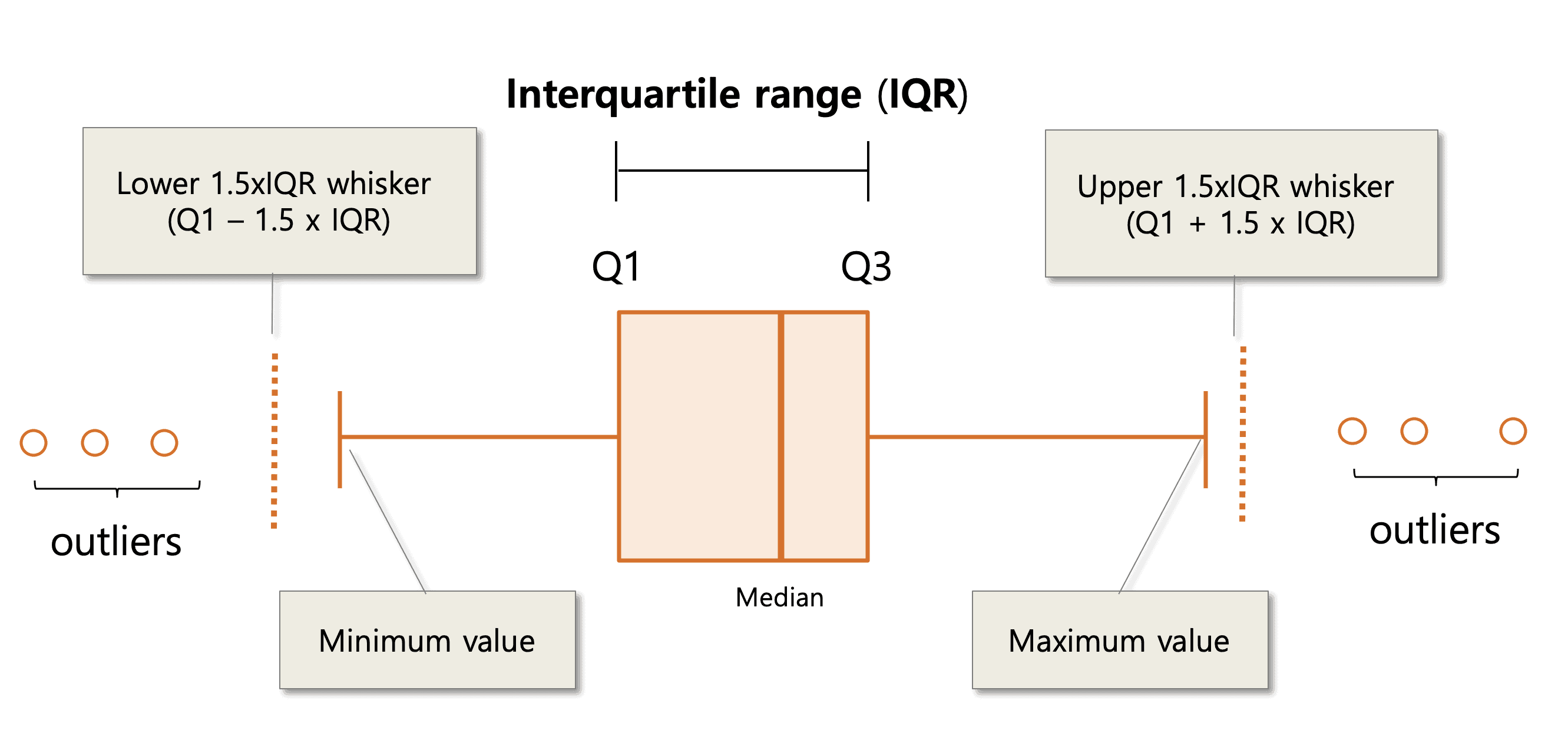
A box plot, also known as a box and whisker plot, graphically represents the five number summary. It is a way to visualize the distribution of a dataset and to identify any outliers or unusual values!
To create a box plot, you start by drawing a horizontal line called the "axis" and marking the minimum, first quartile, median, third quartile, and maximum values of the dataset on it. These marks are then used to create a box shape: the bottom of the box corresponds to the first quartile, the top of the box corresponds to the third quartile, and the line inside the box corresponds to the median.
Lines ("whiskers") extend from each quartile to the most extreme data value that is not an outlier (as determined by the 1.5×IQR rule); outliers are plotted individually beyond the whiskers. If there are no outliers, the whiskers will reach the minimum and maximum.
Using the interquartile range, or IQR, we can erect fences to detect the outlier in our data:
Upper fence = Q3 + 1.5 IQR
and
Lower fence = Q1 - 1.5 IQR
The fences are not included in the box plot, but it helps us to draw the whiskers of the box plot. Any values beyond the whiskers are plotted individually with a distinct symbol (often a dot or asterisk) to indicate outliers.
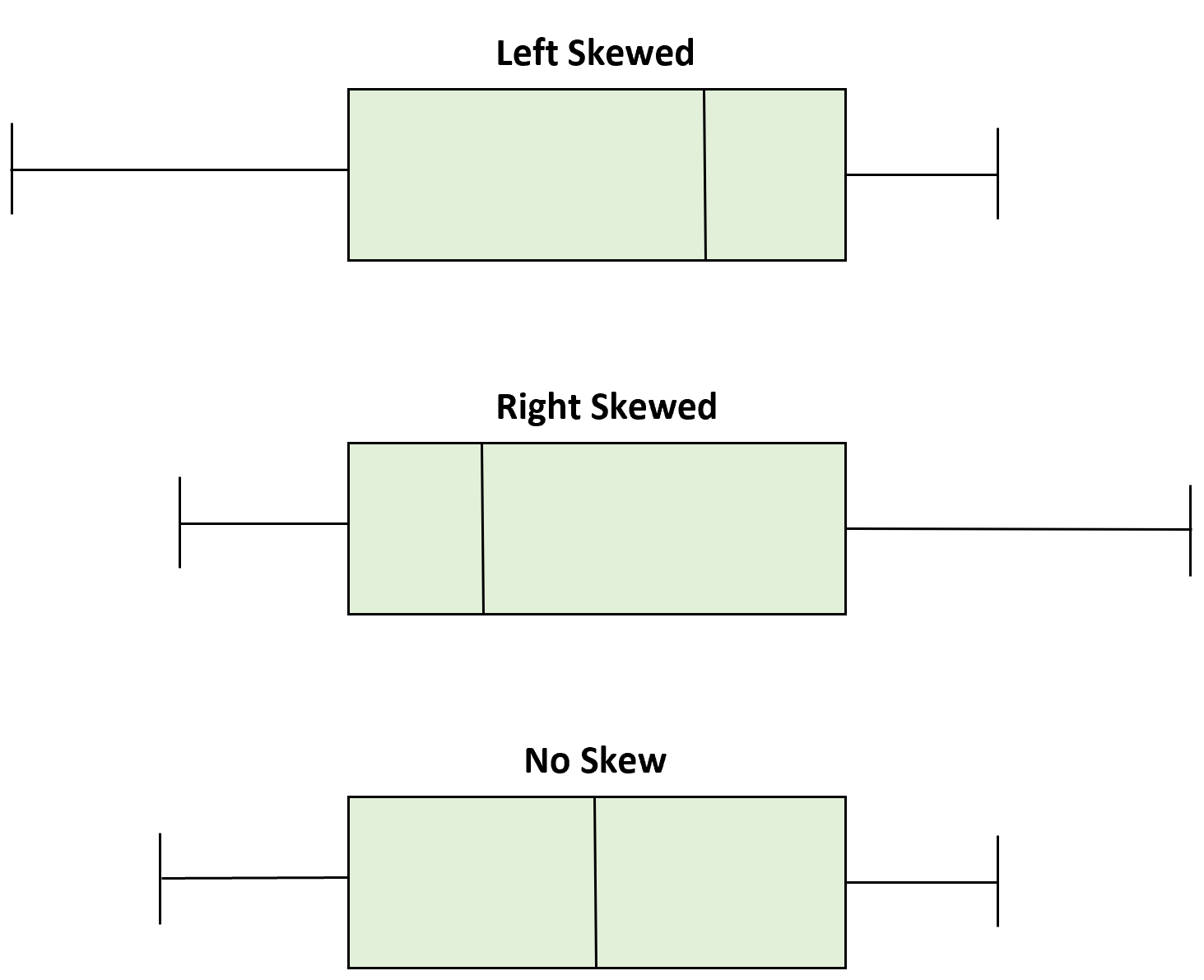
Box Plots and Skew
Box plots can help us find important features about the distribution. The central box stretches from Q1 to Q3 and shows the middle (50%) of data. If the median is roughly centered within the box (about equidistant from Q1 and Q3) and the whiskers are of similar length, the distribution appears roughly symmetric. However, we should also look at whiskers. If the whiskers have different lengths, the distribution will be skewed on to the longer whisker’s side.
Still unsure? Here's another way to word the explanation above with a visual as the cherry on top:
To determine whether a box plot is skewed or symmetric, you can look at the position of the median relative to the first and third quartiles.
- If the median is roughly in the middle of the box, with about the same amount of data above and below it, the distribution is symmetric.
- If the median is closer to one end of the box, with more data on the other end, the distribution is skewed.
Mean vs. Median and Shape
- If a distribution is relatively symmetric, the mean and median are close to each other.
- If a distribution is skewed right, the mean is usually to the right of (greater than) the median.
- If a distribution is skewed left, the mean is usually to the left of (less than) the median.
Example in context: Because the income distribution is often right-skewed, the mean income typically exceeds the median income.
Key Vocabulary
- Minimum
- Quartile 1 (or First Quartile)
- Median
- Quartile 3 (or Third Quartile)
- Maximum
- Boxplots
- Fences
Practice Questions
(1) Which of the following is NOT a part of a five number summary?
A) Minimum value
B) First quartile
C) Median
D) Range
E) Third quartile
(2) Consider the following dataset of exam scores for a class of 30 students:
75, 80, 85, 85, 90, 90, 90, 95, 95, 95, 95, 95, 95, 100, 100, 100, 100, 100, 100, 100, 100, 100, 100, 100, 100, 100, 100, 100, 100, 100
A. Create a five number summary for the dataset.
B. Create a box plot for the dataset.
C. What can you conclude about the distribution of the exam scores based on the five number summary and the box plot?
(3) A researcher is studying the heights of a sample of 100 adults. The five number summary for the sample is:
Minimum value: 150 cm
First quartile: 160 cm
Median: 170 cm
Third quartile: 180 cm
Maximum value: 200 cm
Is a data point with a height of 220 cm considered an outlier according to the 1.5 x IQR rule?
Answers
(1) D) Range. A five number summary consists of the minimum value, the first quartile, the median, the third quartile, and the maximum value of a dataset. The range, which is the difference between the minimum and maximum values, is not a part of the five number summary.
(2) A. Sorted data (n = 30). Median = average of 15th and 16th values = 100. Q1 = median of the first 15 values = 95. Q3 = median of the last 15 values = 100. Five-number summary: Min = 75, Q1 = 95, Median = 100, Q3 = 100, Max = 100.
B. I'll leave it up to you to draw the box plot and get some practice.
C. IQR = Q3 − Q1 = 100 − 95 = 5. Lower fence = 95 − 1.5(5) = 87.5; upper fence = 100 + 1.5(5) = 107.5. Outliers are values below 87.5 (75, 80, 85, 85) — note there are two 85s. The lower whisker extends from Q1 down to the smallest non-outlier (90), not to 75. The upper whisker is at 100. The distribution is strongly left-skewed: many scores at the top (median and Q3 at 100) with a longer lower tail.
(3) To answer this question, you need to calculate the interquartile range (IQR) of the sample. The IQR is the difference between the third quartile and the first quartile, and is a measure of the spread of the data. In this case, the IQR is 180 cm - 160 cm = 20 cm.
According to the 1.5 x IQR rule, a data point is considered an outlier if it is more than 1.5 times the IQR below the first quartile or more than 1.5 times the IQR above the third quartile.
In this case, the data point with a height of 220 cm is more than 1.5 times the IQR above the third quartile (180 cm), so it is considered an outlier.
The correct answer is: Yes, a height of 220 cm is considered an outlier in our data set! (Notice how we didn't need the raw dataset or the box plot to determine whether a data point is an outlier or not? The five number summary definitely suffices in providing enough information and context.)
Using Summary Statistics to Justify a Claim (in context)
In two classes, Class A five-number summary: 60, 72, 80, 88, 98; Class B: 65, 75, 82, 90, 95. Claim: Class B tends to score higher because its median (82 vs. 80) is greater. Variability is similar (IQRs 16 vs. 15). These statistics support the claim in context.
Vocabulary
The following words are mentioned explicitly in the AP® course framework for this topic.Term | Definition |
|---|---|
boxplot | A graphical representation of the five-number summary showing the distribution of data through a box and whiskers. |
first quartile | The median of the lower half of an ordered data set, denoted as Q1, marking the boundary below which 25% of the data falls. |
five-number summary | A set of five values that describe a dataset: minimum, first quartile (Q1), median, third quartile (Q3), and maximum. |
maximum | The largest value in a dataset. |
mean | The average value of a dataset, represented by μ in the context of a population. |
median | The middle value when data are ordered; for an even number of data points, typically the average of the two middle values. |
minimum | The smallest value in a dataset. |
outlier | Data points that are unusually small or large relative to the rest of the data. |
quantitative data | Data that consists of numerical values that can be measured and analyzed mathematically. |
quartile | A value that divides an ordered data set into four equal parts; Q1 and Q3 form the boundaries for the middle 50% of values. |
skewed left | A distribution with a longer tail extending to the left, where the mean is typically less than the median. |
skewed right | A distribution with a longer tail extending to the right, where the mean is typically greater than the median. |
summary statistics | Numerical measures that describe key features of a dataset, such as center, spread, and shape. |
symmetric distribution | A distribution where data is evenly distributed around the center, with the mean and median approximately equal. |
third quartile | The median of the upper half of an ordered data set, denoted as Q3, marking the boundary below which 75% of the data falls. |
whiskers | Lines extending from the ends of a boxplot that reach to the most extreme data points that are not outliers. |
Frequently Asked Questions
What is a five-number summary in AP Statistics?
A five-number summary includes the minimum, Q1, median, Q3, and maximum of a quantitative data set.
How do you make a boxplot from a five-number summary?
Draw an axis, mark the five-number summary, make a box from Q1 to Q3 with a line at the median, and draw whiskers to the most extreme non-outlier values.
What does the box in a boxplot represent?
The box represents the middle 50% of the data. Its left and right edges are Q1 and Q3, and the line inside the box is the median.
How do you use the 1.5 x IQR rule for outliers?
Find IQR = Q3 - Q1. Values below Q1 - 1.5(IQR) or above Q3 + 1.5(IQR) are considered outliers.
How can a boxplot show skew?
A boxplot suggests skew when one whisker is much longer or the median is noticeably closer to one side of the box. The longer side points toward the skew.
What is the difference between mean and median in skewed data?
In right-skewed data, the mean is usually greater than the median. In left-skewed data, the mean is usually less than the median.