You might recall from earlier that categorical variables can be represented using tables and/or graphs. This section will provide more context that'll equip us with the ability to eventually construct and describe numerical or graphical representations of data distributions.
As for why graphs are big in statistics, graphical representations and statistics are powerful tools for understanding and summarizing data. Graphs can help you visualize the patterns and relationships in your data, and statistics can help you quantify and describe those patterns. By using both graphical representations and statistics, you can gain a deeper understanding of your data and communicate that understanding to others!
Bar Graphs
Bar charts (or bar graphs) are used to display frequencies (counts) or relative frequencies (proportions) for categorical data. The height or length of each bar in a bar graph corresponds to either the number or proportion of observations falling within
each category.
To create a bar graph, you first need to decide on the categories you want to include. Each category corresponds to a separate bar on the graph. The height of each bar represents the frequency or count of observations in that category. All the bars have the same width, and there is a gap between adjacent bars to distinguish them from each other.
When translated into a step-by-step procedure, here's how we would create a bar graph:
- Determine the categories you want to include in the graph.
- Count the number of observations in each category.
- Mark the frequencies on the vertical axis and the categories on the horizontal axis.
- Draw the bars, with the height of each bar representing the frequency of the corresponding category.
- Add a title and axis labels to the graph to help interpret the data. It's important to choose an appropriate and consistent scale for the vertical axis. You should also consider adding a legend to the graph if you have multiple series of data that you want to compare.
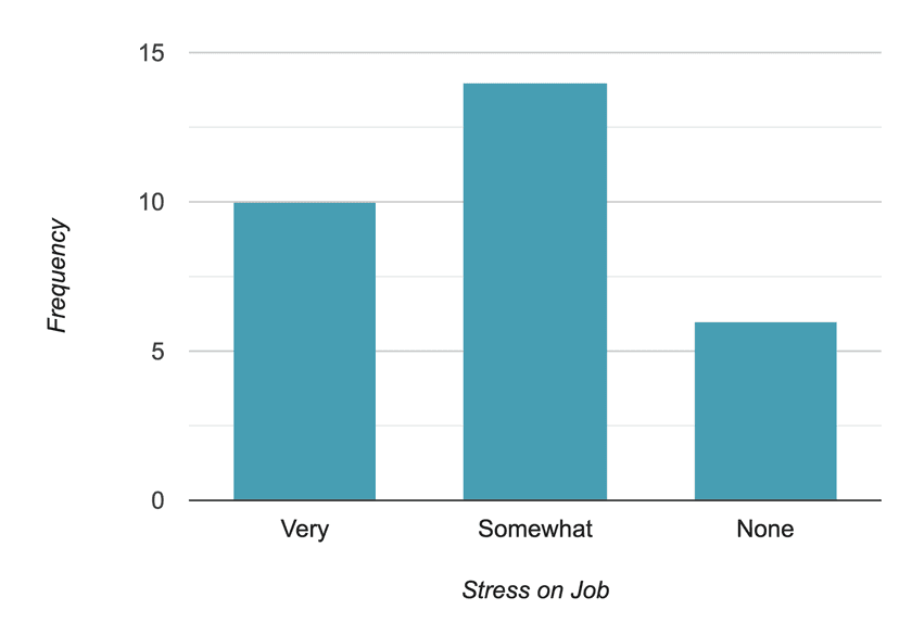
To keep it short, here is the bar graph of stress on the job. We can also use relative frequencies or percentages to construct the bar graph. You can be creative and color each category with a different color. It will be visually attractive and easier to compare them.

Pie Charts
A pie chart is a circular graph that is divided into slices, with each slice representing a different category. The size of each slice is proportional to the fraction of the whole that is represented by that category. Pie charts are often used to show the relative proportions of different categories within a dataset.

To create a pie chart, you'll have to keep the following steps in mind:
- Determine the categories you want to include in the pie chart. (Example: Commuter, non-commuter)
- Calculate the fraction of the whole that is represented by each category (Example: Out of 50 respondents, 30 commuters would occupy 3/5ths of the pie, while 20 non-commuters would occupy the remaining 2/5ths of the pie).
- Draw a circle and divide it into slices that are proportional to the fractions calculated in step 2.
- Label each slice with the corresponding category and the percentage it represents.
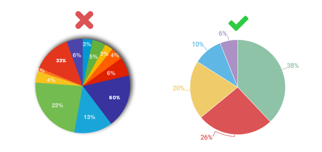
- Add a title to the pie chart to help interpret the data. It's important to keep in mind that pie charts are best used to compare the relative proportions (percentages and relative frequencies, for example) of different categories. They're not as effective at showing precise values or small differences between categories. If you want to show detailed values or compare the values of multiple categories, it is usually better to use a different type of graph, such as a bar chart.
Tips:
- The choice between bar graphs and pie charts will depend on how many categories that variable of your interest assumes and the size of it. Whenever you have many categories or few categories with about the same frequencies, then the bar graph should be your first choice. If the pie has many slices or slices of the same size, it will be hard to compare the groups.
- Be careful of quantity distortions and keeping the area principle.
Contingency Table (Two-Way Table)
Now that we know how to represent data in tables and charts, let's add one more character to the tables gang to keep things evenly balanced!
A contingency table is a type of table that is used to organize and (later on) analyze categorical data. It shows how the observations in a dataset are distributed among different categories of two or more variables. Contingency tables can help in understanding relationships between variables and identifying patterns or trends in the data.
To create a contingency table, you'll have to:
- Determine the variables you want to include in the table.
- Count the number of observations in each category of each variable.
- Organize the counts in a table, with each row representing a category of one variable and each column representing a category of the other variable.
- Add row and column totals to the table. (This step is the easiest to forget!)
- Analyze the table to identify any patterns or trends in the data. (This is important when establishing context and responding to Multiple Choice and Free Response Questions in the AP exam!) If the numbers in the cells of the contingency table are the same for all categories, we can say that the variables are independent, If the numbers in the cells are different for different categories (with some having higher values than others), then the variables might be related. For example, if you are analyzing data on the relationship between gender and income, you might find that the proportions of men and women in different income categories are different, indicating some sort of relationship between the two variables.
🎥 Watch: AP Stats - Analyzing Categorical Data
Key Vocabulary
- Frequency Table
- Relative Frequency Table
- Pie Chart
- Bar Graph
- Two-way Table
Real-Life Applications: To Trust or Not To Trust a Bar/Pie Chart?
Chances are, you've probably seen a bar or pie chart in some shape or form before in the news, media you consume, or even other textbooks. It's important to remember that they shouldn't be taken immediately at face value as they could be easily misused. To help inform whether bar/pie charts are reliable or not, here are examples of ways they are commonly misused:
- Using bar/pie charts to compare variables on different scales: Charts are best used to compare categories or groups that are on the same scale. If you are comparing variables that are on different scales, it can be difficult to accurately compare the sizes of the bars/pie slices.
- Using bar/pie charts to show continuous data: Charts are best used to show categorical data, not continuous data. If you have continuous data, it is usually better to use a different type of graph, such as a line graph or scatterplot.
- Using bar/pie charts to show small differences: Charts are not very effective at showing small differences between categories. If the differences between the categories are small, it may be difficult to accurately interpret the graph.
- Using bar/pie charts to show trends over time: Charts are not well suited for showing trends over time. For this purpose, it is usually better to use a line graph or a time series plot.
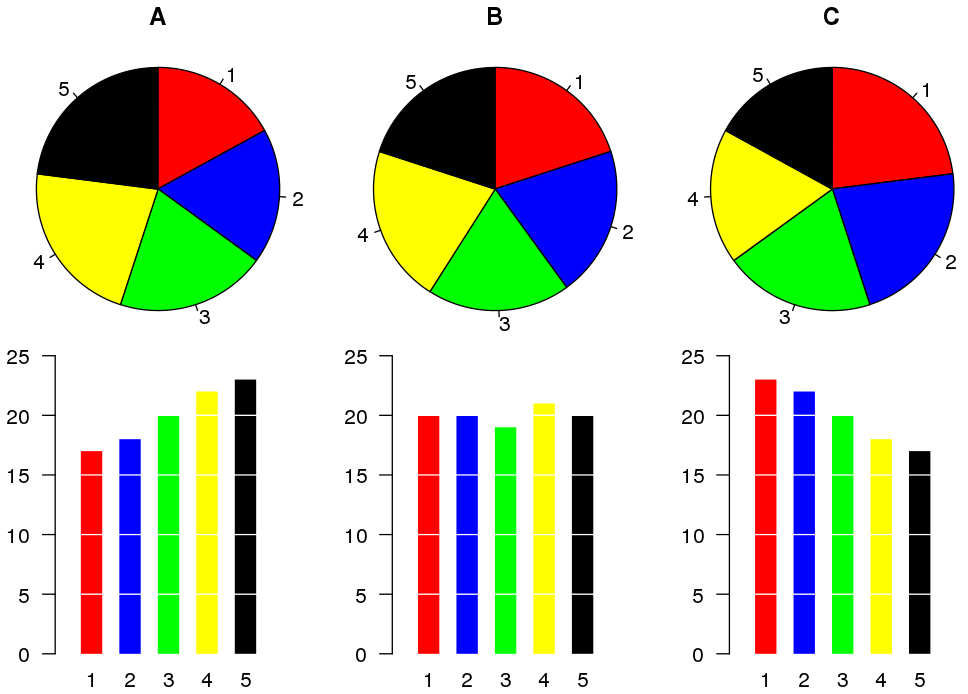
- Using bar/pie charts to show more than two variables: Charts are typically used to compare two variables. If you want to show more than two variables, it is usually better to use a different type of graph. The example below compares A, B, and C; here, you can see that it might make more sense to use a bar chart over a pie chart.
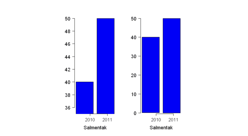
- Using bar/pie charts to show a false impression of size: Truncated bar graphs (bar graphs that don't start at a y-value of 0) can be misleading if the truncation is not clearly labeled or if the truncation is done in a way that distorts the data. For example, if the truncation is done at an arbitrary value, it could give the impression that the data is more evenly distributed than it really is. See the example below and notice how the differences between 2010 and 2011 are more noticeable in a truncated bar graph (left) compared to the usual bar graph (right).
In today's age where misinformation can easily and quickly spread, it's very important to choose the appropriate type of graph for your data and the message you want to convey. Carefully considering the limitations of each type of graph can help you avoid misusing (or mistrusting) them!
Vocabulary
The following words are mentioned explicitly in the College Board Course and Exam Description for this topic.
| Term | Definition |
|---|---|
| bar chart | A graph that displays frequencies or relative frequencies for categorical data using rectangular bars, where the height or length represents the count or proportion in each category. |
| bar graph | A graphical representation using rectangular bars to display the frequency or count of categories in a categorical variable. |
| categorical data | Data that represents categories or groups rather than numerical measurements, such as colors, types, or classifications. |
| frequencies | The count or number of observations falling within each category of categorical data. |
| frequency table | A table that displays the number of cases or observations falling into each category. |
| graphical representations | Visual displays such as bar charts, pie charts, or other graphs used to present data in a visual format. |
| relative frequency | The proportion of observations in a category, expressed as a decimal, fraction, or percentage of the total. |
Frequently Asked Questions
How do I make a bar chart for categorical data?
Make a bar chart in 5 simple steps: 1. Make a frequency (or relative frequency) table for your categorical variable. Decide whether you’ll plot counts or proportions (CED: UNC-1.C.1). 2. Choose your categories for the x-axis and put equal-width bars with small gaps between them (bars should NOT touch). Height = count or proportion (UNC-1.C.2). 3. Label axes and give a clear title that names the context (e.g., “Favorite Ice Cream Flavor—Survey of 200 Students”)—include units (counts or %) and category labels. 4. Pick a sensible scale so bars are easy to read; consider ordering categories by size (Pareto chart) to highlight the mode or by a logical order if categories are ordinal (UNC-1.C.3, categorical mode). 5. For comparing groups, use side-by-side bars or stacked/segmented bars and report marginal or conditional distributions when relevant (UNC-1.E.1). On the AP exam, bar graphs are acceptable for describing and comparing categorical distributions—be sure your graph supports any claims you make (CED: UNC-1.D). For more tips and examples, see the Topic 1.4 study guide (https://library.fiveable.me/ap-statistics/unit-1/representing-categorical-variable-with-graphs/study-guide/Gobk5WIjg5UjPZwOpwTR). For extra practice, try problems at (https://library.fiveable.me/practice/ap-statistics).
What's the difference between frequency and relative frequency in bar graphs?
Frequency = the count of observations in each category (how many). Relative frequency = that count divided by the total (a proportion or percent). In a bar graph the height of each bar can show either: the raw number (frequency) or the fraction/percent of the whole (relative frequency). UNC-1.C in the CED explicitly says bar charts can display frequencies or relative frequencies and that bar height corresponds to number or proportion. Why it matters: use frequency when you care about actual counts; use relative frequency when you want to compare distributions from different-sized groups (percentages make comparisons fair). Example: 50 students like pizza and 30 like tacos (frequencies). If one class has 100 students and another has 40, comparing relative frequencies (50% vs 75%) gives the real story. For AP exam practice and review, see the Topic 1.4 study guide (https://library.fiveable.me/ap-statistics/unit-1/representing-categorical-variable-with-graphs/study-guide/Gobk5WIjg5UjPZwOpwTR) and try practice problems (https://library.fiveable.me/practice/ap-statistics).
When do I use a bar chart vs other types of graphs for categorical variables?
Use a bar chart any time your variable is categorical and you want to show counts or proportions—that’s the CED rule (UNC-1.C.1–C.2). The bar height = frequency or relative frequency, so bar graphs make shape, mode, and comparisons easy to see. When to pick a different form: - Compare two (or more) groups on the same categorical variable: use side-by-side bar charts or stacked/segmented bar charts (UNC-1.E.1) so you can see conditional or marginal distributions. - Show breakdown of parts of a whole across categories: stacked bars or a mosaic plot can be clearer than many separate bars. - Emphasize ordering by size: use a Pareto chart (bars sorted by frequency). Avoid histograms (quantitative only) and don’t confuse bar width with meaning—bars should be same width and separated. For quick review and examples, see the Topic 1.4 study guide (https://library.fiveable.me/ap-statistics/unit-1/representing-categorical-variable-with-graphs/study-guide/Gobk5WIjg5UjPZwOpwTR). For whole-unit review and practice problems, check the unit page (https://library.fiveable.me/ap-statistics/unit-1) and practice set (https://library.fiveable.me/practice/ap-statistics).
I'm confused about how to set up the axes on a bar graph - which variable goes where?
Put the categorical variable’s categories on the horizontal axis and the count or relative frequency on the vertical axis. In other words: x-axis = category labels (e.g., red, blue, green or freshman/sophomore/junior), y-axis = frequency or proportion. The height (or length for horizontal bars) shows the number or proportion in each category (CED: UNC-1.C.1–C.2). If labels are long or there are many categories, use horizontal bars so labels stay readable. If you’re comparing groups, use side-by-side (grouped) bars or stacked bars and include a clear legend; then the x-axis still lists the category and each bar’s height shows the count/proportion for that subgroup (CED: UNC-1.E.1). Always label axes (including “count” or “proportion”) and choose counts vs. proportions depending on whether sample sizes differ. For AP review, see the Topic 1.4 study guide (https://library.fiveable.me/ap-statistics/unit-1/representing-categorical-variable-with-graphs/study-guide/Gobk5WIjg5UjPZwOpwTR) and Unit 1 overview (https://library.fiveable.me/ap-statistics/unit-1). For extra practice, check the AP practice problems (https://library.fiveable.me/practice/ap-statistics).
How do I calculate relative frequencies for my bar chart?
Relative frequency = the proportion of observations in each category. To make a relative-frequency bar chart: 1. Count how many observations fall in each category (the frequency). 2. Add up the total number of observations, n. 3. For each category calculate relative frequency = frequency ÷ n. (If you prefer percent, multiply by 100.) Example: if 18 students prefer pizza out of n = 60, relative frequency = 18/60 = 0.30 (30%). 4. Make a bar chart where each bar’s height is that proportion (or percent). Label the y-axis “Relative frequency” or “Percent” and include category labels on the x-axis. Bars should be separated (categorical) and the heights should sum to 1 (or 100%) across categories. On the AP exam you can show either counts or relative frequencies—just be clear in your labels (CED: UNC-1.C.1–C.2). For a quick review, see the Topic 1.4 study guide (https://library.fiveable.me/ap-statistics/unit-1/representing-categorical-variable-with-graphs/study-guide/Gobk5WIjg5UjPZwOpwTR) and practise more at (https://library.fiveable.me/practice/ap-statistics).
What does it mean when they ask me to "describe the distribution" of categorical data from a graph?
When you’re asked to “describe the distribution” of categorical data from a graph, say what the graph actually shows using AP stats language: give counts or relative frequencies, identify the mode, note which categories are largest/smallest, describe variability (are most observations concentrated in one or two categories or spread out?), and always tie it to context. For comparisons (side-by-side or stacked bars) mention differences in proportions between groups and point out any obvious patterns. Use numbers: report the count or percent for the key category (e.g., “Category A is most common: 120 people, 40%”). That meets UNC-1.C/UNC-1.D expectations (bar charts show counts/proportions; use those to justify claims) and Skill 2.A on the exam. For a quick review of how to phrase these descriptions and practice examples, see the Topic 1.4 study guide (https://library.fiveable.me/ap-statistics/unit-1/representing-categorical-variable-with-graphs/study-guide/Gobk5WIjg5UjPZwOpwTR) and try practice problems (https://library.fiveable.me/practice/ap-statistics).
Can someone explain step by step how to compare two categorical data sets using bar graphs?
Step-by-step to compare two categorical data sets with bar graphs: 1. Pick counts or proportions. Use counts when sample sizes are equal; use relative frequency (proportions) to compare different sample sizes (CED: relative frequency, UNC-1.C). 2. Make sure both graphs use the same categories and the same y-scale. If you don’t, differences will be misleading. 3. Choose a display: side-by-side (paired bars for each category) or stacked/segmented bars (shows composition). Side-by-side is best to compare category-by-category; stacked bars show overall makeup (CED keywords: side-by-side bar chart, stacked bar chart). 4. Label axes, include counts/proportions, and give context (what the categories mean). 5. Compare systematically: for each category state which group has higher proportion/count, note the size of differences, and mention marginal distributions if relevant. Discuss patterns (which categories dominate), and any surprising gaps. 6. If testing claims on the exam, refer to conditional or marginal distributions and be explicit about context (CED: UNC-1.D, UNC-1.E). For a quick review, see the Topic 1.4 study guide (https://library.fiveable.me/ap-statistics/unit-1/representing-categorical-variable-with-graphs/study-guide/Gobk5WIjg5UjPZwOpwTR) and try practice questions (https://library.fiveable.me/practice/ap-statistics).
I don't understand the difference between counts and proportions on bar charts - when do I use each?
Use counts when you want the raw number of observations in each category; use proportions (relative frequencies) when you need to compare categories that come from different-sized groups or when you want a percentage-style summary. The CED says bar charts can show either counts or relative frequencies (UNC-1.C.1–1.C.2). Quick example: Group A has 10 students out of 30 who prefer pizza (count = 10); Group B has 15 out of 60 (count = 15). Counts make B look bigger, but proportions show A = 10/30 = 33% vs B = 15/60 = 25%—proportions give the fair comparison. On the AP exam, pick proportions whenever groups differ in size or when the question asks about “percentage” or “likelihood.” Use counts when the context or question asks for “how many.” For comparing two categorical distributions, side-by-side or stacked bar charts of proportions (or a mosaic plot) are common choices. For a short guide, see the Topic 1.4 study guide (https://library.fiveable.me/ap-statistics/unit-1/representing-categorical-variable-with-graphs/study-guide/Gobk5WIjg5UjPZwOpwTR). For extra practice, check the AP practice problems (https://library.fiveable.me/practice/ap-statistics).
How do I know what claims I can make about categorical data just from looking at the graph?
From a categorical graph (bar chart, side-by-side or stacked bar, mosaic), you can only claim what the bars show: counts or relative frequencies, which category is the mode (largest bar), and direct comparisons of proportions or counts between categories or groups. Use context: “X has about 40% of responses; Y is most common.” That matches UNC-1.C and UNC-1.D—height = number/proportion, and graphs reveal shape/center/variation for categories. What you cannot claim from the graph alone: causation, significance (no p-values), or population-wide inference unless you know the data came from a proper random sample or experiment. For comparing sets, report marginal or conditional distributions and be explicit about units and context. Practice reading and writing these claims on the AP by using the Topic 1.4 study guide (https://library.fiveable.me/ap-statistics/unit-1/representing-categorical-variable-with-graphs/study-guide/Gobk5WIjg5UjPZwOpwTR) and try problems at (https://library.fiveable.me/practice/ap-statistics) to get exam-style phrasing.
What's the formula for converting frequencies to relative frequencies?
Use this simple formula: relative frequency (proportion) = frequency for a category ÷ total number of observations Or in symbols: rf_i = f_i / n If you want a percent, multiply by 100: percent_i = (f_i / n) × 100%. This is exactly what the CED means by “relative frequencies (proportions)” for bar charts—the bar heights can show f_i (counts) or rf_i (proportions). For practice converting and making frequency tables or bar graphs, see the Topic 1.4 study guide (https://library.fiveable.me/ap-statistics/unit-1/representing-categorical-variable-with-graphs/study-guide/Gobk5WIjg5UjPZwOpwTR). For more unit review and practice problems, check the Unit 1 overview (https://library.fiveable.me/ap-statistics/unit-1) and the practice bank (https://library.fiveable.me/practice/ap-statistics).
When comparing multiple data sets, should I use separate bar charts or put them on the same graph?
Use whichever makes the comparison easiest and honest about proportions. If the two (or more) data sets have the same categories and you want a direct comparison, put them on the same graph—e.g., side-by-side (grouped) bar charts, stacked/segmented bars, or a mosaic plot showing conditional/marginal distributions. Use relative frequencies (percentages) when sample sizes differ so you compare proportions, not raw counts. Use separate bar charts when there are many categories or the combined graph gets cluttered—then place the charts next to each other with the same scale so you can still compare centers and variability. For two categorical variables, a contingency table plus a bar chart of conditional distributions is often best. This matches the CED: bar graphs (counts or relative frequencies) for categorical data and using side-by-side/stacked bars or contingency tables to compare sets (Topic 1.4). For a quick refresher, see the Topic 1.4 study guide (https://library.fiveable.me/ap-statistics/unit-1/representing-categorical-variable-with-graphs/study-guide/Gobk5WIjg5UjPZwOpwTR). For more practice, try the AP practice questions (https://library.fiveable.me/practice/ap-statistics).
I missed class - what are all the different ways to represent categorical data besides bar charts?
Besides plain bar charts, you can represent categorical data with: - Frequency (or relative-frequency) tables and contingency tables—great for showing counts, proportions, marginals and conditionals (useful for comparing groups). - Side-by-side (paired) bar charts—compare the same categories across two groups (UNC-1.E). - Stacked (segmented) bar charts—show how a total breaks down by subcategories; good for visualizing conditional distributions. - Mosaic plots—area displays that show joint and conditional relationships across two categorical variables. - Pareto charts—bars sorted by frequency (largest to smallest) to highlight the most common categories. - Pie charts—show proportions (use sparingly on the exam; bars/tables are clearer for comparisons). These all display frequencies or proportions (UNC-1.C). For more AP-aligned examples and quick practice, check the Topic 1.4 study guide (https://library.fiveable.me/ap-statistics/unit-1/representing-categorical-variable-with-graphs/study-guide/Gobk5WIjg5UjPZwOpwTR) and the Unit 1 overview (https://library.fiveable.me/ap-statistics/unit-1). For extra practice problems, see (https://library.fiveable.me/practice/ap-statistics).
How do I interpret what the height of each bar means in different types of bar graphs?
Short answer: the height (or length) of any bar always shows how many or what fraction of observations are in that category—but what that “how many” refers to depends on the type of bar graph. - Simple bar chart / Pareto chart: each bar’s height = frequency (count) or relative frequency (proportion) for that single category. Read it as “this many people chose X” or “this percent chose X.” (CED UNC-1.C.1–C.2) - Side-by-side bars (for comparing groups): heights show counts/proportions for each category within each group. Compare heights across groups to describe conditional distributions (e.g., proportion of males vs females who prefer A). - Stacked (segmented) bar chart / mosaic plot: total bar height = total count/proportion for that x-category; each segment’s height = count/proportion of the subcategory. Use segments to compare parts of the whole and the bar tops (or total heights) for marginal differences. When answering AP questions, say whether heights are counts or relative frequencies, name marginal vs conditional distribution, and identify the categorical mode if needed. For a quick review, check the Topic 1.4 study guide (https://library.fiveable.me/ap-statistics/unit-1/representing-categorical-variable-with-graphs/study-guide/Gobk5WIjg5UjPZwOpwTR) and try practice problems (https://library.fiveable.me/practice/ap-statistics).
What's the difference between a bar chart and a histogram and when do I use each for AP Stats?
A bar chart (bar graph) displays a categorical variable: each bar’s height shows the count or relative frequency in a category (UNC-1.C.1–C.2). Use bars with gaps between them, and use side-by-side or stacked bars, mosaic plots, or Pareto charts when comparing groups (UNC-1.E.1). A histogram displays a quantitative variable: bars represent contiguous intervals (bins) and touch, showing the distribution’s shape, center, and spread (Topic 1.5/1.6). On the AP exam, if the variable is categorical (favorite color, brand, yes/no), make a bar chart; if it’s measured (age, score, weight), use a histogram. For comparing two categorical distributions, use frequency/contingency tables or side-by-side/stacked bar charts (UNC-1.E). Want more practice and quick tips? Check the Topic 1.4 study guide (https://library.fiveable.me/ap-statistics/unit-1/representing-categorical-variable-with-graphs/study-guide/Gobk5WIjg5UjPZwOpwTR) and thousands of practice problems (https://library.fiveable.me/practice/ap-statistics).
I keep messing up my bar graphs - what are the most common mistakes students make when graphing categorical data?
Common mistakes students make with bar graphs (and how to fix them): - Not labeling axes or forgetting units/context—always name the categorical variable and show counts or proportions (UNC-1.C.1). - Bars with unequal widths or touching—bars should be the same width and have gaps so they aren’t mistaken for a histogram. - Starting the vertical axis above zero—start at 0 so bar heights correctly represent counts/proportions (UNC-1.C.2). - Mixing counts and percentages without saying which—use frequency or relative frequency consistently, especially when comparing groups (UNC-1.E.1). - Bad ordering of categories—order logically (time, size) or by frequency for a Pareto-style comparison. - Using pie charts or stacked bars when a side-by-side bar chart or mosaic plot would compare conditional/marginal distributions more clearly. On the AP exam you’ll be scored for correct representation and context; practice making clear bar charts (see the Topic 1.4 study guide: https://library.fiveable.me/ap-statistics/unit-1/representing-categorical-variable-with-graphs/study-guide/Gobk5WIjg5UjPZwOpwTR and more practice at https://library.fiveable.me/practice/ap-statistics).