Graphical Representations of Data
Graphical representations of data help you understand and communicate information. Stem-and-leaf graphs, line graphs, and bar graphs help visualize both categorical and continuous data, making patterns and trends easier to spot.
Each visualization technique serves a specific purpose. Stem-and-leaf graphs show data distribution while preserving original values. Line graphs display frequency distributions and trends over time. Bar graphs compare proportions across categories or groups.

Data Visualization Techniques
Choosing the right graph depends on two things: the type of data you have and the story you're trying to tell. Categorical data (like favorite colors or political parties) calls for bar graphs. Continuous numerical data (like test scores or temperatures) works well with stemplots or line graphs.
- Stem-and-leaf graphs, line graphs, and bar graphs are the most common methods covered in this unit
- The choice of visualization method depends on the type of data and the information to be conveyed
- Proper use of scale keeps the representation accurate; a poorly chosen scale can distort patterns and mislead your audience

Stem-and-Leaf Graphs for Datasets
A stemplot (stem-and-leaf graph) displays the distribution of a small dataset by splitting each data value into a stem (the leading digit or digits) and a leaf (the trailing digit). The key advantage over other graphs is that stemplots preserve every original data value, so you can reconstruct the full dataset just by reading the plot.
How to construct a stemplot:
- Identify the range of your data and decide what the stems will be. For two-digit numbers, the tens digit is typically the stem and the ones digit is the leaf. For three-digit numbers, the hundreds and tens digits form the stem.
- List all stems vertically in ascending order, even if a stem has no leaves.
- Go through each data value and write its leaf next to the corresponding stem.
- Reorder the leaves within each stem from least to greatest.
For example, given the dataset: 23, 25, 31, 36, 36, 42, 47, 55, 98
| Stem | Leaves |
|---|---|
| 2 | 3 5 |
| 3 | 1 6 6 |
| 4 | 2 7 |
| 5 | 5 |
| 6 | |
| 7 | |
| 8 | |
| 9 | 8 |
Notice the empty stems for 6, 7, and 8. Those gaps, along with the isolated 98, make it easy to identify outliers, which are data points that fall far from the rest of the distribution. In this case, 98 stands out clearly.
Stemplots work best for small to moderate datasets (roughly 15–50 values). With very large datasets, the display becomes unwieldy.
Line Graphs for Frequency Distributions
A line graph plots data values on the x-axis against their frequency (or relative proportion) on the y-axis, then connects the plotted points with line segments. This makes it easy to see the overall shape of a distribution at a glance.
How to construct a line graph:
- Determine the distinct data values (or class intervals) for the x-axis.
- Count the frequency or calculate the proportion for each value.
- Plot each (value, frequency) pair as a point.
- Connect adjacent points with straight line segments.
The shape of the resulting line tells you a lot about your data:
- A symmetric distribution looks roughly the same on both sides of its center (like a bell-shaped curve).
- A skewed distribution has a longer tail on one side. Right-skewed means the tail stretches toward higher values; left-skewed means it stretches toward lower values.
- A bimodal distribution has two distinct peaks, suggesting two clusters in the data.
Peaks represent values with high frequencies, while valleys represent values with low frequencies. Line graphs are also particularly useful for time series data, where the x-axis represents time and the connected points reveal trends, cycles, or seasonal patterns.
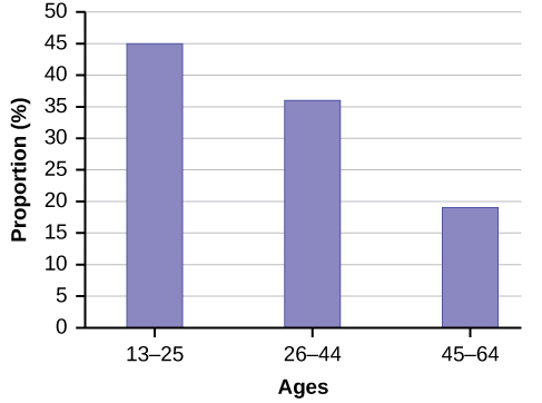
Bar Graphs for Proportion Comparisons
Bar graphs use rectangular bars to compare frequencies, proportions, or other measures across different categories. The height (or length) of each bar represents the value for that category, making differences between groups immediately visible.
How to construct a bar graph:
- List the categories or groups along the x-axis.
- Determine the frequency, proportion, or other measure for each category.
- Draw a rectangular bar for each category with its height matching the corresponding measure.
- Leave gaps between bars to signal that the categories are distinct (not continuous).
That last point matters: the gaps between bars distinguish a bar graph from a histogram. A histogram groups continuous data into intervals with no gaps, showing how the data is distributed across a range. A bar graph displays separate categories.
There are three common variations of bar graphs:
- Simple bar graphs compare a single measure across categories (e.g., number of students who prefer each ice cream flavor).
- Stacked bar graphs divide each bar into sub-categories to show composition (e.g., within each flavor preference, how many are male vs. female).
- Side-by-side bar graphs place bars for two or more groups next to each other within each category, making direct comparison straightforward (e.g., comparing income levels by age group for different regions).
When reading or constructing bar graphs, always check that the y-axis starts at zero. A truncated axis exaggerates differences between categories and can be misleading.