Box Plots
Box plots give you a visual summary of a dataset using just five key numbers. They're especially useful for quickly spotting the center, spread, and skewness of a distribution, and they make comparing multiple datasets straightforward when placed side by side.

Construction of Box Plots
Every box plot is built from the five-number summary:
- Minimum — the smallest value in the dataset
- Q1 (first quartile) — the median of the lower half (25th percentile)
- Median (Q2) — the middle value of the entire dataset (50th percentile)
- Q3 (third quartile) — the median of the upper half (75th percentile)
- Maximum — the largest value in the dataset
To construct a box plot from these five numbers:
-
Draw a number line that covers the range of your data.
-
Draw a rectangular box from Q1 to Q3. This box represents the interquartile range (IQR), where .
-
Draw a vertical line inside the box at the median (Q2).
-
Calculate the outlier boundaries: and . Any data point beyond these boundaries is an outlier and gets plotted as an individual dot.
-
Draw whiskers from each edge of the box to the most extreme data point that is not an outlier. The whiskers do not necessarily extend to the minimum and maximum if outliers are present.
That last point trips people up. The whiskers reach to the farthest non-outlier values, not automatically to the min and max. If your dataset has outliers, the whiskers stop short and the outliers appear as separate points.

Interpretation of Box Plot Features
The box captures the middle 50% of the data. A wider box means more variability in that central portion; a narrow box means the middle half of values are tightly clustered.
The median line shows the center of the distribution. Its position within the box tells you about skewness:
- Median closer to Q1 → the data is right-skewed (the upper half of values is more spread out)
- Median closer to Q3 → the data is left-skewed (the lower half of values is more spread out)
- Median roughly centered in the box → the distribution is approximately symmetric
The whiskers show how far the data extends beyond the middle 50%, excluding outliers. A longer whisker on one side reinforces the direction of skew. For example, if the right whisker is much longer than the left, that's another sign of right skew.
Outliers are individual points plotted beyond the whiskers. These represent unusually extreme values. A single outlier might just be an unusual observation, but multiple outliers on one side can signal a strongly skewed distribution or data entry errors worth investigating.
Data Distribution and Variability
Box plots summarize four key aspects of a distribution at a glance: center (median), spread (IQR and range), shape (skewness from median position and whisker lengths), and unusual values (outliers). The quartiles divide the data into four groups, each containing roughly 25% of the observations.
One limitation to keep in mind: box plots don't show the exact shape of the distribution the way a histogram does. Two datasets can produce identical box plots but have very different frequency patterns within each quartile. Box plots trade that detail for the ability to compare groups efficiently.
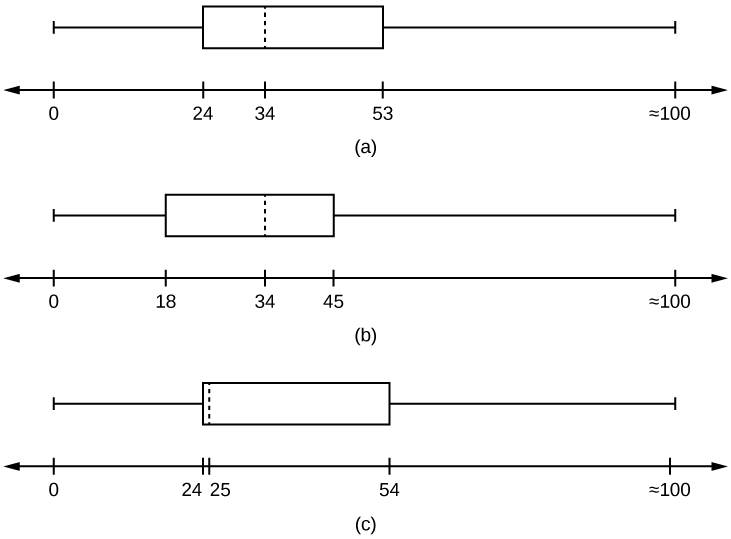
Comparison Using Side-by-Side Box Plots
Placing box plots on the same scale lets you compare multiple groups directly. For example, you might compare exam scores across three class sections. Here's what to look at:
- Compare medians — Which group has a higher or lower center? If one box plot's median line sits clearly above another's, that group tends to have higher values.
- Compare IQRs (box lengths) — A longer box means more variability in the middle 50%. If Class A's box is twice as wide as Class B's, the scores in Class A are more spread out.
- Compare whisker lengths — Longer whiskers indicate a wider overall range (excluding outliers). Unequal whisker lengths between groups suggest different amounts of variability in the tails.
- Compare outliers — Note which groups have outliers and on which side. A group with several low outliers might have a few students who struggled significantly compared to their peers.
When writing comparison statements, be specific. Instead of "Class A did better," say something like "Class A's median score (82) was higher than Class B's (74), and Class A's IQR was narrower, suggesting more consistent performance."
Side-by-side box plots are one of the most efficient ways to compare distributions across groups, which is why they show up frequently on assessments. Practice reading them quickly by always checking center, spread, shape, and outliers in that order.