Online Writing Techniques
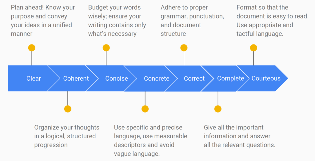
Writing for the web is fundamentally different from writing for print. Online readers don't read top to bottom the way they would with a newspaper article. They scan, skip, and click away fast. That means your job as a digital journalist is to make every sentence earn its place and make your content easy to navigate at a glance.
This section covers the core writing techniques and formatting strategies that make online journalism effective.
Writing Style for Online Audiences
The single biggest shift in web writing is conciseness. Online readers are impatient. They're scanning on phones, toggling between tabs, and deciding within seconds whether your content is worth their time.
- Use simple, direct language. Avoid jargon and complex sentence structures. Most major news sites aim for roughly an 8th-grade readability level (you can check this with tools like the Flesch-Kincaid readability test). That's not about dumbing things down; it's about being clear.
- Keep paragraphs short. Stick to 2-3 sentences per paragraph. On a phone screen, even a moderate paragraph can look like a wall of text. Single-sentence paragraphs work well for emphasis, but use them sparingly so they don't lose their punch.
- Use white space generously. Add line breaks between paragraphs and leave breathing room around text blocks. White space isn't wasted space; it makes your content feel approachable instead of overwhelming.
Frontload your most important information. This is the inverted pyramid structure you've already learned, and it matters even more online. Place the key facts (who, what, when, where, why) at the top of the story and at the beginning of individual paragraphs. Many readers won't scroll past the first few lines, so don't bury the lead.

Web-Friendly Formatting Techniques
Beyond writing style, the way you structure content on a page makes a huge difference in whether people actually read it.
Hyperlinks let you add depth without adding length. Instead of cramming background information into your article, link to it. Internal links (pointing to other articles on your site) keep readers exploring your publication. External links to reputable sources (government data, academic research, primary documents) build credibility. A good rule: link where it genuinely helps the reader, not just to pad the page with blue text.
Bullet points and numbered lists break complex information into scannable pieces. They work well for things like key findings, step-by-step processes, or comparing options. Try to keep lists to about 5-7 items. Longer than that, and the list itself becomes hard to scan.
Subheadings divide your content into logical sections and let readers jump to what they care about. Use H2 tags for main sections and H3 tags for subsections, creating a clear hierarchy. Keep them concise and descriptive (roughly 8 words or fewer). A reader skimming only your subheadings should still get the gist of the article.
Bold and italic text can draw the eye to key terms or important phrases, but overuse kills the effect. And avoid underlining text on the web, since readers will assume underlined words are clickable links.
Optimizing Content for Web
Headlines for Digital Platforms
Your headline does double duty online. It needs to grab a human reader's attention and perform well in search engines.
- Include relevant keywords, especially near the beginning of the headline. This helps with search engine optimization (SEO), which determines how easily people find your article through Google.
- Keep headlines around 60 characters. Search engines typically cut off display titles beyond that length, so anything longer may get truncated in results.
- Be specific and clear. Numbers, questions, and concrete details tend to perform well ("5 Ways Local Budgets Affect Your Commute" is stronger than "Budget Issues in Your City"). But avoid pure clickbait. If your headline promises something the article doesn't deliver, readers lose trust.
Subheadings also matter for SEO. Incorporate specific phrases that people actually search for (these are called long-tail keywords). For example, "how city council votes affect school funding" is more searchable than just "local government decisions."
When writing headlines, think about how they'll look shared on social media with no other context. A headline that's clear and informative on its own will get shared more than one that only makes sense alongside the article.
Multimedia in Written Content
Online journalism isn't just text. Images, video, audio, and data visualizations are core tools, not decorations.
Images break up long stretches of text and can communicate information faster than words. Choose high-quality visuals that genuinely support the story (photos from the scene, relevant infographics, charts showing data you're referencing). Compress image files so they load quickly (aim for under 100KB when possible), and always include alt text, which is a short description of the image. Alt text makes your content accessible to visually impaired readers using screen readers, and it helps with SEO.
Video and audio can bring a story to life in ways text can't. An embedded clip of a source speaking, a short explainer video, or an audio interview adds depth and keeps readers engaged. Two practical requirements: make sure multimedia loads fast (slow-loading video drives readers away), and always provide captions or transcripts for accessibility.
Infographics and data visualizations turn complex data into something a reader can understand at a glance. Charts, graphs, and diagrams work well for statistics, timelines, or processes. Keep them clean and clearly labeled, cite your data sources, and include alt text so the information is accessible to all readers.