🎒ACT Review
ACT Science: Interpretation of Data
ACT Science: Interpretation of Data
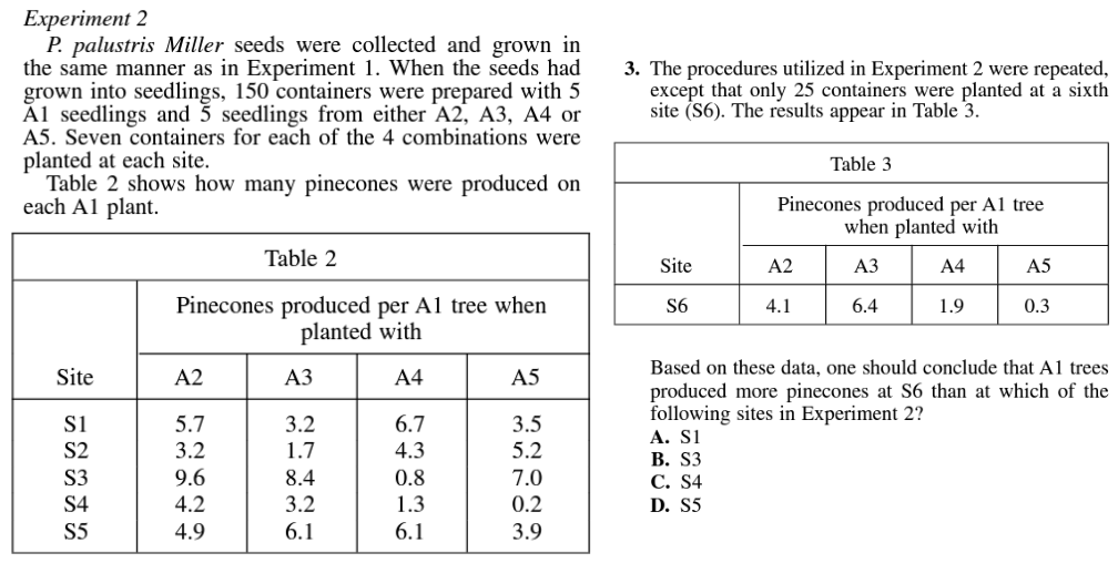
Unit & Topic Study Guides
Reading
English
Math
Science
Writing
Frequently Asked Questions
TL;DR
ACT Science: Interpretation of Data is about optional ACT Science, a 40-minute section with 40 questions total and 34 scored questions. Focus on data, experiments, and evaluating scientific models.
The ACT Science section tests your ability to read and analyze scientific data, not your knowledge of specific science topics. You need to pull information from tables, graphs, and diagrams, spot trends, and sometimes do light math.
Interpretation of Data is one of the four reporting categories scored on the ACT Science section. According to ACT, this category asks you to "manipulate and analyze scientific data presented in scientific tables, graphs, and diagrams (e.g., recognize trends in data, translate tabular data into graphs, interpolate and extrapolate, and reason mathematically)."

📊 Types of Data Presentation
This topic centers on understanding how scientific data is displayed and what that data is telling you. You'll encounter three main formats: tables, graphs, and diagrams.
📦 A table:

Image Courtesy of ACT's Practice Test 1, Passage 1
📈 A graph:
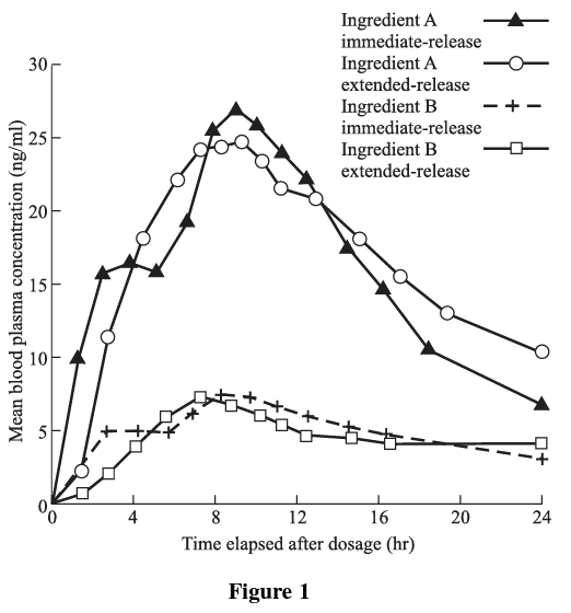
Image Courtesy of ACT Practice Test 2, Passage 2
🗒️ A diagram:
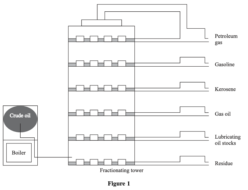
Image Courtesy ACT Practice Test 1, Passage 5
⭕️ Features of Data Presentation
Before answering any questions, take a moment to note the key features of whatever data you're looking at. Here's what to check for each type.
Reading a Table

Image Courtesy ACT Practice Test 1, Passage 1
When you see a table, run through this checklist:
- Which table is it? Questions often say "According to Table 1..." so you need to know which one you're looking at and whether it connects to a specific passage or figure.
- What's being measured? Read the column headers carefully.
- What are the units? Time could be in seconds, minutes, or hours. Speed could be in feet per second or meters per second. Getting the units wrong is one of the most common mistakes on this section.
- How many trials or conditions are there? Note whether data is broken into multiple trials, groups, or experiments.
- Is anything pre-calculated? Sometimes the table gives you an average (mean), but other times you'll need to calculate it yourself.
There's a lot packed into a single table, so don't skip this step.
Reading a Graph
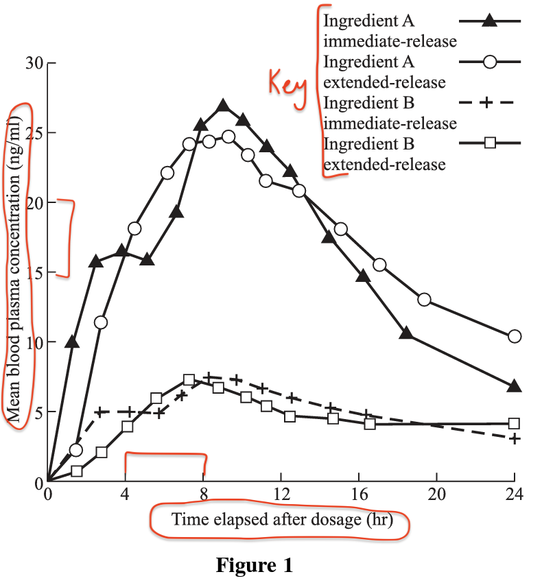
Image Courtesy of ACT Practice Test 2, Passage 2
Graphs display units alongside what's being measured on each axis. In this example, the x-axis shows time elapsed after dosage (in hours), while the y-axis shows mean blood plasma concentration (in nanograms per milliliter).
Pay close attention to the intervals along each axis. Here, time increases in increments of 4, while concentration increases in increments of 5. Misreading the scale is an easy way to pick the wrong answer. Also check the key/legend, which tells you what each line or color represents. Since graphs are visual versions of tables, the key is especially important when multiple data sets are being compared.
Reading a Diagram
For diagrams, you'll need to read the corresponding passage carefully. Diagrams often represent a process or setup, and the passage explains what each part means. There's usually less raw numerical data in a diagram, but the labels and structure matter.
📉 Relationships and Trends in the Data
Once you've identified the features, the next step is spotting trends: how does one variable change as another variable changes?
The main way to describe these trends is through correlations:
- Positive (direct) correlation: As one variable increases, the other increases too.
- Negative (inverse) correlation: As one variable increases, the other decreases.
- No correlation: The data points look scattered with no clear pattern.
Positive Correlation Example
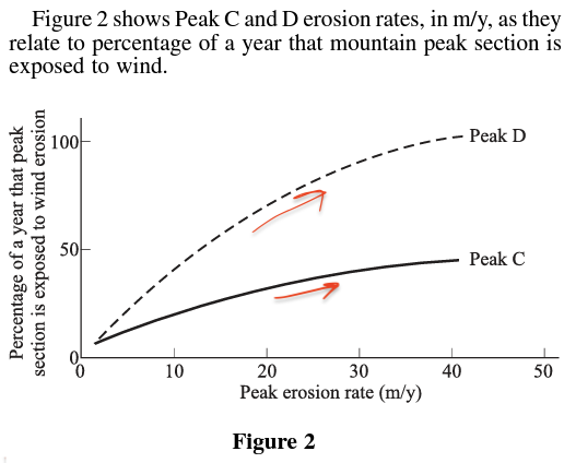
Image Courtesy of ACT Practice Test 2, Passage 6
This graph shows a positive correlation: as the peak erosion rate increases, the percentage of wind erosion exposed also increases. Notice that both variables are increasing, but at different rates. Peak D has a steeper slope (stronger positive correlation) than Peak C.
Mixed Correlation Example
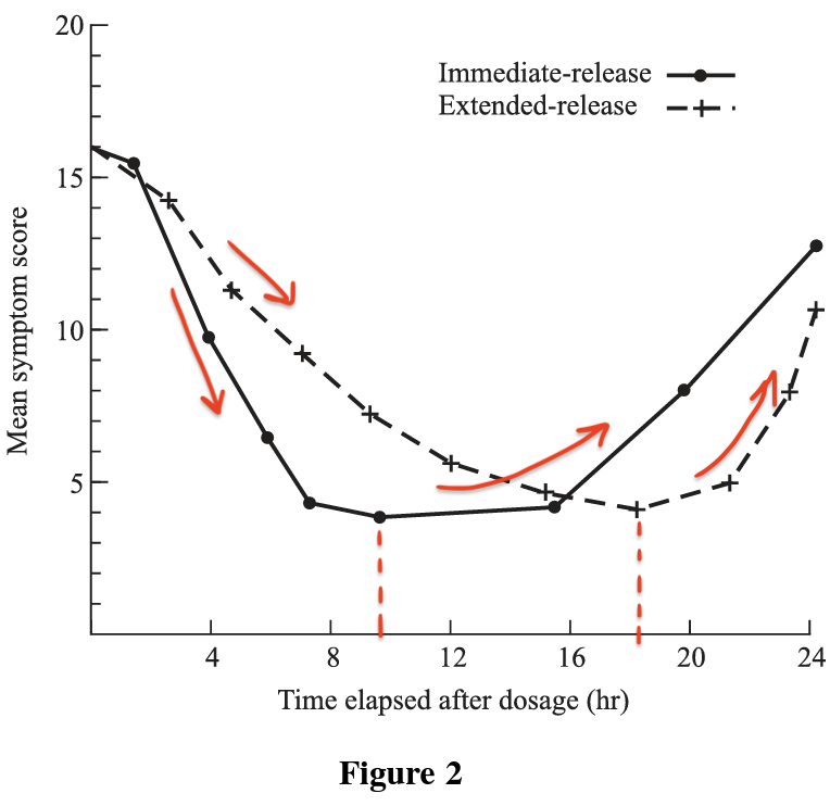
Image Courtesy of ACT Practice Test 2, Passage 2
This graph shows both a negative and positive correlation. At first, both drug delivery types show a decreasing mean symptom score over time (negative correlation). But at a certain point, the scores begin to increase again (positive correlation). Watch for these shifts in direction because the ACT will ask about them.
Bar Graph Trends
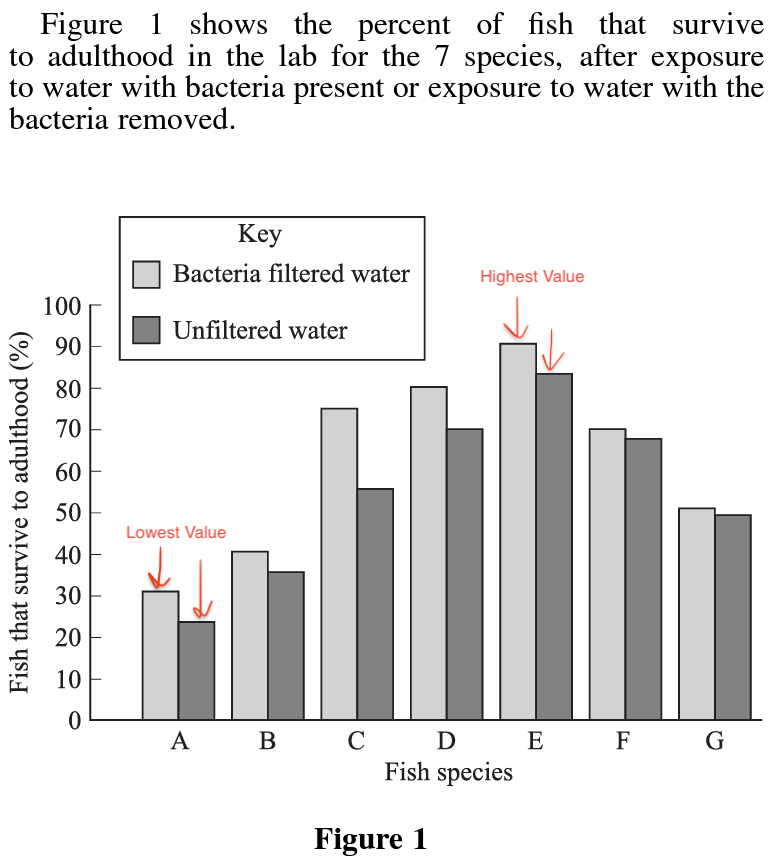
Image Courtesy of ACT Practice Test 2, Passage 4
Bar graphs don't have a connecting line, so correlations aren't as visually obvious. Instead, you compare the heights of bars. Here, seven fish species (A through G) are measured for survival rate in two conditions: unfiltered water and bacteria-filled water. You can quickly identify which species has the highest and lowest survival rate in each condition by comparing bar heights.
🏃 Quick Graphs Review
Before moving on, here's a quick refresher on common mathematical relationships you might see in ACT Science graphs.
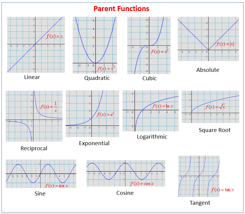
Image Courtesy of Online Math Learning
Recognizing these shapes helps you identify relationships quickly. A straight diagonal line suggests a linear relationship. A curve that flattens out suggests a logarithmic or square root relationship. A curve that gets steeper suggests an exponential or quadratic relationship. These same patterns apply when you're looking at trends in tables, too.
✏️ Translating Data Presentations
A common question type asks you to convert data from one format to another, such as turning a table into a graph or matching a graph to a table.
Here's a step-by-step approach using an example:
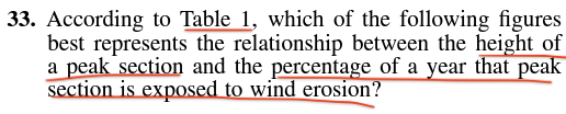
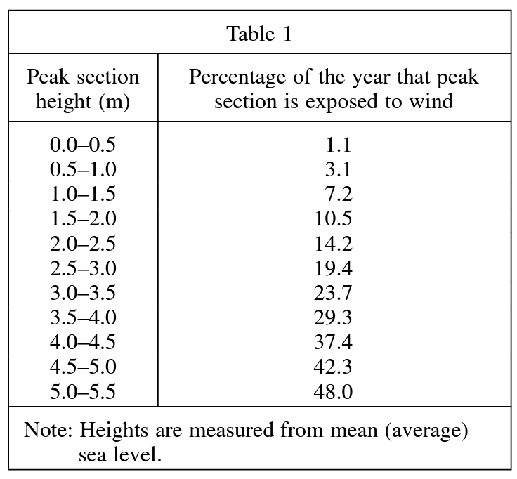
Image Courtesy of ACT Practice Test 2, Passage 6
Step 1: Identify the features. The peak section height is measured in meters, and the percentage of the year exposed to wind is unitless. The height values are increasing.
Step 2: Determine the trend. Look at the percentages as height increases:
The percentage increases as height increases. That's a positive correlation. But notice that the increases aren't perfectly even; some jumps are bigger than others.
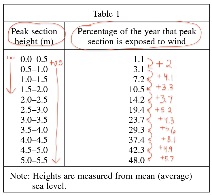
Step 3: Eliminate wrong answers.
Image Courtesy of ACT Practice Test 2, Passage 6
Since the correlation is positive, you can immediately eliminate B and D (both show downward-sloping lines).
Step 4: Choose between remaining options. Both A and C show positive correlations, but they differ in shape:
- Graph C shows a roughly steady increase (close to linear), which matches the table's pattern of consistent upward movement.
- Graph A shows a curve that gets steeper and then dips back down around 6 meters. But the table shows no decrease at higher values.
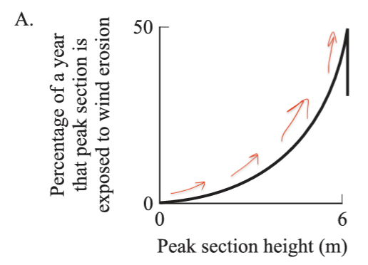
Image Courtesy of ACT Practice Test 2, Passage 6, Question 33
The correct answer is C.
The key takeaway: identify the trend in the original data, then find the graph that matches that trend. Don't overthink it.
📍 Extrapolation and Interpolation
These two skills come up frequently on the ACT Science section.
- Extrapolation: Predicting a value outside the range of given data by extending the trend.
- Interpolation: Estimating a value between two known data points.
Both rely on first identifying the trend in the data.
Extrapolation Example
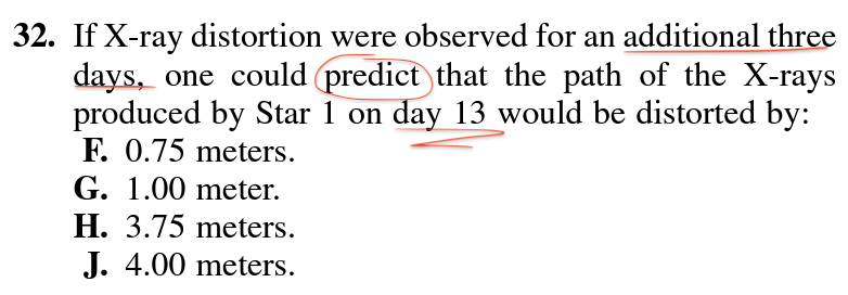
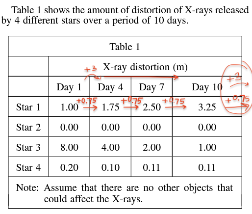
Image Courtesy of ACT Practice Test 1, Passage 6
Here's how to solve this:
- The question only asks about Star 1 on day 13, so ignore Stars 2, 3, and 4.
- Find the pattern for Star 1: the x-ray distortion increases by 0.75 m every 3 days.
- Day 13 is 3 days after day 10, so add 0.75 m to the day 10 value: meters.
- The answer is J.
Interpolation Example
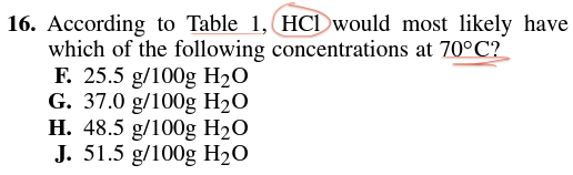
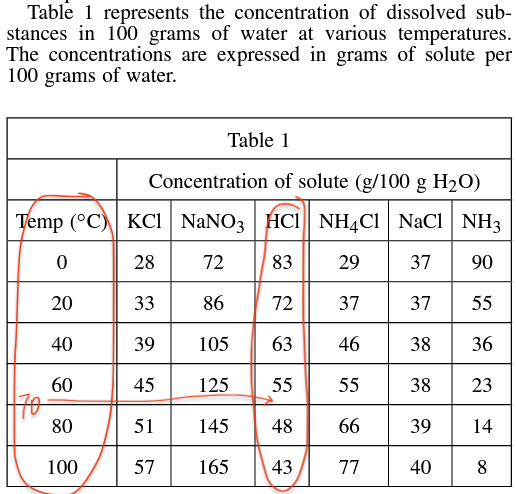
Image Courtesy of ACT Practice Test 1, Passage 3
This table shows the concentration of several dissolved substances at different temperatures. The question asks about HCl at 70°C, but the table only gives values at 60°C and 80°C.
- Focus only on the HCl column.
- Since 70°C is exactly halfway between 60°C and 80°C, find the midpoint of the two concentrations: g/100 g .
- The answer is J (51.5 g/100 g ).
For interpolation, the midpoint formula works when the target value is exactly halfway. If it's not halfway (say, 65°C instead of 70°C), you'd weight the estimate closer to the nearer data point.
📊 Comparing and Combining Data Presentations
Some questions require you to pull information from more than one table, graph, or diagram to find the answer. The process is straightforward: use one data source to find a value, then use that value to look something up in a second data source.
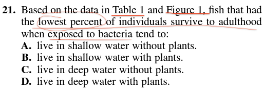
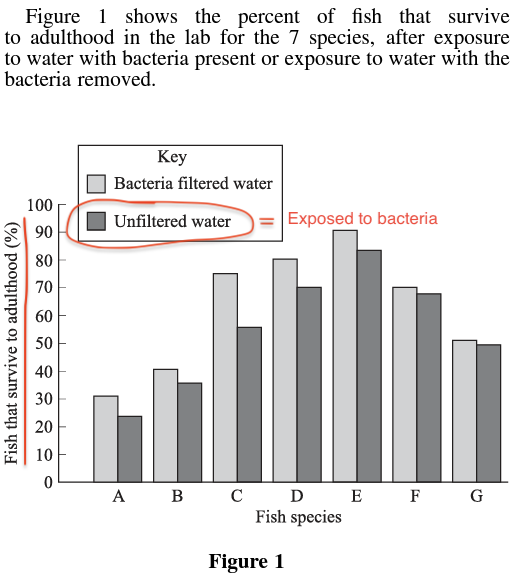
Image Courtesy ACT Practice Test 2, Passage 4
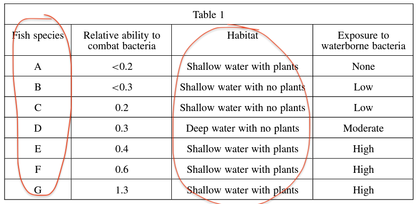
Image Courtesy of ACT Practice Test 2, Passage 4
Here's the process for this question:
- Start with Figure 1. The question asks which fish species had the lowest survival rate when exposed to bacteria. The darker bars represent bacteria exposure, and fish species A has the smallest dark bar.
- Move to Table 1. The question asks what habitat that fish species lives in. Looking up species A in Table 1, it lives in shallow water with plants.
- The answer is B.
The trick with these questions is knowing which data source to check first. Read the question carefully to figure out the order.
💡 Tips and Strategies
🖊️ 1. Mark up your test booklet
When skimming passages and questions under time pressure, it's easy to miss details. Underline key parts of the question, circle specific values or variables being asked about, and cross out answer choices you've eliminated. You're not scored on what you write in the booklet, only on your answer sheet.
🔍 2. Pay attention to units
This is the single most common trap on data interpretation questions. Always check whether the units in the question match the units in the table or graph. A question might ask for a measurement in minutes when the table uses hours. The wrong answer choices are often the correct number in the wrong units.
🖇️ 3. Go straight to the right data source
Data interpretation questions almost always tell you which table, graph, or diagram to use, often with the phrase "according to." If it's not stated directly, match the variables in the question to the data source that measures those variables. Also, passages are often organized by experiment, and each experiment typically has its own data presentation. If a question references a specific experiment, look at the corresponding figure.
💆 4. Don't rush calculations
No calculator is allowed on the ACT Science section, but some questions require arithmetic like finding averages or midpoints. Take your time with these. A careless addition error under time pressure can cost you a point on a question you otherwise knew how to solve.
📖 5. Read answer choices carefully
The ACT often includes answer choices designed to trip you up. You might see two choices starting with "smaller than" and two starting with "larger than," or numerical answers listed in order with one value skipped. Always read every answer choice fully before selecting one. The difference between the right and wrong answer is sometimes a single word or number.
🔎 Testing Your Knowledge: Interpretation of Data
Time to practice. Since these skills overlap on real ACT questions, the practice questions below aren't separated by skill type.
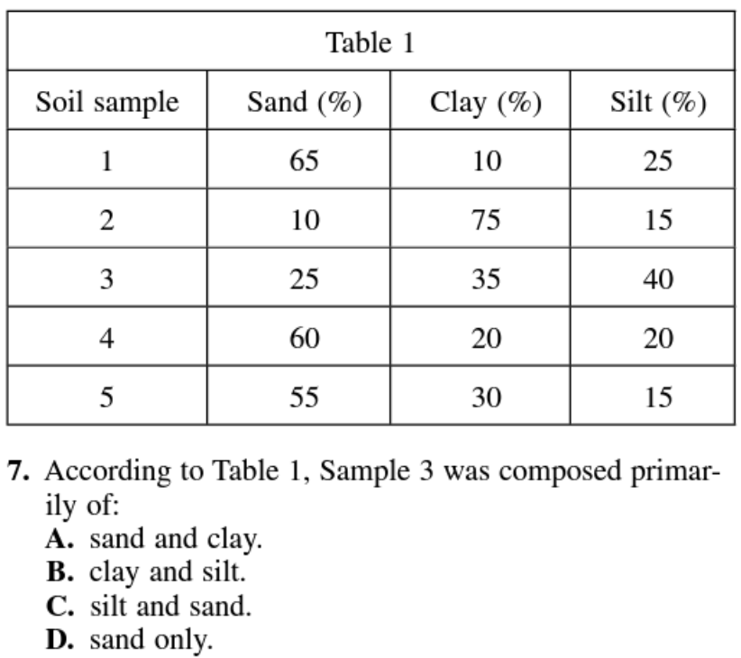
Image Courtesy of ACT Practice Test 3, Passage 2
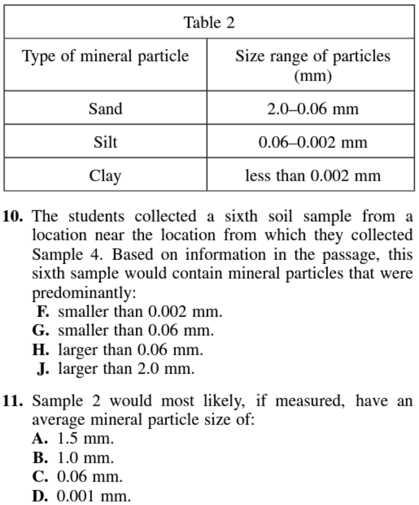
Image Courtesy of ACT Practice Test 3, Passage 2
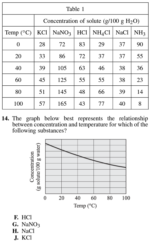
Image Courtesy of ACT Practice Test 1, Passage 3
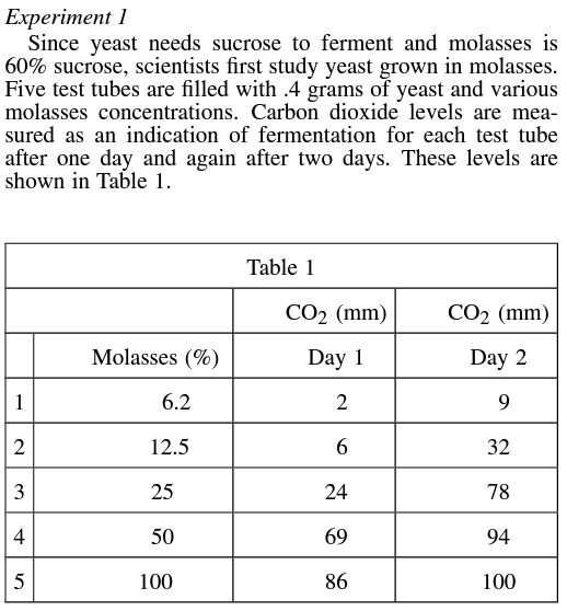
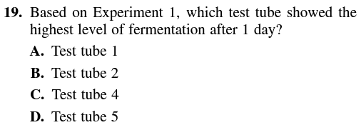
Image Courtesy of ACT Practice Test 3, Passage 4
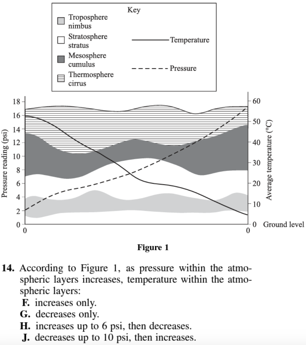
Image Courtesy of ACT Practice Test 2, Passage 3
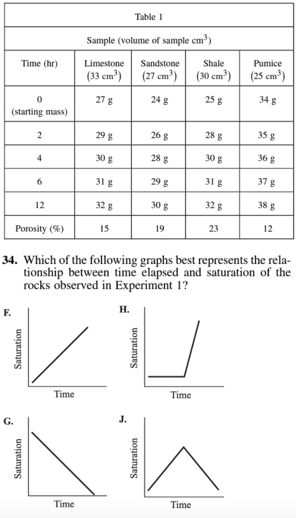
Image Courtesy of ACT Practice Test 3, Passage 6
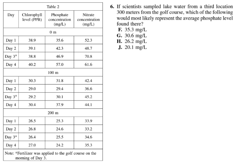
Image Courtesy of ACT Practice Test 3, Passage 1