TL;DR
ACT Math: Essential Skills: Data Analysis & Representations 📈 is about ACT Math, the required 50-minute section with 45 questions total and 41 scored questions. Focus on essential skills, algebra, functions, geometry, statistics, and modeling.
Data analysis and representations questions test your ability to read, interpret, and draw conclusions from data presented in various formats. These skills show up across the entire ACT Math section and fall under Integrating Essential Skills, which accounts for roughly 40-43% of the exam.

📤 Distribution Measures
🎯 Measures of Center
Measures of center describe a "typical" value in a data set. There are three you need to know:
- Mean: The average. Add up all values and divide by how many there are.
- Median: The middle value when data is arranged from least to greatest. If there's an even number of values, average the two middle ones.
- Mode: The value that appears most often. A data set can have more than one mode, or no mode at all if every value appears the same number of times.
The ACT loves testing whether you can move between these. If they give you the mean, you can find the sum (mean × number of values). If they give you the sum, you can find the mean.
Example
The average of five different test scores has the same value as the median of the five scores. The sum of the five test scores is 465. What is the sum of the four scores that are NOT the median?
- Find the mean:
- Since the mean and median are equal, the median is also 93.
- Subtract the median from the total sum:
The sum of the four remaining scores is 372.
🍞 Measures of Spread
Measures of spread tell you how spread out or clustered the data is.
- Range: The difference between the highest and lowest values. Quick to calculate, but sensitive to outliers.
- Standard deviation: Measures how far, on average, each data point sits from the mean. A larger standard deviation means the data is more spread out; a smaller one means data points are clustered near the mean.
You won't need to calculate standard deviation by hand on the ACT, but you do need to understand what it means and be able to compare standard deviations between data sets.
Example
The prices of candy in a shop differ depending on the type. Chocolate bars cost , gummy bears cost , and lollipops cost . What is the range for the price of candy in the shop?
Highest value minus lowest value: . The range is .
🛎️ Normal Distribution
The normal distribution is a symmetric, bell-shaped curve where data clusters around the center and tapers off equally on both sides.
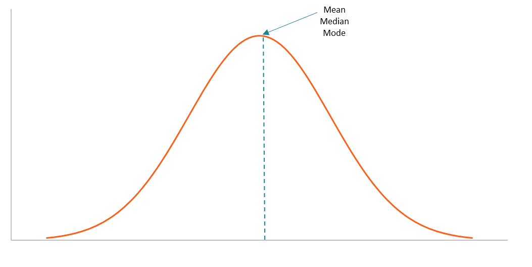
Image Courtesy of Corporate Finance Institute
In a normal distribution, the mean, median, and mode are all equal and sit at the center of the curve.
The 68-95-99.7 Rule
This rule tells you what percentage of data falls within each standard deviation from the mean:
- 68% of values fall within 1 standard deviation of the mean
- 95% of values fall within 2 standard deviations of the mean
- 99.7% of values fall within 3 standard deviations of the mean

So if the mean test score is 75 with a standard deviation of 5, about 68% of students scored between 70 and 80, and about 95% scored between 65 and 85.
👋 Associations Between Two Variables
🤝 Correlation
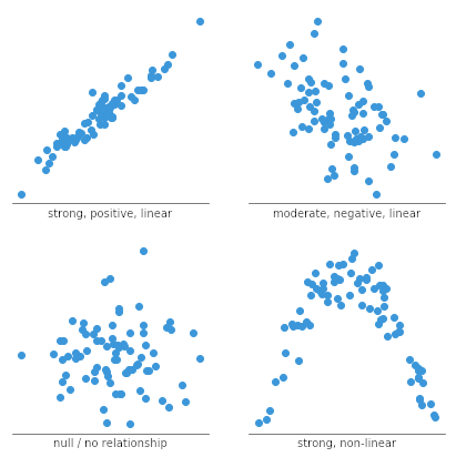
Correlation describes how two variables relate to each other. On the ACT, you'll look at a graph or data set and determine:
- Direction: A positive correlation means both variables increase together. A negative correlation means one increases while the other decreases.
- Strength: A strong correlation means the data points cluster tightly around a trend line. A weak correlation means they're more scattered.
- No correlation: The data points show no clear pattern at all.
You won't need to calculate a correlation coefficient, but you should be able to identify these patterns visually.
🌠 Regression
Regression finds the equation that best fits a set of data from two variables.
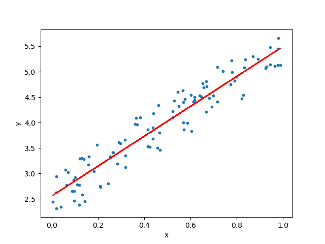
- Simple linear regression produces a straight-line equation () and is used when data follows a roughly linear trend. This is the most common type on the ACT and is often used to predict future values.
- Quadratic regression produces a parabolic equation and is used when data curves rather than following a straight line.
The fastest way to perform regression on the ACT is with your graphing calculator. If you're not comfortable with that process, practice beforehand:
📋 2-Way Tables
A 2-way table (also called a two-way frequency table) organizes data by two categorical variables. Common pairings include things like grade level vs. favorite subject, or gender vs. preferred activity. Each cell shows how many data points fit both categories.
These problems are really logic puzzles. You're given some values and the totals, and you use addition and subtraction to find what's missing. The key strategy: only fill in what you need to answer the question. Don't waste time completing the entire table.
Example
High school upperclassmen are surveyed about their favorite subjects. What percentage of seniors chose science?
| Math | English | Science | History | Total | |
|---|---|---|---|---|---|
| Juniors | 12 | 55 | 107 | 214 | |
| Seniors | 22 | 16 | 92 | ||
| Total | 62 | 28 | 199 | 398 |
You need two things: the number of seniors who chose science, and the total number of seniors.
Finding total seniors: seniors total.
Finding seniors who chose science: seniors chose science.
Finding the percentage:
⚇ Scatter Plots
Scatter plots use individual dots to represent data points, with one variable on each axis. They're useful for visually identifying:
- The direction of a relationship (positive, negative, or none)
- The strength of the correlation (tight cluster vs. loose spread)
- Whether a linear or non-linear model would be a better fit
🤔 Interpreting Models
Once you have a model (from regression or algebraic manipulation), you need to evaluate whether it actually fits the data well.
Cross-reference the scatter plot with the line of best fit. If the data points cluster closely around the line, the linear model is a good fit ✔️ If the points curve away from the line or show no clear pattern, a linear model isn't appropriate ❌ and a different model (like quadratic) may work better.
When interpreting a linear model :
- The slope () tells you how much changes for each one-unit increase in .
- The y-intercept () tells you the predicted value of when .
- You can plug in values of to predict corresponding values, but be cautious about predicting far beyond the range of the original data.