Art elements are the building blocks of visual expression. Line, shape, form, color, value, texture, and space work together to create meaning and evoke emotion in artwork. Understanding these elements helps you analyze and appreciate art across various styles and periods.
Artists manipulate these elements to convey ideas and feelings. From the swirling lines of Van Gogh's Starry Night to the geometric shapes of Mondrian's Broadway Boogie Woogie, each element plays a distinct role in shaping a viewer's experience.
Elements of Art
There are seven elements of art. Think of them as the vocabulary artists use to communicate visually. Every artwork you encounter, from a Renaissance oil painting to a modern sculpture, relies on some combination of these elements.
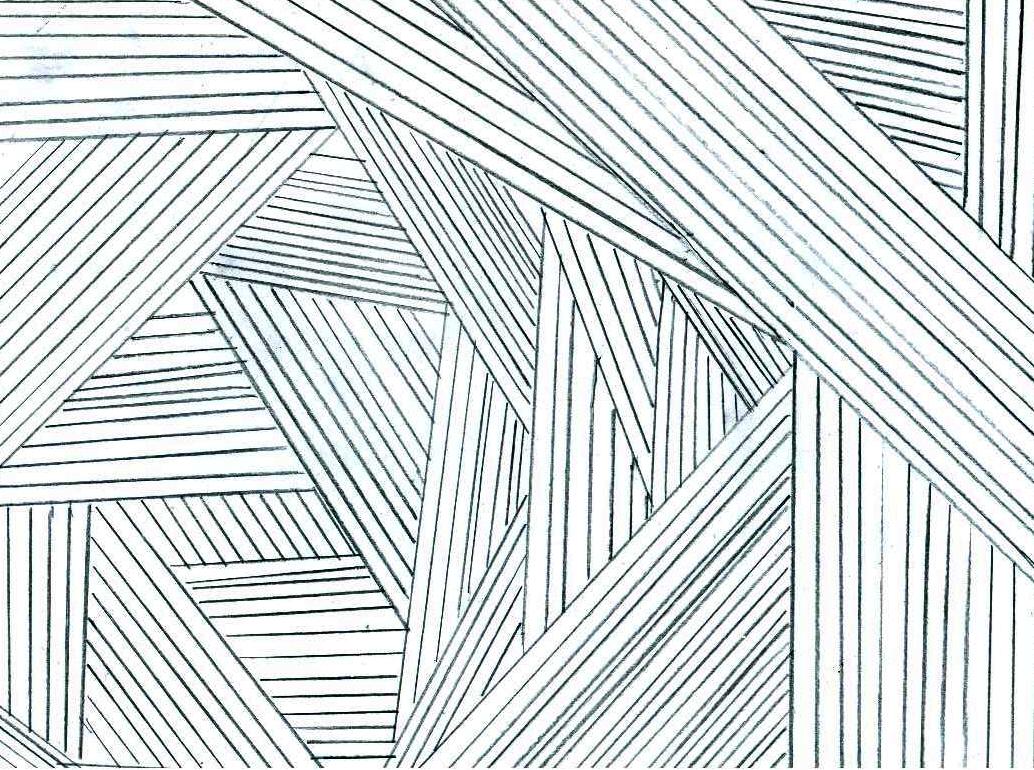
Line
A line is a mark made by a moving point. It defines edges, contours, and boundaries within an artwork.
Lines come in many types: straight, curved, horizontal, vertical, diagonal, thick, thin, continuous, or broken. A portrait artist might use delicate contour lines to trace the curve of a jawline, while a painter might slash bold diagonal lines across a canvas to create tension and energy.
Shape
A shape is a two-dimensional, enclosed area defined by lines, color, or value.
- Geometric shapes are precise and mathematical: circles, squares, triangles, rectangles. Mondrian's paintings are built almost entirely from geometric shapes arranged in grids.
- Organic shapes are free-form and irregular, often resembling forms found in nature. Matisse's paper cutouts are a great example, with their flowing, leaf-like silhouettes.
Form
Form is the three-dimensional version of shape. It has height, width, and depth, giving it volume. Light and shadow are what make form visible on a flat surface.
Basic forms include cubes, spheres, cylinders, and pyramids, but forms can also be organic and irregular. Rodin's sculptures showcase dramatic organic forms, while Cézanne's still lifes break down natural objects into simplified geometric forms like cylinders and cones.
Color
Color is the visual sensation produced when light reflects off a surface. It has three key properties:
- Hue: the name of the color (red, blue, yellow, etc.)
- Value: how light or dark the color is
- Intensity (also called saturation): how pure or muted the color is
Van Gogh used bright, highly saturated colors to heighten emotional impact, while Rembrandt relied on muted, earthy tones to create a sense of warmth and intimacy in his portraits.
Value
Value refers to the lightness or darkness of a color or tone. A value scale runs from pure white to pure black, with many shades of gray in between.
Value is how artists create the illusion of light falling on objects. Caravaggio is famous for extreme value contrast, placing deep shadows right next to bright highlights (a technique called chiaroscuro). By contrast, Seurat's pointillist works use subtle, gradual value shifts that blend together when viewed from a distance.
Texture
Texture describes the surface quality of an object. It comes in two forms:
- Actual texture (tactile): you can physically feel it. The thick, raised paint in a Van Gogh painting (called impasto) has real, rough texture.
- Implied texture (visual): it looks like it has texture but is actually smooth. A photorealistic painting of tree bark has implied texture.
Other texture qualities include smooth, bumpy, glossy, matte, and fuzzy. Brancusi's polished bronze sculptures, for instance, have an extremely smooth, reflective texture that contrasts sharply with the rough stone bases he often used.
Space
Space is the area within, around, and between objects in an artwork.
- Positive space is the area occupied by the subject or objects.
- Negative space is the empty area surrounding them.
Space can also describe depth. Albert Bierstadt's landscape paintings create deep, expansive space that pulls your eye toward a distant horizon. Japanese ukiyo-e prints, on the other hand, deliberately flatten space, stacking elements on top of each other with little sense of depth. Artists use techniques like perspective, overlapping, and size variation to control how deep or shallow space feels.
Visual Effects and Meaning
Each element carries its own expressive power. Here's how artists use them to shape meaning:
- Line creates movement, direction, and rhythm. Sharp, jagged lines can suggest anger or chaos, while flowing curved lines feel calm and graceful.
- Shape builds the basic structure of a composition. Repeated shapes create patterns. Shapes can also carry symbolic weight: circles often suggest unity or wholeness, while triangles imply stability.
- Form adds depth and dimensionality. It can make objects feel solid and heavy, or light and weightless, depending on how the artist handles light and shadow.
- Color evokes mood directly. Warm colors (reds, oranges, yellows) tend to feel energetic or intense. Cool colors (blues, greens, purples) feel calmer or more somber. Color also carries cultural symbolism: red for passion, blue for serenity.
- Value creates the illusion of depth and volume. It defines where the light source is, where shadows fall, and where the viewer's eye should focus.
- Texture adds visual interest and variety. It can push an artwork toward realism (detailed, lifelike surfaces) or abstraction (unexpected or exaggerated textures).
- Space establishes depth and perspective. It directs the viewer's eye through the composition and creates a sense of balance or tension.

Elements in Art Styles
Different art movements prioritize different elements. Recognizing this helps you identify styles and understand what each movement was trying to achieve.
- Impressionism emphasizes color and light to capture fleeting moments and atmospheric effects. Loose, visible brushstrokes create a sense of texture and movement across the canvas.
- Cubism fragments objects into geometric shapes, showing multiple viewpoints at once. Color palettes tend to be muted so the focus stays on structure and the planes of objects.
- Abstract Expressionism features spontaneous, gestural use of line and color to express raw emotion. Artists like Pollock and de Kooning often worked on large-scale canvases to create immersive visual experiences.
- Minimalism reduces forms to essential geometric shapes and solid colors. The relationship between positive and negative space becomes the primary focus.
- Pop Art employs bold, graphic color and flat shapes to reference popular culture and mass media. Artists like Warhol and Rauschenberg incorporated texture through collage, screen printing, and mixed media techniques.
Applying the Elements of Art
Analyzing Elements in Specific Artworks
- The Starry Night by Vincent van Gogh (1889)
- Swirling, expressive lines convey the movement and energy of the night sky
- Vibrant, contrasting colors (deep blues against bright yellows) evoke emotion and mysticism
- Simplified, organic shapes represent the village and rolling landscape
- The Persistence of Memory by Salvador Dalí (1931)
- Soft, melting forms symbolize the fluidity and subjectivity of time
- Muted, dreamlike colors create a surreal, mysterious atmosphere
- Precise, detailed textures enhance the illusion of reality, making the impossible scene feel strangely convincing
- Broadway Boogie Woogie by Piet Mondrian (1942-43)
- Geometric shapes and primary colors capture the rhythm and energy of New York City's grid
- Balanced composition of positive and negative space creates harmony and order
- The absence of texture and depth emphasizes flatness and pure abstraction
Evaluating How Elements Convey Meaning
When you look at an artwork and want to evaluate how effectively the elements work, follow these steps:
- Identify which elements the artist emphasizes most. What stands out first: color? line? texture?
- Consider how the combination of elements contributes to the overall impact. Do they work together harmoniously, or do they clash in a way that creates tension?
- Assess whether the elements fit the subject matter, style, and medium. A portrait using jarring, clashing colors sends a very different message than one using soft, muted tones.
- Reflect on how the artwork makes you feel, and consider whether that emotional response aligns with what the artist seems to be communicating.
Experimentation with Art Elements
Hands-on practice is the best way to internalize these concepts. Here are some exercises to try:
- Combine different types of lines (thick, thin, curved, jagged) in a single drawing to see how they create energy and expression
- Work with a limited color palette (just 3-4 colors) to explore the effects of hue, value, and intensity
- Create collages using cut paper shapes and various textures to build abstract or representational compositions
- Sculpt forms using clay, paper, or found objects to explore three-dimensional space
- Manipulate value by drawing the same object under different lighting conditions
- Incorporate both actual and implied textures into a mixed media piece
- Arrange positive and negative spaces intentionally to create balanced or asymmetrical compositions