AP exam review verified for 2027

AP Environmental Science Unit 8 Review: Aquatic & Terrestrial Pollution

Review AP Environmental Science Unit 8 to understand how pollutants enter aquatic and terrestrial systems, move through food chains, and harm ecosystems and human health. This unit covers everything from point and nonpoint sources to eutrophication, biomagnification, solid waste, sewage treatment, and infectious disease.

Use the topic guides, key terms, and practice questions available for this unit to work through all 15 topics before your exam.

What is AP Environmental Science unit 8?

Pollution in Unit 8 is organized around three big questions: Where do pollutants come from? How do they move through and affect ecosystems? What are the consequences for human health? The 15 topics move from source identification through aquatic impacts, chemical toxicology, waste management, and disease.

Unit 8 is about how human activities introduce physical, chemical, and biological pollutants into water and soil, and the cascading effects those pollutants have on ecosystems and people. Key mechanisms include eutrophication, biomagnification, thermal oxygen loss, and pathogen cycling.

Pollution sources and aquatic impacts

Topics 8.1 through 8.6 establish where pollution comes from and what it does to water. Point sources are single identifiable origins like a discharge pipe; nonpoint sources are diffuse, like agricultural runoff. Aquatic impacts include coral bleaching, oil spill damage, eutrophication-driven dead zones, and thermal pollution reducing dissolved oxygen.

Chemical pollutants and toxicology

Topics 8.7 through 8.8 and 8.12 through 8.13 focus on how persistent organic pollutants like DDT and PCBs accumulate in fatty tissue and magnify up food chains, causing eggshell thinning and reproductive harm. LD50 and dose-response curves give you quantitative tools to compare toxicity across chemicals and species.

Waste, treatment, and disease

Topics 8.9 through 8.11 and 8.14 through 8.15 cover solid waste disposal in sanitary landfills, waste reduction through recycling and composting, the three stages of sewage treatment, and how pollutants and pathogens like Yersinia pestis, Plasmodium, and Vibrio cholerae cycle through environments to cause human disease.

Pollution moves, concentrates, and persists

The central idea of Unit 8 is that pollutants rarely stay where they are released. Nutrients travel from farm fields to coastal dead zones. Fat-soluble POPs move from water into plankton, then fish, then apex predators at concentrations millions of times higher than the original source. Pathogens spread from contaminated water into human populations. Understanding these pathways, not just the sources, is what the AP exam tests.

AP Environmental Science unit 8 topics

8.1

Sources of Pollution

Distinguish point sources (single identifiable origin like a discharge pipe or smokestack) from nonpoint sources (diffuse origins like agricultural runoff or urban stormwater). Nonpoint sources are harder to regulate because they lack a single traceable location.

open guide
8.2

Human Impacts on Ecosystems

Pollutants push aquatic organisms outside their tolerance range. Key impacts include oil spill hydrocarbon toxicity, coral bleaching from warming and sediment, and eutrophication-driven dead zones tracked by the oxygen sag curve.

open guide
8.3

Endocrine Disruptors

Chemicals like DDT, PCBs, and atrazine interfere with animal hormone systems, causing birth defects, developmental disorders, and sex-ratio shifts such as feminization of male fish near wastewater outfalls.

open guide
8.4

Human Impacts on Wetlands and Mangroves

Wetlands provide water purification, flood protection, and habitat. Development, dam construction, overfishing, and agricultural and industrial pollutants all degrade these services. Mangroves face additional pressure from aquaculture clearing.

open guide
8.5

Eutrophication

Excess nitrogen and phosphorus from fertilizer runoff and wastewater cause algal blooms. Microbial decomposition of dead algae depletes dissolved oxygen, creating hypoxic dead zones. Oligotrophic waters have the opposite condition: low nutrients and high dissolved oxygen.

open guide
8.6

Thermal Pollution

Industrial cooling water discharge raises water temperature. Warm water holds less dissolved oxygen than cold water, stressing or killing cold-water species like trout and increasing metabolic rates of decomposers, further reducing oxygen.

open guide
8.7

Persistent Organic Pollutants (POPs)

POPs like DDT and PCBs are synthetic, fat-soluble molecules that resist breakdown and travel globally via wind and water. They accumulate in fatty tissue and cause reproductive and developmental harm in wildlife and humans.

open guide
8.8

Bioaccumulation and Biomagnification

Bioaccumulation is the buildup of fat-soluble substances in an individual organism. Biomagnification is the increasing concentration at each higher trophic level. DDT, PCBs, and methylmercury all biomagnify, causing eggshell thinning and neurological harm in apex predators.

open guide
8.9

Solid Waste Disposal

Solid waste goes to sanitary landfills (lined with plastic or clay, with leachate and methane collection systems), incinerators, or the ocean. E-waste contains toxic heavy metals. Illegally dumped tires create mosquito breeding habitat.

open guide
8.10

Waste Reduction Methods

Recycling converts waste into new products but is energy-intensive. Composting turns organic waste into fertilizer but can attract pests. Landfill methane capture generates energy. E-waste recycling prevents heavy metal leaching into groundwater.

open guide
8.11

Sewage Treatment

Primary treatment physically removes solids. Secondary treatment uses aerobic bacteria to break down organic matter and reduce BOD. Tertiary treatment removes remaining nutrients and pollutants. Disinfection with chlorine, ozone, or UV light kills pathogens before discharge.

open guide
8.12

Lethal Dose 50% (LD50)

LD50 is the dose of a chemical lethal to 50% of a test population of a specific species, expressed in mg/kg body weight. Lower LD50 means higher toxicity. LD50 values are species-specific and used to compare relative danger of chemicals.

open guide
8.13

Dose Response Curve

A dose-response curve graphs organism effect or mortality rate against increasing toxin dose. The LD50 is read at the 50% mortality point. Steeper curves indicate a narrower range between no effect and lethal dose. Use these graphs to compare toxicity of different chemicals.

open guide
8.14

Pollution and Human Health

Dysentery results from untreated sewage in water. Mesothelioma is caused by asbestos exposure. Elevated tropospheric ozone impairs respiratory function. Establishing cause-and-effect is difficult because humans are exposed to many pollutants simultaneously.

open guide
8.15

Pathogens and Infectious Diseases

Pathogens including Yersinia pestis (plague), Plasmodium (malaria), Vibrio cholerae (cholera), and Mycobacterium tuberculosis cycle through environments via vectors, water, and air. Climate shifts expand vector ranges poleward. Poor sanitation and poverty accelerate disease spread.

open guide
practice snapshot

Hardest AP Environmental unit 8 topics

This snapshot uses Fiveable practice activity to show where students tend to miss questions and which review moves are worth prioritizing first.

75%average MCQ accuracy

Across 13k multiple-choice practice attempts for this unit.

13kMCQ attempts

Practice activity included in this snapshot.

63%average FRQ score

Across 53 scored free-response attempts for this unit.

Hardest topics in unit 8

MCQ miss rate
8.11

Review Sewage Treatment with attention to how the concept appears in AP-style source and evidence questions.

35%313 tries
8.6

Review Thermal Pollution with attention to how the concept appears in AP-style source and evidence questions.

27%2,148 tries
8.5

Review Eutrophication with attention to how the concept appears in AP-style source and evidence questions.

27%1,391 tries
8.14

Review Pollution and Human Health with attention to how the concept appears in AP-style source and evidence questions.

25%170 tries

Unit 8 review notes

8.1

Point and Nonpoint Sources of Pollution

Every pollution question on the AP exam starts with source identification. A point source is a single, identifiable origin you can locate on a map. A nonpoint source is diffuse and spread across a landscape, making it harder to regulate and trace.

  • Point source: A single identifiable pollution origin such as a factory smokestack, a municipal wastewater treatment plant outfall pipe, or an industrial discharge pipe.
  • Nonpoint source: Diffuse pollution spread across a wide area, such as agricultural runoff carrying fertilizers and pesticides, urban stormwater runoff, or atmospheric deposition.
  • Why nonpoint is harder to regulate: Nonpoint sources lack a single pipe or stack to monitor; pollution enters waterways from many locations across a watershed simultaneously.
Given a scenario, can you classify the pollution source as point or nonpoint and explain why nonpoint sources are more difficult to control?
FeaturePoint SourceNonpoint Source
OriginSingle identifiable locationDiffuse, spread across landscape
ExampleFactory discharge pipe, smokestackAgricultural runoff, urban stormwater
Ease of regulationEasier to monitor and regulateDifficult to trace and control
Legal frameworkRequires NPDES permitManaged through BMPs and land-use rules
8.2

Human Impacts on Aquatic Ecosystems

Aquatic organisms have a tolerance range for each environmental factor. When pollutants push conditions outside that range, organisms experience stress, reduced reproduction, or death. Three major impact types appear repeatedly on the AP exam: oil spills, coral reef damage, and eutrophication-driven dead zones.

  • Tolerance range: The range of conditions within which an organism can maintain homeostasis; outside this range, physiological stress and death occur.
  • Oil spill effects: Hydrocarbons in oil kill organisms directly; oil coats bird feathers and mammal fur, reducing insulation and buoyancy; oil components that sink smother benthic organisms.
  • Coral reef threats: Increasing ocean temperature causes coral bleaching by expelling symbiotic algae; sediment runoff smothers reefs; destructive fishing practices like bottom trawling physically destroy reef structure.
  • Oxygen sag curve: A graph showing dissolved oxygen dropping downstream from an organic pollution input as decomposers consume oxygen, then recovering further downstream as the system self-purifies.
  • Dead zones: Hypoxic areas in coastal waters where dissolved oxygen is too low to support most aquatic life, often caused by nutrient runoff triggering algal blooms whose decomposition depletes oxygen.
Can you trace the sequence from nutrient input to algal bloom to oxygen depletion to fish die-off, and explain how oil spills harm organisms through multiple pathways?
8.3

Endocrine Disruptors

Endocrine disruptors are chemicals that mimic or block hormones in animals. Even at low concentrations they can alter development, reproduction, and sex ratios. DDT, PCBs, BPA, and atrazine are the most commonly tested examples.

  • Endocrine disruptor: A chemical that interferes with the hormone system of animals by mimicking, blocking, or altering hormone signals.
  • Ecosystem effects: Endocrine disruptors cause birth defects, developmental disorders, and gender imbalances in fish and other species, including feminization of male fish exposed to synthetic estrogens in wastewater.
  • Key examples: DDT and PCBs are persistent organic pollutants that also act as endocrine disruptors; atrazine (an herbicide) has been linked to feminization in frogs.
Can you describe what an endocrine disruptor does to an organism's hormone system and give two specific ecological effects?
8.4

Human Impacts on Wetlands and Mangroves

Wetlands are areas where water covers the soil for at least part of the year. They deliver critical ecosystem services, and human activities steadily reduce both their area and function.

  • Wetland ecosystem services: Water purification, flood protection, water filtration, carbon storage, and habitat for fish, birds, and invertebrates.
  • Threats: Commercial development drains and fills wetlands; dam construction alters flow regimes and sediment delivery; overfishing removes species that depend on wetland nursery habitat; agricultural and industrial pollutants degrade water quality.
  • Mangrove-specific threats: Mangroves are cleared for shrimp aquaculture and coastal development, removing storm surge protection and nursery habitat for marine species.
Can you list three ecosystem services wetlands provide and match each major threat to the specific service it disrupts?
8.5

Eutrophication and Thermal Pollution

Both eutrophication and thermal pollution reduce dissolved oxygen in water, but through different mechanisms. Eutrophication is driven by excess nutrients; thermal pollution is driven by heat from industrial cooling water discharge.

  • Eutrophication sequence: Excess nitrogen and phosphorus from agricultural runoff or wastewater enter a water body, triggering an algal bloom. When the algae die, microbial decomposition consumes dissolved oxygen, creating hypoxic conditions and fish die-offs.
  • Oligotrophic vs. eutrophic: Oligotrophic waters have low nutrients, stable algae populations, and high dissolved oxygen. Eutrophic waters have high nutrients, algal blooms, and low dissolved oxygen.
  • Thermal pollution mechanism: Power plants and industrial facilities discharge heated water; warm water holds less dissolved oxygen than cold water, stressing or killing cold-water species like trout.
  • Anthropogenic nutrient sources: Agricultural fertilizer runoff and wastewater effluent are the primary human causes of eutrophication; phosphate-containing detergents are a secondary source.
Can you explain why both excess nutrients and elevated water temperature lead to lower dissolved oxygen, and distinguish the two mechanisms?
FeatureEutrophicationThermal Pollution
Primary causeExcess nitrogen and phosphorusHeated industrial discharge
Mechanism of O2 lossMicrobial decomposition of algae consumes O2Warm water holds less dissolved O2
Main sourcesAgricultural runoff, wastewaterPower plants, industrial cooling
Key indicatorAlgal bloom, hypoxic dead zoneReduced DO near discharge point
8.7

Persistent Organic Pollutants, Bioaccumul­a­tion, and Biomagnific­a­tion

POPs like DDT and PCBs are synthetic carbon-based molecules that resist breakdown, dissolve in fat, and travel long distances via wind and water. These properties make them accumulate in organisms and concentrate at higher trophic levels.

  • Persistent organic pollutants (POPs): Synthetic, carbon-based chemicals such as DDT and PCBs that do not easily break down, are fat-soluble, and can travel globally via wind and water currents.
  • Bioaccumulation: The buildup of a fat-soluble substance within an individual organism's fatty tissues over its lifetime, because the organism absorbs the chemical faster than it eliminates it.
  • Biomagnification: The increase in concentration of a substance at each successive trophic level in a food chain, because predators consume many contaminated prey organisms and store the chemical in their fat.
  • Ecological effects: Eggshell thinning in raptors (caused by DDT metabolite DDE), developmental deformities, and reproductive failure in top carnivores; humans experience reproductive, nervous, and circulatory system harm.
  • Long-range transport: POPs evaporate in warm regions and condense in cold polar regions, explaining why high POP concentrations appear in Arctic wildlife far from industrial sources.
Can you distinguish bioaccumulation from biomagnification, name two POPs and their specific effects, and explain why apex predators carry the highest concentrations?
8.9

Solid Waste Disposal and Waste Reduction

Solid waste is any discarded non-liquid, non-gas material from domestic, industrial, or agricultural sources. Most ends up in sanitary landfills, but incineration, recycling, and composting offer alternatives with their own trade-offs.

  • Sanitary landfill components: A bottom liner (plastic or clay), leachate collection system, stormwater collection system, methane collection system, and a cap. These features prevent groundwater contamination and capture landfill gas.
  • Landfill problems: Leachate can contaminate groundwater if the liner fails; anaerobic decomposition produces methane, a potent greenhouse gas; illegally dumped items like tires create mosquito breeding habitat.
  • E-waste: Discarded electronics containing heavy metals like lead, mercury, and cadmium that can leach into groundwater if landfilled improperly; reduced through recycling and reuse programs.
  • Recycling trade-offs: Recycling reduces demand for virgin materials but is energy-intensive and costly; composting converts organic waste into fertilizer but can produce odors and attract rodents.
  • Landfill gas capture: Methane produced by anaerobic decomposition in landfills can be captured and burned to generate electricity, reducing greenhouse gas emissions and producing energy.
Can you label the five components of a sanitary landfill, explain what each prevents, and compare the benefits and drawbacks of recycling versus composting?
8.11

Sewage Treatment

Sewage treatment removes contaminants from wastewater in three sequential stages before discharge. Each stage targets a different type of pollutant, and disinfection is the final step before treated water re-enters the environment.

  • Primary treatment: Physical removal of large solids using screens and grates, followed by settling of suspended solids in a sedimentation tank to produce primary sludge.
  • Secondary treatment: Biological process in which aerobic bacteria break down dissolved organic matter in an aerated tank; produces inorganic sludge that settles out. Reduces biological oxygen demand (BOD).
  • Tertiary treatment: Ecological or chemical processes that remove remaining pollutants such as nitrogen, phosphorus, and pathogens not eliminated in secondary treatment; may use constructed wetlands, chemical precipitation, or filtration.
  • Disinfection: Final step before discharge; chlorine, ozone, or UV light is used to kill remaining bacteria and pathogens in the treated effluent.
Can you describe what is removed at each treatment stage and explain why tertiary treatment is necessary to prevent eutrophication in receiving waters?
StageMethodWhat is removed
PrimaryScreens, grates, sedimentationLarge solids, suspended particles
SecondaryAerated bacterial digestionDissolved organic matter, reduces BOD
TertiaryChemical or ecological processesNutrients (N, P), remaining pathogens
DisinfectionChlorine, ozone, or UV lightRemaining bacteria and pathogens
8.12

LD50 and Dose-Response Curves

LD50 and dose-response curves are the quantitative tools APES uses to compare toxicity. You need to read graphs, compare values, and draw conclusions about relative danger of chemicals.

  • LD50: The dose of a chemical lethal to 50% of a test population of a specific species, expressed in mg of chemical per kg of body weight. A lower LD50 means higher toxicity.
  • Dose-response curve: A graph showing how the effect on an organism or mortality rate in a population changes as the dose of a toxin increases. Typically S-shaped (sigmoidal) on a log-dose scale.
  • Reading the curve: The steeper the curve, the smaller the range of doses between no effect and lethal effect. The LD50 is read at the 50% mortality point on the y-axis.
  • Species specificity: LD50 values differ by species; a chemical may be highly toxic to one species and less toxic to another, so LD50 always specifies the test organism.
Given two dose-response curves on the same graph, can you identify which chemical is more toxic and explain your reasoning using LD50 values?
8.14

Pollution, Human Health, and Infectious Disease

Unit 8 closes by connecting specific pollutants to human diseases and explaining how pathogens cycle through environments. Establishing cause and effect is complicated by the fact that humans are exposed to many chemicals simultaneously.

  • Dysentery: Caused by untreated sewage contaminating streams and rivers; transmitted via the fecal-oral route through waterborne pathogens.
  • Mesothelioma: A cancer caused mainly by asbestos fiber inhalation, often from occupational exposure in construction, shipbuilding, or mining.
  • Tropospheric ozone and respiratory health: Elevated ground-level ozone impairs lung function and worsens respiratory conditions; formed when NOx and VOCs react in sunlight.
  • Pathogen adaptation and spread: Pathogens evolve to exploit new hosts and transmission routes; as climate zones shift poleward, vectors like Aedes aegypti mosquitoes (Zika, dengue) and Anopheles (malaria) expand into previously unaffected regions.
  • Poverty and disease: Low-income areas with inadequate sanitation and contaminated drinking water create conditions for cholera, dysentery, and other waterborne diseases to spread.
Can you match dysentery, mesothelioma, and respiratory disease to their specific pollutant causes, and explain two ways climate change expands the geographic range of infectious diseases?

Practice AP Environmental Science unit 8 questions

Try stimulus-based AP practice questions and written prompts after you review the notes.

Example stimulus-based MCQs

open all practice
graph

Stimulus-based practice question

graph

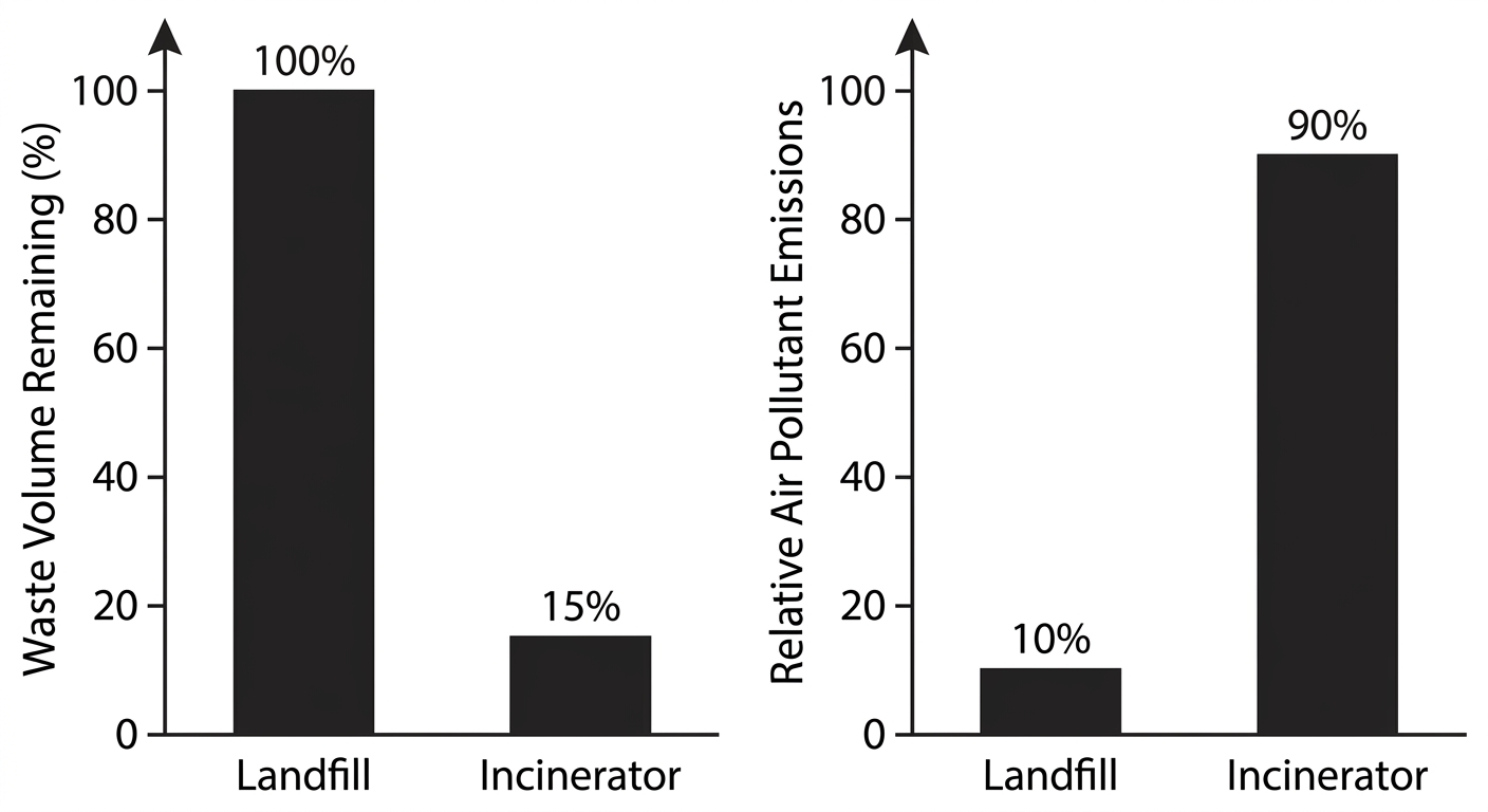
Mass-burn incinerators can reduce municipal solid waste volume by 85% compared with landfilling, but they also increase air pollutant emissions. An environmental policy analyst writes, "Proponents of incineration emphasize this dramatic volume reduction as the solution to our region's declining landfill capacity. However, because municipal waste contains plastics and electronic components, incineration converts solid pollution into atmospheric pollution, releasing hazardous dioxins and heavy metals. Mass combustion transfers the pollution problem from land to air rather than resolving it."

Question

Which statement best identifies the analyst's claim about incineration?

Incineration transfers pollution from land to air rather than solving the municipal waste problem.

Incineration greatly reduces waste volume but creates air pollution that can be addressed through additional regulation.

Landfills and incineration are complementary disposal methods that together address the region's waste management needs.

Improved incineration technology makes mass combustion an effective long-term solution to municipal solid waste disposal.

graph

Stimulus-based practice question

graph

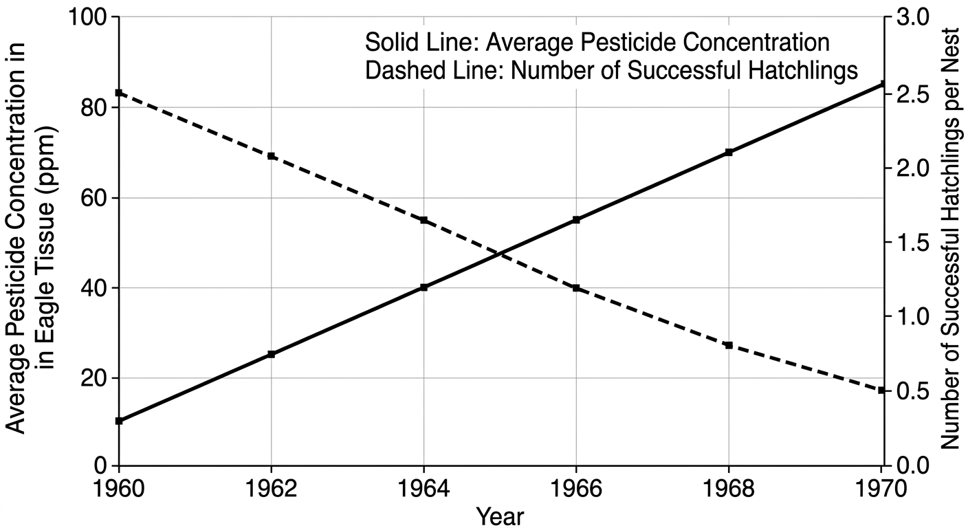
Wildlife biologists monitored a local bald eagle population over a ten-year period, tracking both their reproductive success and their exposure to a synthetic, fat-soluble agricultural pesticide used on nearby farms. The figure shows the relationship between the pesticide concentration in adult eagle tissues and the number of successful hatchlings per nest. Analysis of unhatched eggs revealed severe eggshell thinning.

Question

Which agricultural policy change would most directly prevent future reproductive failure in these apex predators?

Mandating a transition to pesticides that degrade rapidly.

Increasing the application of water-soluble fertilizers.

Implementing no-till farming to reduce soil erosion rates.

Planting genetically modified crops resistant to herbicides.

Example FRQs

open all FRQs
FRQ

Agricultural runoff, eutrophication, bioaccumulation in aquatic ecosystems

3. Lake Patterson is a 450-hectare freshwater lake located in an agricultural region. Over the past decade, increased fertilizer use from nearby farms has led to elevated nutrient levels in the lake. Additionally, historical use of the pesticide DDT in the watershed has resulted in persistent contamination. A coal-fired power plant on the northern shore discharges cooling water into the lake. The local wastewater treatment plant processes sewage from the surrounding communities before discharging treated effluent into the lake.

Organism

Trophic Level

DDT Concentration (ppm)

Phytoplankton

Producer

0.04

Zooplankton

Primary Consumer

0.23

Small Fish

Secondary Consumer

2.07

Large Predatory Fish

Tertiary Consumer

13.8

Parameter

Value

Average flow rate

8.5 × 10^6 liters per day

Influent nitrogen concentration

45 mg/L

Effluent nitrogen concentration

8 mg/L

Location

Temperature Before Cooling Tower (°C)

Temperature After Cooling Tower (°C)

Power plant discharge area

32

24

Lake average (control area)

22

22

A.

Identify whether agricultural runoff into Lake Patterson is a point source or nonpoint source of pollution.

B.

Describe one specific effect that excessive fertilizer runoff from agricultural fields could have on the dissolved oxygen levels in Lake Patterson.

C.

Explain why DDT concentrations increase at higher trophic levels in the Lake Patterson food web, as shown in Table 1.

D.

Calculate the biomagnification factor for DDT between phytoplankton and large predatory fish. Show your work. Based on the data in Table 1, the DDT concentration in phytoplankton is 0.04 ppm and the DDT concentration in large predatory fish is 13.8 ppm in Lake Patterson.

E.

Calculate the total mass of nitrogen, in kilograms, removed by the wastewater treatment plant each day. Show your work. The municipal wastewater treatment plant serving the Lake Patterson watershed processes an average flow rate of 8.5 × 10^6 liters per day. According to Table 2, the influent nitrogen concentration is 45 mg/L and the effluent nitrogen concentration is 8 mg/L.

F.

Propose one realistic solution that agricultural producers in the Lake Patterson watershed could implement to reduce nutrient pollution entering the lake from their fields.

G.

Calculate the percent reduction in the temperature increase (above background lake temperature) in the discharge area after the cooling tower was installed. Show your work. The coal-fired power plant installed a cooling tower system to reduce thermal pollution. Based on the data in Table 3, the water temperature in the power plant discharge area was 32°C before the cooling tower was installed and 24°C after the cooling tower was installed. The lake average temperature in the control area remained constant at 22°C.

FRQ

Endocrine disruptors, amphibian development, agricultural pollution

1. Northern Leopard Frogs (Lithobates pipiens) are an indicator species commonly found in wetlands across North America. These amphibians have permeable skin that makes them highly sensitive to environmental pollutants. Populations of Northern Leopard Frogs have been declining in agricultural regions where pesticides and fertilizers are frequently applied.

A.

Describe one mechanism by which endocrine disruptors, such as atrazine, affect the development of amphibians.

Figure 2. Dissolved Oxygen Levels at Increasing Distances from an Agricultural Drainage Pipe

Line graph with one data series (solid line with filled circular markers) and one reference line (dashed horizontal line) showing average dissolved oxygen at set distances from an agricultural drainage pipe.

Axes (exact formatting and scales):
- X-axis label: "Distance from drainage pipe (m)".
- X-axis range: from 0 to 500.
- X-axis tick marks and visible tick labels: 0, 100, 200, 300, 400, 500 (tick interval exactly 100).
- Y-axis label: "Average dissolved oxygen (mg/L)".
- Y-axis range: from 0 to 10.
- Y-axis tick marks and visible tick labels: 0, 1, 2, 3, 4, 5, 6, 7, 8, 9, 10 (tick interval exactly 1).
- The origin is the bottom-left corner intersection of the axes and is explicitly labeled "0".
- Arrows on the positive ends of both axes.
- No grid lines.

Data placement requirements (must match exactly):
- Plot six filled circular markers at the following x tick values with the following y values: at x=0 the marker is at y=2.5; at x=100 the marker is at y=3.8; at x=200 the marker is at y=5.2; at x=300 the marker is at y=6.8; at x=400 the marker is at y=8.1; at x=500 the marker is at y=8.9.

Main curve shape description (unambiguous geometry):
- A single solid black line connects the markers from left to right.
- Each adjacent pair of markers is connected by a straight line segment (piecewise linear), producing a monotonic increase.
- The slope of the line segments decreases from left to right (largest rise per 100 m occurs nearest x=0; smallest rise per 100 m occurs nearest x=500), creating an overall concave-down trend when viewed as a whole (increasing with decreasing rate).
- There is no peak or dip anywhere; the series is strictly increasing across the entire x-range.

Hypoxia threshold reference line (must be explicit and labeled):
- Draw a dashed horizontal line across the full width of the plotting area at y=5.0.
- Place the text label "Hypoxia threshold = 5.0 mg/L" just above the dashed line near the right side of the graph, without overlapping any data markers.

Relative position constraint that must be visually correct:
- The marker at x=200 (y=5.2) is visibly just above the dashed hypoxia line.
- The markers at x=0 and x=100 are visibly below the dashed hypoxia line.
- The markers at x=300, x=400, and x=500 are visibly above the dashed hypoxia line.

Text and styling:
- No title text beyond the axis labels.
- No legend.
- Data markers are filled circles of uniform size.
- Solid data line is medium thickness; dashed threshold line is thinner than the data line.
B.

Based on the information provided, explain how the application of fertilizers on the cornfields can lead to the trend in dissolved oxygen shown in Figure 2.

Figure 1. Concentration of Atrazine and Percentage of Male Frogs with Feminization Traits

Line graph with a single data series (solid line with filled circular markers) showing how the percentage of male frogs exhibiting feminization traits changes with atrazine concentration.

Axes (exact formatting and scales):
- X-axis label: "Atrazine concentration (µg/L)".
- X-axis range: from 0.0 to 3.0.
- X-axis tick marks and visible tick labels: 0.0, 0.5, 1.0, 1.5, 2.0, 2.5, 3.0 (tick interval exactly 0.5).
- Y-axis label: "Male frogs with feminization traits (%)".
- Y-axis range: from 0 to 80.
- Y-axis tick marks and visible tick labels: 0, 10, 20, 30, 40, 50, 60, 70, 80 (tick interval exactly 10).
- The origin is the bottom-left corner intersection of the axes and is explicitly labeled "0".
- Arrows on the positive ends of both axes.
- No grid lines.

Data placement requirements (must match exactly):
- Plot seven filled circular markers, each centered precisely at the intersection of the following x tick values and y values: at x=0.0 the marker is at y=2; at x=0.5 the marker is at y=10; at x=1.0 the marker is at y=28; at x=1.5 the marker is at y=55; at x=2.0 the marker is at y=70; at x=2.5 the marker is at y=75; at x=3.0 the marker is at y=78.

Curve shape description (unambiguous geometry):
- A single solid black line connects the markers from left to right.
- Segment from x=0.0 to x=0.5: straight line rising upward.
- Segment from x=0.5 to x=1.0: straight line rising upward with a larger rise than the previous segment.
- Segment from x=1.0 to x=1.5: straight line rising upward; this is the steepest segment in the entire graph.
- Segment from x=1.5 to x=2.0: straight line rising upward but less steep than the previous segment (decreasing slope begins here).
- Segment from x=2.0 to x=2.5: straight line rising upward with a small slope.
- Segment from x=2.5 to x=3.0: straight line rising upward with the smallest slope, nearly horizontal but still increasing.

Overall behavior constraints:
- The plotted series is strictly increasing across the full x-range (no declines).
- There is no maximum or minimum within the plotted interior; the lowest value occurs at the leftmost data point and the highest value occurs at the rightmost data point.
- The visual impression is an increasing curve that begins with low slope, becomes very steep by the middle (between 1.0 and 1.5), then shows progressive flattening from 1.5 through 3.0 (slope decreases monotonically after x=1.5).

Text and styling:
- No title text beyond the axis labels.
- No legend.
- Markers are filled circles of uniform size.
- Line thickness is medium and consistent.
C.

Based on the data in Figure 1, identify the percentage of male frogs with feminization traits at an atrazine concentration of 1.5 μg/L.

D.

Based on the data in Figure 2, describe the relationship between the distance from the agricultural drainage pipe and the level of dissolved oxygen.

E.

Scientists hypothesize that frog populations near the drainage pipe are experiencing reproductive isolation due to chemical pollution. Describe one way the data in Figure 1 support this hypothesis.

F.

Nutrient pollution from agricultural runoff often causes rapid growth of aquatic plants. A group of students decided to investigate the effect of liquid fertilizer on the growth of duckweed (Lemna minor), a common floating aquatic plant. They set up five beakers, each containing 200 mL of pond water. They added different amounts of liquid fertilizer to create concentrations of 0.0%, 0.5%, 1.0%, 2.0%, and 5.0%. They placed 10 duckweed fronds into each beaker and placed them all under a grow light for 7 days. After 7 days, they counted the number of fronds and measured root length.

i.

Identify a likely scientific question for the students' investigation.

ii.

Identify the dependent variable in the students' investigation.

Fertilizer Concentration (%)

Initial Number of Fronds

Number of Fronds after 7 Days

Average Root Length (mm)

0.0 (Control)

10

14

12

0.5

10

28

10

1.0

10

55

8

2.0

10

82

6

5.0

10

35

4

G.

The results of the student investigation are presented in the table below.

i.

Based on the data in the table, explain why the results at 5.0% fertilizer concentration differ from the trend observed between 0.5% and 2.0%.

ii.

Explain how the validity of the experiment would be affected if the students placed the 0.0% and 0.5% beakers in direct sunlight while keeping the other beakers under the grow light.

H.

Great Blue Herons feed on the frogs in this wetland. Explain why the concentration of a persistent organic pollutant (POP), such as DDT (historically used in the area), would be higher in the tissues of the herons than in the tissues of the frogs.

FRQ

Lake pollution, bioaccumulation, ecosystem stress

2. A freshwater lake ecosystem is experiencing significant environmental stress due to pollution from surrounding agricultural activities and industrial operations. Scientists have been monitoring water quality, aquatic organism health, and pollutant concentrations at various trophic levels. The lake serves as a primary water source for a nearby town and supports commercial fishing operations.

Organism Type

Trophic Level

Pollutant X Concentration (ppm)

Phytoplankton

Producer

0.04

Zooplankton

Primary Consumer

0.5

Small Fish

Secondary Consumer

6

Large Predatory Fish

Tertiary Consumer

25

Osprey

Quaternary Consumer

95

Figure 1. Sources of Pollution Entering a Freshwater Lake Ecosystem (Point vs Nonpoint Inputs Shown)

A clean, top-down, full-color but textbook-style map diagram with no perspective (flat overhead view). The figure has no axes and no numeric scales.

Overall layout and orientation:
- The page is landscape. A north arrow labeled "N" is placed in the upper-right corner, pointing straight upward.
- The lake occupies the central area of the map, roughly oval with an irregular shoreline (small coves and one peninsula), colored light blue.
- Land surrounding the lake is light tan/green. A thin dark outline marks the shoreline.

Hydrology (must be spatially explicit):
- One main tributary stream enters the lake from the northwest side (upper-left shoreline). This tributary is drawn as a narrow blue line that begins off the map at the upper-left edge, flows diagonally down-right, and connects to the lake at the northwest shoreline.
- A second tributary stream enters the lake from the west side (mid-left shoreline). It begins off the left edge of the map, flows horizontally right, and connects to the lake at the west shoreline.
- One outlet river leaves the lake at the southeast side (lower-right shoreline). It exits the lake and flows diagonally down-right off the page.

Pollution sources (with exact relative placement and required labels):
1) Farm fields (nonpoint source):
- A rectangular patchwork of 3 adjacent farm fields is located in the northwest quadrant of the map, positioned on land above and to the left of the lake, clearly uphill/upstream of the northwest tributary.
- Each field is drawn as a rectangle with parallel crop-row lines.
- A bold label "Farm fields (fertilizer applied)" is placed directly above the group of fields.
- A second label, "Nonpoint source runoff", appears near the fields.
- Three runoff arrows (exact count = 3) originate from the farm-field area and point toward the northwest tributary. Each arrow ends at the tributary (arrowheads touch the blue stream line), indicating runoff entering the stream.
- Along these arrows, include the text "Fertilizer runoff (N, P)" at least once so it is clearly associated with the arrows.

2) Concentrated animal feeding operation, CAFO (shown as a distinct facility):
- A CAFO facility is located on the west side of the map, left of the lake and slightly below the horizontal midpoint of the lake (west-southwest of the lake).
- Draw a cluster of 3 long, low barn buildings (simple gray rectangles) and one circular manure lagoon (brown circle) adjacent to the barns.
- Place the label "CAFO" above the barns and the label "Manure lagoon" next to the brown circle.
- A single runoff arrow (exact count = 1) begins at the CAFO/manure lagoon area and points to the west tributary stream (arrowhead ends on the stream). The arrow is labeled "Manure/nutrient runoff".

3) Wastewater treatment plant (point source):
- The wastewater treatment plant is placed in the southern part of the map, directly below the lake near the center-bottom area.
- Represent the plant as 2 circular clarifier tanks (two light-gray circles side-by-side) and one rectangular building.
- Label the facility clearly as "Wastewater treatment plant".
- A single discharge pipe (one solid dark line) runs from the plant directly to the south shoreline of the lake, ending at the shoreline with a visible outfall point.
- At the pipe’s lake entry point, include the label "Treated effluent outfall (point source)".
- The pipe is the only connection between the plant and the lake (no ambiguity with streams).

4) Factory (point source thermal discharge):
- The factory is placed on the east side of the map, to the right of the lake, slightly above the lake’s horizontal midpoint (east-northeast of the lake center).
- Draw a rectangular factory building with 2 smokestacks.
- Label it "Factory".
- A single discharge pipe runs from the factory to the east shoreline of the lake. The pipe ends at the shoreline with a distinct outfall symbol.
- At the outfall, add the label "Heated water discharge (thermal pollution, point source)".

Runoff and flow direction clarity:
- All runoff arrows are thick and colored dark green, with arrowheads clearly indicating direction toward streams or the lake.
- The two tributary streams have small blue flow-direction arrows placed on them, pointing toward the lake.
- The outlet river has small blue flow-direction arrows pointing away from the lake.

Required labels that must appear as visible text in the image:
- "Farm fields (fertilizer applied)"
- "Nonpoint source runoff"
- "Fertilizer runoff (N, P)"
- "CAFO"
- "Manure lagoon"
- "Manure/nutrient runoff"
- "Wastewater treatment plant"
- "Treated effluent outfall (point source)"
- "Factory"
- "Heated water discharge (thermal pollution, point source)"
- "N" (north arrow)

Do NOT include any other pollution sources besides these four. Ensure the farm fields and CAFO are clearly shown as land-based diffuse runoff inputs, while the wastewater treatment plant and factory are clearly shown as single pipes (point sources) directly discharging into the lake.
A.

Identify one point source of pollution shown in Figure 1.

B.

Identify one nonpoint source of pollution shown in Figure 1.

Figure 2. Concentration of Persistent Organic Pollutant X in Lake Organisms by Trophic Level

A single data table with a bold caption above it. The table uses clear black grid lines and left-aligned text in the first two columns, with the numeric column right-aligned.

Table structure (exact):
- Exactly 3 columns with the following column headers (top row):
  1) "Organism Type"
  2) "Trophic Level"
  3) "Pollutant X Concentration (ppm)"
- Exactly 6 total rows: 1 header row plus 5 data rows.
- No footnotes, no extra legend, and no additional columns.

Table contents (every cell, exact text):
- Header row: Organism Type | Trophic Level | Pollutant X Concentration (ppm)
- Row 1: Phytoplankton | Producer | 0.04
- Row 2: Zooplankton | Primary Consumer | 0.5
- Row 3: Small Fish | Secondary Consumer | 6
- Row 4: Large Predatory Fish | Tertiary Consumer | 25
- Row 5: Osprey | Quaternary Consumer | 95

Formatting constraints to preserve numerical accuracy:
- The values must appear exactly as written, with the same decimal places: "0.04" and "0.5" must retain their decimals; "6", "25", and "95" must appear as whole numbers with no trailing decimals.
- The unit "ppm" appears only in the third column header and nowhere else.
- No icons or pictures; table only.
C.

Identify the ecological process illustrated by the data in Figure 2 that shows increasing pollutant concentrations at higher trophic levels.

D.

The concentration of Pollutant X in large predatory fish is 25 ppm and the concentration in phytoplankton is 0.04 ppm. Explain why the concentration in large predatory fish is significantly higher than in phytoplankton, even though both organisms live in the same lake.

E.

Pollutant X is a persistent organic pollutant (POP) that acts as an endocrine disruptor in aquatic organisms. Describe one negative effect that endocrine disruptors can have on fish populations in the lake.

F.

Agricultural runoff from the farm fields shown in Figure 1 contains excess fertilizers. Propose one management practice that farmers could implement to reduce the amount of fertilizer entering the lake through runoff.

G.

Excessive fertilizer runoff can lead to eutrophication in aquatic ecosystems. Describe one characteristic of eutrophication that negatively impacts the lake ecosystem.

H.

Justify the management practice proposed in part F by providing an additional environmental benefit, other than reducing fertilizer runoff into the lake.

I.

The factory shown in Figure 1 discharges heated water into the lake, causing thermal pollution. Describe one way thermal pollution negatively affects aquatic organisms in the lake.

J.

The wastewater treatment plant discharges treated effluent into the lake. Describe one process used during secondary sewage treatment that removes organic matter from wastewater before it is discharged.

Key terms

TermDefinition
point sourceA single, identifiable source of a pollutant such as a smokestack or waste discharge pipe that can be located and monitored directly.
nonpoint sourceA diffuse source of pollution that is difficult to identify and trace, such as pesticide spraying or agricultural and urban runoff across a watershed.
Algal BloomsRapid, excessive growth of algae in a water body caused by excess nutrients like nitrogen and phosphorus; when algae die, microbial decomposition depletes dissolved oxygen.
Dead ZonesHypoxic areas in bodies of water where dissolved oxygen is too low to support most aquatic life, typically caused by eutrophication from nutrient runoff.
Dissolved Oxygen (DO)The amount of oxygen dissolved in water; critical for aquatic life. Warm water and high nutrient loads both reduce DO, stressing or killing aquatic organisms.
Biological Oxygen Demand (BOD)The amount of dissolved oxygen consumed by microorganisms decomposing organic matter in water; high BOD indicates heavy organic pollution and low available oxygen for aquatic life.
Oxygen Sag CurveA graph showing dissolved oxygen decreasing downstream from an organic pollution input as decomposers consume oxygen, then recovering further downstream as the system self-purifies.
DDTA synthetic persistent organic pollutant that is fat-soluble, resists breakdown, biomagnifies through food chains, and causes eggshell thinning in raptors and endocrine disruption in wildlife.
PCBsSynthetic, fat-soluble persistent organic pollutants that do not easily break down, accumulate in fatty tissue, biomagnify up food chains, and cause reproductive and neurological harm.
Eggshell thinningA reproductive effect in birds caused by the DDT metabolite DDE, which interferes with calcium deposition during egg formation, reducing hatching success in raptors and other top predators.
landfillThe most common solid waste disposal method; a sanitary landfill uses a bottom liner, leachate collection, stormwater collection, methane capture, and a cap to prevent groundwater contamination and gas release.
E-wasteDiscarded electronic devices such as computers and cell phones that contain toxic heavy metals like lead, mercury, and cadmium, which can leach into groundwater if improperly landfilled.
Milligrams per kilogram (mg/kg)The unit used to express LD50 values; represents the dose of a chemical in milligrams per kilogram of an organism's body weight needed to kill 50% of a test population.
pathogenAn organism or agent that causes disease in humans, including bacteria like Yersinia pestis and Vibrio cholerae, parasites like Plasmodium, and viruses; pathogens cycle through environments via water, air, and vectors.
vectorAn organism that transmits a pathogen from one host to another, such as Anopheles mosquitoes transmitting malaria or Aedes aegypti transmitting Zika and dengue fever.

Common unit 8 mistakes

Confusing bioaccumulation and biomagnification

Bioaccumulation happens within a single organism over its lifetime. Biomagnification describes the increasing concentration across trophic levels in a food chain. A predator biomagnifies because it bioaccumulates from many contaminated prey. These are related but distinct processes.

Reversing the LD50 toxicity relationship

A lower LD50 means a chemical is more toxic, not less. It takes a smaller dose to kill 50% of the population. Students frequently flip this and conclude that a higher LD50 number means more danger.

Stopping eutrophication at the algal bloom

The algal bloom itself is not what kills fish. The critical step is what happens after the algae die: microbial decomposition consumes dissolved oxygen, creating hypoxic conditions. Always complete the full sequence through oxygen depletion.

Mixing up sewage treatment stages

Primary treatment is physical (screens and settling), not biological. Secondary treatment is biological (bacteria breaking down organic matter). Tertiary is chemical or ecological. Students often describe secondary as physical or skip the aeration step that makes bacterial decomposition work.

Treating all wetland threats as identical

Different threats disrupt different ecosystem services. Dam construction alters hydrology and sediment flow. Agricultural runoff causes nutrient pollution and eutrophication. Coastal development directly destroys habitat. Match the specific threat to its specific impact on the AP exam.

How this unit shows up on the AP exam

Cause-and-effect chains across multiple steps

AP Environmental Science frequently asks you to trace a pollution event through multiple steps to its ecological or human health outcome. For Unit 8, practice writing complete chains: fertilizer application leads to runoff leads to algal bloom leads to oxygen depletion leads to fish die-off. Stopping the chain one step early is a common source of lost points. The same multi-step reasoning applies to biomagnification, oil spill effects, and pathogen spread.

Graph and data interpretation for toxicology

Dose-response curve graphs are a likely data-analysis task. You may be asked to read LD50 values off a graph, compare the toxicity of two chemicals by comparing their curves, or explain what the slope of a curve indicates about the range of dangerous doses. Practice identifying the 50% mortality point and drawing conclusions about relative toxicity from visual data.

Evaluating solutions with trade-offs

Unit 8 topics frequently appear in questions that ask you to propose a solution and evaluate its benefits and drawbacks. Recycling reduces landfill use but is energy-intensive. Tertiary sewage treatment removes nutrients but costs more than secondary alone. Composting produces useful fertilizer but attracts pests. Be ready to name a specific benefit and a specific drawback for any waste management or pollution control strategy.

Final unit 8 review checklist

  • Classify pollution sourcesFor any given scenario, identify whether the source is point or nonpoint and explain why nonpoint sources are harder to regulate. Practice with examples like a factory pipe versus fertilizer runoff.
  • Trace the eutrophication sequenceBe able to write out the full chain: nutrient input (agricultural runoff or wastewater) leads to algal bloom, algae die, microbial decomposition consumes dissolved oxygen, hypoxic dead zone forms, fish die off.
  • Explain biomagnification with a food chain exampleShow how DDT or methylmercury concentrations increase from water to phytoplankton to small fish to large fish to apex predators. Connect this to eggshell thinning in raptors or neurological harm in humans.
  • Label a sanitary landfill diagramKnow the five components: bottom liner, leachate collection system, stormwater collection system, methane collection system, and cap. Be able to explain what environmental problem each component prevents.
  • Describe all three sewage treatment stagesPrimary removes solids physically. Secondary uses aerobic bacteria to reduce BOD. Tertiary removes remaining nutrients and pollutants. Disinfection (chlorine, ozone, or UV) kills pathogens before discharge.
  • Read and compare dose-response curvesGiven a graph with two curves, identify which chemical is more toxic by comparing LD50 values. Remember: lower LD50 equals higher toxicity. Practice reading the 50% mortality point off the y-axis.
  • Match pollutants to human health effectsKnow these three pairings: untreated sewage causes dysentery; asbestos causes mesothelioma; elevated tropospheric ozone causes respiratory problems. Be ready to explain why establishing causation is difficult.
  • Connect climate change to disease spreadExplain how warming expands the geographic range of vectors like Aedes aegypti and Anopheles mosquitoes, bringing diseases like malaria and Zika into previously unaffected temperate regions.

How to study unit 8

Step 1: Sources and aquatic impacts (8.1-8.4)Start with the topic guides for 8.1 through 8.4. Practice classifying point versus nonpoint sources with real examples. Draw out the tolerance range concept and list the three major threats to coral reefs. Review wetland ecosystem services and match each human threat to the service it disrupts.
Step 2: Eutrophication and thermal pollution (8.5-8.6)Use the 8.5 and 8.6 topic guides to write out the full eutrophication sequence from nutrient input to dead zone. Then compare it to thermal pollution using the dissolved oxygen-temperature relationship. Make a side-by-side table of causes, mechanisms, and effects for both.
Step 3: POPs, bioaccumulation, and biomagnification (8.7-8.8)Read the 8.7 and 8.8 topic guides together since the topics are tightly linked. Draw a food chain showing DDT concentrations increasing from water through four trophic levels. Practice explaining why fat solubility is the key property that drives both bioaccumulation and biomagnification.
Step 4: Waste and sewage (8.9-8.11)Use the topic guides for 8.9 through 8.11. Sketch a labeled landfill diagram from memory and explain each component. Then write out the three sewage treatment stages with the method and what is removed at each. Compare recycling and composting benefits and drawbacks in a short table.
Step 5: Toxicology, health, and disease (8.12-8.15)Work through the 8.12 and 8.13 topic guides and practice reading dose-response curve graphs, identifying LD50 values, and comparing toxicity. Then review 8.14 and 8.15 by making a chart of each pollutant or pathogen, its source, and its specific human health effect. Use the available practice questions to test yourself across all 15 topics.

More ways to review

Topic study guides

Open the individual guides for Unit 8 when you want a closer review of one topic.

browse guides

Practice questions

Use AP-style practice after you review the notes so you can check what you understand.

start practice

FRQ practice

Practice free-response reasoning and compare your answer with scoring guidance.

practice FRQs

Cheatsheets

Use unit cheatsheets for a quick visual review after you work through the notes.

open cheatsheets

Score calculator

Estimate your broader AP score goal after you review the course and exam format.

open calculator

Frequently Asked Questions

What topics are covered in APES Unit 8?

APES Unit 8: Aquatic and Terrestrial Pollution covers 15 topics across pollution sources, ecosystem impacts, and human health. Key topics include Sources of Pollution, Eutrophication, Endocrine Disruptors, Persistent Organic Pollutants (POPs), Bioaccumulation and Biomagnification, Solid Waste Disposal, Sewage Treatment, Dose Response Curve, and Pathogens and Infectious Diseases. Here's the full topic list: - 8.1 Sources of Pollution - 8.2 Human Impacts on Ecosystems - 8.3 Endocrine Disruptors - 8.4 Human Impacts on Wetlands and Mangroves - 8.5 Eutrophication - 8.6 Thermal Pollution - 8.7 Persistent Organic Pollutants (POPs) - 8.8 Bioaccumulation and Biomagnification - 8.9 Solid Waste Disposal - 8.10 Waste Reduction Methods - 8.11 Sewage Treatment - 8.12 Lethal Dose 50% (LD50) - 8.13 Dose Response Curve - 8.14 Pollution and Human Health - 8.15 Pathogens and Infectious Diseases See APES Unit 8 for matched practice on all 15 topics.

How much of the APES exam is Unit 8?

APES Unit 8 makes up 7-10% of the AP Environmental Science exam. That slice covers aquatic and terrestrial pollution, including point and nonpoint sources, bioaccumulation and biomagnification, eutrophication, sewage treatment, and pathogens and infectious diseases. It's a focused unit, but the concepts show up in both the MCQ and FRQ sections.

What's on the APES Unit 8 progress check (MCQ and FRQ)?

The APES Unit 8 progress check in AP Classroom includes both an MCQ section and an FRQ section drawn from the unit's 15 pollution topics. The MCQ portion tests concepts like eutrophication, bioaccumulation and biomagnification, endocrine disruptors, and sewage treatment. The FRQ portion often asks you to analyze pollution scenarios, interpret a dose response curve, or evaluate waste reduction strategies. Pathogens and infectious diseases and LD50 calculations are also common targets. For practice questions matched to every progress check topic, visit APES Unit 8.

How do I practice APES Unit 8 FRQs?

The best way to practice APES Unit 8 FRQs is to focus on the topics that generate the most free-response questions: eutrophication, bioaccumulation and biomagnification, sewage treatment, and pathogens and infectious diseases. FRQs in this unit typically ask you to identify pollution sources, explain environmental or health impacts, or propose solutions. For dose response curve questions, practice reading the graph and calculating or comparing LD50 values. Work through past prompts by writing out full responses, then check your reasoning against the scoring guidelines. You can find practice sets organized by topic at APES Unit 8.

Where can I find APES Unit 8 practice questions?

For APES Unit 8 practice questions, including multiple-choice and practice test sets, APES Unit 8 on Fiveable organizes MCQs and FRQs by topic across all 15 pollution topics. When you're doing MCQ practice, prioritize bioaccumulation and biomagnification, eutrophication, sewage treatment, and infectious diseases since those appear most often. Mixing topic-specific drills with full practice test sections helps you get comfortable with the range of question types College Board uses for this unit.

How should I study APES Unit 8?

Start APES Unit 8 by grouping the 15 topics into three clusters: pollution sources and ecosystem impacts (8.1-8.6), chemical pollutants and their movement through food chains (8.7-8.8), and waste management and human health (8.9-8.15). Learn point vs. nonpoint sources first since that framing applies across the whole unit. Then build out your understanding of bioaccumulation and biomagnification, eutrophication, and sewage treatment, which are the highest-yield topics for both MCQ and FRQ. For the health side, make sure you can read a dose response curve and explain how pathogens and infectious diseases spread through contaminated water or soil. Draw diagrams for eutrophication and biomagnification rather than just reading about them. Finish each study session with a few practice questions to catch gaps early. APES Unit 8 has resources organized by topic to keep your review focused.

What graphs do I need to know for APES Unit 8?

The most important graph in APES Unit 8 is the dose response curve (Topic 8.13), which plots the effect of a pollutant against the dose given to a population. You need to read the curve to identify the LD50, the dose at which 50% of a test population dies, and compare toxicity between substances. A steeper curve means a more potent toxin. You should also be comfortable reading eutrophication diagrams that show how excess nutrients drive algal blooms, deplete oxygen, and create dead zones. Biomagnification diagrams showing pollutant concentration increasing at each trophic level appear in both MCQ and FRQ contexts. Practice labeling and interpreting all three at APES Unit 8.

Ready to review Unit 8?Start with the notes, check the topic cards, and use the practice or resource links when they are available for this course.