Data Visualization Techniques
Data visualization turns raw health data into something you can actually see and interpret. In descriptive epidemiology, choosing the right chart, graph, or map determines whether your audience spots the pattern you're trying to show, or misses it entirely.
Frequency Tables and Charts
Frequency tables organize categorical data into rows showing each category, its count (frequency), and its percentage of the total. They're your starting point for summarizing data like blood types in a population or disease outcomes (recovered, hospitalized, deceased). Tables give you exact numbers, which is useful when precision matters, but they make it hard to spot overall patterns at a glance.
Histograms display the distribution of continuous data. The x-axis shows ranges of values (called bins), and the y-axis shows how often values fall in each range. Looking at a histogram, you can quickly assess:
- Central tendency: Where most of the data clusters
- Spread: How wide or narrow the distribution is
- Skewness: Whether the data leans left or right
A common use is plotting age distribution of cases during an outbreak. If cases cluster in a narrow age range, that tells you something about who's susceptible.
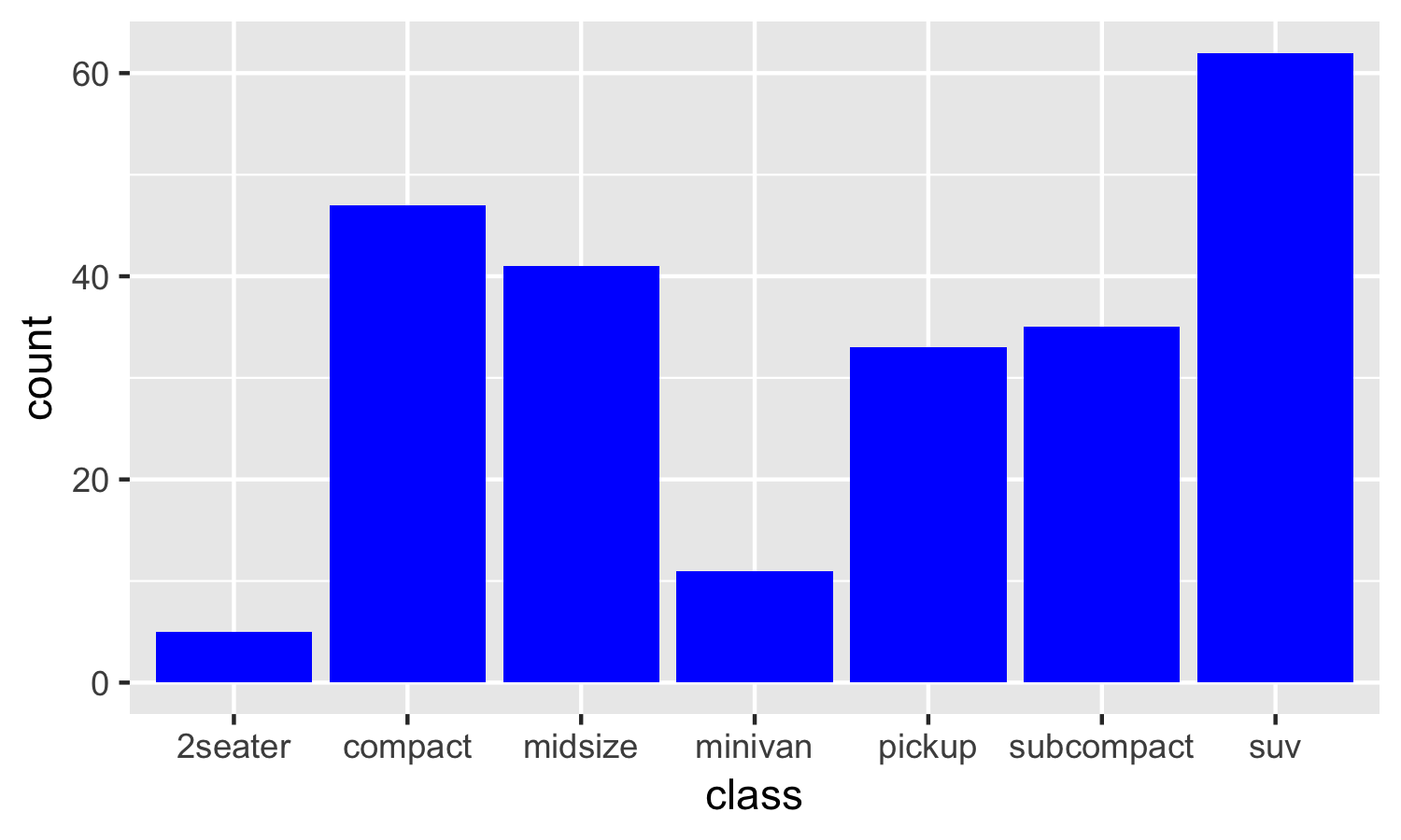
Bar charts compare categorical (not continuous) data. Each bar represents a distinct category, like disease prevalence by region or exposure rates for different risk factors. The key difference from histograms: bar charts have gaps between bars because the categories are separate, while histogram bars touch because the data is continuous.
Line Graphs for Disease Trends
Line graphs are the go-to for showing how a measure changes over time. Time goes on the x-axis, and your measure of interest (incidence rate, case count, mortality rate) goes on the y-axis. Data points are connected by lines so you can follow the trajectory.
When interpreting a line graph, look for:
- Overall trend: Is the measure increasing, decreasing, or staying stable over the full time period?
- Seasonal patterns: Do you see regular peaks and valleys? Flu incidence, for example, spikes every winter.
- Sudden changes: A sharp spike might signal an outbreak. A sudden drop after a specific date could reflect an intervention taking effect.
Line graphs are especially useful for tracking outbreak progression (like daily COVID-19 case counts) and for evaluating whether a public health intervention actually changed the trend.

Geographic and Advanced Visualization
Maps for Disease Distribution
Maps add a spatial dimension that tables and graphs can't provide. There are three main types used in epidemiology:
- Dot maps place a dot for each individual case on a geographic map. These are great for spotting clusters. John Snow's famous cholera map is a classic dot map.
- Choropleth maps shade regions (states, counties, countries) by color to represent rates or proportions. Darker shading typically means higher rates. You'll see these used for things like cancer incidence by state.
- Isopleth maps use contour lines to show continuous data across an area, similar to elevation lines on a topographic map. These are less common but useful for environmental exposures.
Every map should include a legend (explaining what colors or symbols mean), a scale (for distance reference), and a title with data source.
When interpreting maps, look for spatial clusters, proximity to potential environmental risk factors (industrial sites, water sources), and differences between regions. One major caution: maps can lead to the ecological fallacy, where you assume that patterns observed at the group or regional level apply to individuals within those regions. Just because a county has a high disease rate doesn't mean every person there is at high risk.
Evaluating and Choosing Visualization Techniques
Each visualization type has trade-offs:
| Type | Strength | Weakness |
|---|---|---|
| Tables | Precise numerical data | Hard to see overall patterns |
| Graphs | Reveal trends and patterns visually | Scale choices can mislead |
| Maps | Show spatial context and clusters | Risk of ecological fallacy |
Choosing the right one depends on three things:
- Your audience: A general public health report needs simple, intuitive visuals. A scientific paper can use more complex displays.
- Data complexity: Multi-variable data may need layered graphs; simple comparisons work fine with bar charts.
- Your key message: If the story is about change over time, use a line graph. If it's about geographic spread, use a map.
A few best practices to keep in mind: keep designs simple and uncluttered, use color and contrast intentionally (not decoratively), and always include context like axis labels, units, and data sources. On the ethical side, avoid manipulating axis scales to exaggerate trends, protect individual privacy when mapping case locations, and be transparent about any limitations or biases in the underlying data.