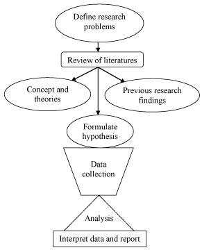
Types of Data

Qualitative and Quantitative Data
Understanding the difference between these two data types is one of the first things you need to nail down, because it affects how you collect, display, and analyze your results.
Qualitative data describes qualities or characteristics without using numbers. Think of it as descriptive data. You might record that a solution turned cloudy, that a mineral has a glassy texture, or that a substance smells like sulfur. These observations add context and detail that numbers alone can't capture.
Quantitative data is anything you can measure and express as a number. A beaker holds 250 mL of water. A reaction took 34 seconds. The temperature rose from 22°C to 47°C. Because it's numerical, quantitative data can be graphed, averaged, and compared statistically.
Most good experiments use both types together. Quantitative data gives you precision, while qualitative data helps explain what's actually happening behind those numbers.
Variables in Experiments
Independent and Dependent Variables
Every experiment revolves around a simple question: if I change this one thing, what happens? The "one thing" you change is the independent variable, and what happens as a result is the dependent variable.
- The independent variable is the factor you deliberately manipulate. If you're testing how fertilizer amount affects plant growth, the amount of fertilizer is your independent variable. On a graph, it goes on the x-axis.
- The dependent variable is what you measure in response. In the plant example, that's the height of the plant. It "depends" on what you did to the independent variable. It goes on the y-axis.
A quick way to remember: you choose the independent variable, and you measure the dependent variable.
Control Variables and Their Importance
Control variables (also called constants) are every other factor you keep the same so they don't interfere with your results.
In the fertilizer experiment, control variables would include the type of soil, the amount of sunlight, the amount of water, and the species of plant. If you changed the water amount and the fertilizer amount at the same time, you'd have no way to tell which one caused the plant to grow more.
Keeping control variables constant is what makes an experiment valid. It lets you confidently say that changes in the dependent variable were actually caused by the independent variable, not by some other factor you forgot to account for.
Data Presentation
Graphical Representations of Data
Graphs turn raw numbers into visual patterns, making trends and relationships much easier to spot. Picking the right type of graph matters:
- Line graphs show how something changes over time or across a continuous range (e.g., temperature readings every hour).
- Bar graphs compare distinct categories or groups (e.g., average test scores for three different classes).
- Scatter plots reveal whether two variables are correlated (e.g., plotting study time against exam score to see if there's a relationship).
- Pie charts show parts of a whole (e.g., the percentage of Earth's atmosphere made up by each gas).
- Histograms display how frequently values fall within certain ranges (e.g., how many students scored between 70–79, 80–89, etc.).
Every graph needs a descriptive title, labeled axes with units, and a legend if there's more than one data series. A graph without labels is just a picture.
Tabular Data Organization
Tables organize your raw data into rows and columns so you (and anyone reading your work) can look up specific values quickly.
- Rows usually represent individual trials or observations.
- Columns represent different variables or measurements.
- Column headers should include the variable name and its unit (e.g., "Temperature (°C)" not just "Temperature").
- Use consistent decimal places and significant figures throughout.
Tables and graphs serve different purposes. A table gives you exact numbers; a graph shows you the overall pattern. Strong lab reports typically include both.
Statistical Analysis
Measures of Central Tendency
These three values each summarize a dataset in a different way. Knowing when to use each one is just as important as knowing how to calculate them.
Mean is the arithmetic average. Add up all the values and divide by how many there are.
For example, if five trials give you masses of 12 g, 14 g, 13 g, 12 g, and 14 g, the mean is . The mean is useful but sensitive to outliers. One extreme value can pull it up or down significantly.
Median is the middle value when you arrange your data in order. Using the same dataset sorted (12, 12, 13, 14, 14), the median is 13 g. If you have an even number of values, average the two middle ones. The median is more resistant to outliers than the mean, so it's a better choice when your dataset has one or two extreme values skewing things.
Mode is the most frequently occurring value. In the dataset above, both 12 and 14 appear twice, so the dataset is bimodal. Mode is the only measure of central tendency that works for categorical (qualitative) data, like finding the most common eye color in a class.
Error Analysis and Uncertainty
No measurement is perfectly exact. Error analysis is how scientists figure out how close their measurements are to the true value and how consistent their measurements are with each other. These two ideas have specific names:
- Accuracy is how close a measurement is to the true or accepted value.
- Precision is how close repeated measurements are to each other.
You can be precise without being accurate. Imagine a scale that always reads 0.5 g too high. Your readings will cluster tightly together (precise), but they'll all be off from the real value (inaccurate).
Two types of errors affect your results in different ways:
- Systematic errors push all measurements in the same direction (like that miscalibrated scale). They reduce accuracy. You can often fix them by recalibrating your instrument or adjusting your technique.
- Random errors cause measurements to scatter unpredictably above and below the true value (e.g., slight variations in how you read a graduated cylinder). They reduce precision. You can minimize them by taking more trials and averaging.
Uncertainty expresses the range within which the true value likely falls. If you measure a length as 15.2 cm with an uncertainty of cm, you're saying the actual value is probably between 15.1 cm and 15.3 cm.
When you combine multiple measurements in a calculation, the uncertainties combine too. This is called propagation of uncertainty, and it's why your final answer can never be more precise than your least precise measurement.
Always report results with the correct number of significant figures. The number of sig figs should reflect the precision of your measuring instrument. Reporting a ruler measurement as 15.237 cm when the ruler only marks millimeters would overstate your precision.