Simple Linear Regression (Line of Best Fit)
5 min read•november 23, 2021
William
William
How Do You Graph Simple Linear Regressions?
Welcome back to another quick guide, statisticians! When looking at data, statisticians interpret using several methods. One of the methods they use when analyzing data is graphing the Simple Linear Regression or the Line of Best Fit. 🙈
You’re not alone if you have no idea what that word means. It’s time to put on your statistician hat as we explore this idea! 🎩
Let’s get started! 🚀
Scatterplots: A Quick Recap
A scatterplot is a primary way that statisticians capture numerical data from two variables. Just like the graph you might use for an algebraic course, this graph will include x and y axes, where the y axis is dependent on the x-axis! For instance, if we had the variables “hours of sleep” and “test score,” the x-axis would be the hours of sleep, and the y-axis would be the test score because the test score is typically dependent on the hours of sleep. 😴
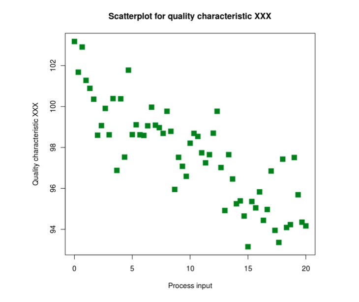
Image courtesy of Wikipedia
In a scatterplot, you’ll see many points all over a graph, and they may form a “line” of some sort, going in a specific direction. The Simple Linear Regression, or the Line of Best Fit, is a linear line that most accurately reflects the data’s overall trend as a whole, taking into account all points. 🏹
Line of Best Fit: the Equation
Since we know that the line that reflects the scatterplot’s data points will be linear, we can use the same equation we would use in a class like Algebra 1, except we’ll be using slightly different variables. We’ll have a slightly different structure! 👌
| Linear Parent Graph Equation | Statistics’ Line of Best Fit |
| y = mx + b | ŷ = a + bx |
| m is the slope, b is the y-intercept | a is the y-intercept, b is the slope |
With statistics, we'll want to be clear on the meaning of the variables! While the algebraic linear parent graph equation is universal because the x and y axes always remain the same, it is different for the x and y axes of statistics because they represent different things! For instance, one scatterplot could recognize hours of activity with coffee consumption, while another might correlate the association between ice cream consumption with degrees in Fahrenheit! ❕
(ŷ, otherwise known as y-hat, is the predicted value of y. This is because the Line of Best Fit is what most accurately reflects all the points collectively. Because scatterplots aren’t usually perfectly linear, this is the best estimation if you were to draw a line that most accurately reflects all the points in the scatterplot.)
You can use this sentence stem as a statistician to interpret the Line of Best Fit: 🌳
ŷ = [a] + [b]x, where for every 1 [type of x] increase in [x type] [(x descriptor)], there is a [b value] [b type] increase in [ŷ] [(ŷ descriptor)].
For instance, if we decided to compare degrees in Celsius (x) with water consumption by gallon per person (y), we could say the following:
ŷ = 0.75 + 0.04x where for every 1 degree increase in temperature (Celsius), there is a 0.04 increase in water consumption (gallon). (The numbers assigned are random)
To interpret this, that means that if x is equal to 15 degrees Celsius, the individual would, on average, drink the initial 0.75 gallons with the additional 0.04(15) gallons for a total of 0.6 gallons! 🥛
Line of Best Fit: an Interpretation
Let’s take some time to look at a Line of Best Fit to see a statistician’s interpretation and analysis in action!
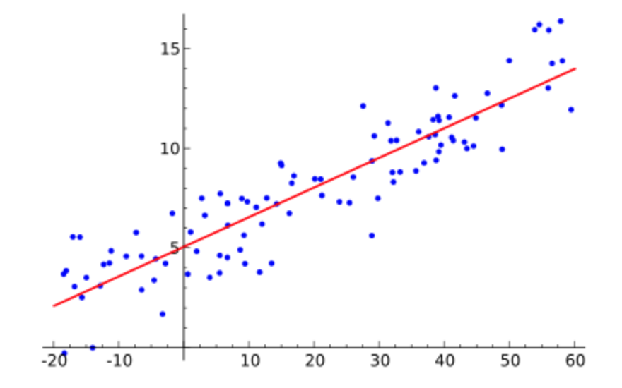
Image courtesy of Wikipedia
If we were to take a look at the graph above and ignore the red line, we could see that the graph is moderately strong, positive, and linear! There doesn’t seem to be any visible outliers. ➕
Since there are no labels for the x and y axes, we can safely use “x” and “y” as the respective labels for each. We also don’t have any points, so we’ll use estimates in the equation and interpretation below.
ŷ = 5 + 0.4x, where for every 1 unit increase in the x-axis, there is a 0.4 unit increase in the y-axis.
I calculated these values by eyeballing the graph. I knew that since the Line of Best Fit intersected at about (0, 5), the a value would be 5 as a represents the y-intercept. As for the b value, I eyeballed the graph and noticed there was an approximate slope of 0.4! (Gotta zoom in the picture to get to that point of approximation, though.) 👀
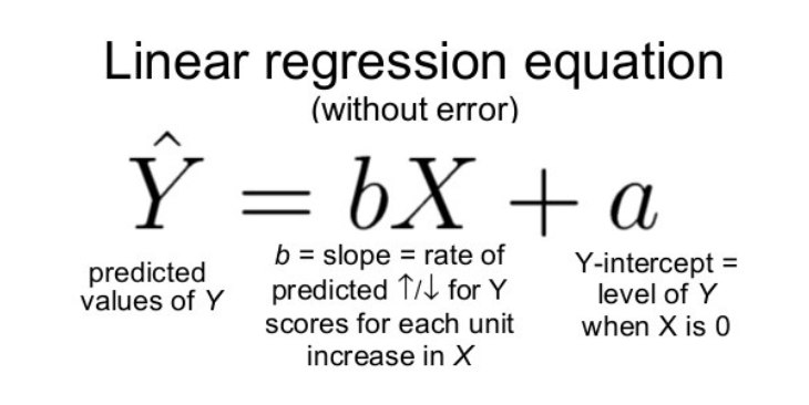
Calculating the Line of Best Fit
Doing hand calculations can be incredibly tedious and challenging, especially with large masses of data! Statisticians typically use a graphing calculator to ease this process. Performing this process should be achievable through most all calculator operating systems.

Image courtesy of Wikipedia
Press STAT
Press 1:EDIT
Enter all raw data into L1 and L2.
Press STAT again
Press the RIGHT arrow to be on the CALC module
Press 8:LinReg(a+bx)
Press ENTER
Once you press enter, you should see something similar to the following:
y = a + bx
a = value
b = value
Once you plug in the a and b values with their corresponding variables in the equation, you have your Line of Best Fit! 🎉
What to Take Away
The Line of Best Fit is what statisticians use to most accurately draw a linear line that reflects the entire graph. While the concept of the equation is generally the same as the linear equation, the value of y-hat is an estimation of a certain point’s y-value when it has an x-value assigned to it. 💯
Great work exploring another concept as a statistician! Wishing you the best of luck with your studies, and see you next time! 🌊
Simple Linear Regression (Line of Best Fit)
5 min read•november 23, 2021
William
William
How Do You Graph Simple Linear Regressions?
Welcome back to another quick guide, statisticians! When looking at data, statisticians interpret using several methods. One of the methods they use when analyzing data is graphing the Simple Linear Regression or the Line of Best Fit. 🙈
You’re not alone if you have no idea what that word means. It’s time to put on your statistician hat as we explore this idea! 🎩
Let’s get started! 🚀
Scatterplots: A Quick Recap
A scatterplot is a primary way that statisticians capture numerical data from two variables. Just like the graph you might use for an algebraic course, this graph will include x and y axes, where the y axis is dependent on the x-axis! For instance, if we had the variables “hours of sleep” and “test score,” the x-axis would be the hours of sleep, and the y-axis would be the test score because the test score is typically dependent on the hours of sleep. 😴
Image courtesy of Wikipedia
In a scatterplot, you’ll see many points all over a graph, and they may form a “line” of some sort, going in a specific direction. The Simple Linear Regression, or the Line of Best Fit, is a linear line that most accurately reflects the data’s overall trend as a whole, taking into account all points. 🏹
Line of Best Fit: the Equation
Since we know that the line that reflects the scatterplot’s data points will be linear, we can use the same equation we would use in a class like Algebra 1, except we’ll be using slightly different variables. We’ll have a slightly different structure! 👌
| Linear Parent Graph Equation | Statistics’ Line of Best Fit |
| y = mx + b | ŷ = a + bx |
| m is the slope, b is the y-intercept | a is the y-intercept, b is the slope |
With statistics, we'll want to be clear on the meaning of the variables! While the algebraic linear parent graph equation is universal because the x and y axes always remain the same, it is different for the x and y axes of statistics because they represent different things! For instance, one scatterplot could recognize hours of activity with coffee consumption, while another might correlate the association between ice cream consumption with degrees in Fahrenheit! ❕
(ŷ, otherwise known as y-hat, is the predicted value of y. This is because the Line of Best Fit is what most accurately reflects all the points collectively. Because scatterplots aren’t usually perfectly linear, this is the best estimation if you were to draw a line that most accurately reflects all the points in the scatterplot.)
You can use this sentence stem as a statistician to interpret the Line of Best Fit: 🌳
ŷ = [a] + [b]x, where for every 1 [type of x] increase in [x type] [(x descriptor)], there is a [b value] [b type] increase in [ŷ] [(ŷ descriptor)].
For instance, if we decided to compare degrees in Celsius (x) with water consumption by gallon per person (y), we could say the following:
ŷ = 0.75 + 0.04x where for every 1 degree increase in temperature (Celsius), there is a 0.04 increase in water consumption (gallon). (The numbers assigned are random)
To interpret this, that means that if x is equal to 15 degrees Celsius, the individual would, on average, drink the initial 0.75 gallons with the additional 0.04(15) gallons for a total of 0.6 gallons! 🥛
Line of Best Fit: an Interpretation
Let’s take some time to look at a Line of Best Fit to see a statistician’s interpretation and analysis in action!
Image courtesy of Wikipedia
If we were to take a look at the graph above and ignore the red line, we could see that the graph is moderately strong, positive, and linear! There doesn’t seem to be any visible outliers. ➕
Since there are no labels for the x and y axes, we can safely use “x” and “y” as the respective labels for each. We also don’t have any points, so we’ll use estimates in the equation and interpretation below.
ŷ = 5 + 0.4x, where for every 1 unit increase in the x-axis, there is a 0.4 unit increase in the y-axis.
I calculated these values by eyeballing the graph. I knew that since the Line of Best Fit intersected at about (0, 5), the a value would be 5 as a represents the y-intercept. As for the b value, I eyeballed the graph and noticed there was an approximate slope of 0.4! (Gotta zoom in the picture to get to that point of approximation, though.) 👀
Calculating the Line of Best Fit
Doing hand calculations can be incredibly tedious and challenging, especially with large masses of data! Statisticians typically use a graphing calculator to ease this process. Performing this process should be achievable through most all calculator operating systems.
Image courtesy of Wikipedia
Press STAT
Press 1:EDIT
Enter all raw data into L1 and L2.
Press STAT again
Press the RIGHT arrow to be on the CALC module
Press 8:LinReg(a+bx)
Press ENTER
Once you press enter, you should see something similar to the following:
y = a + bx
a = value
b = value
Once you plug in the a and b values with their corresponding variables in the equation, you have your Line of Best Fit! 🎉
What to Take Away
The Line of Best Fit is what statisticians use to most accurately draw a linear line that reflects the entire graph. While the concept of the equation is generally the same as the linear equation, the value of y-hat is an estimation of a certain point’s y-value when it has an x-value assigned to it. 💯
Great work exploring another concept as a statistician! Wishing you the best of luck with your studies, and see you next time! 🌊
Resources
© 2024 Fiveable Inc. All rights reserved.
AP® and SAT® are trademarks registered by the College Board, which is not affiliated with, and does not endorse this website.