Data can be enormous and hard to understand when observed in its raw, unprocessed likeness. For this purpose, statistics was created to help us organize and analyze data. First, values are organized in tables; then, data are graphed in different displays.
Tables are a necessary step to start analyzing data, but it may fail to highlight essential features with data. The graphical displays are visually attractive, easy to read, and see important patterns of the distribution. For categorical variables, the choices are limited. Bar graphs and pie charts are the most common displays when looking at data in chart-like formats.
Frequency Tables
Let's say we just finished sending out a survey to our AP Statistics class on how stressful being a student is as a hypothetical occupation with our categories being "very," "somewhat," and "none" (not stressful at all). We, then, have collected 30 responses. How do we organize these responses and make sense of them?
One way to do so is to “pile” the data by counting the number of data values in each category of interest. From there, we can organize these counts into a frequency table, which records the totals and the category names.
At this point, you might wonder: "Wait, what's a frequency table?"
A frequency table for qualitative data lists all categories in one column and the number of elements that belong to each of the categories on the next column. Tallies (e.g., ||||) can be used to number the raw data. The frequency table has the following look:
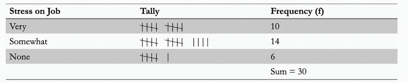

The variable is stress on job, which assumes three categories; very, somewhat, and none. Since there is some order, stress on job can be ranked as an ordinal variable. The frequency table always reports the sum of the frequencies that makes up our sample.
Extension: Relative Frequency Tables
The concept of frequency tables can be extended using relative frequencies and percentages.
- The relative frequency is found by dividing the frequency for each category by the sum of all frequencies.
- The percentage is obtained by multiplying the relative frequency of category by 100.
Relative frequency of a category = Frequency of that cat category / Sum of all frequencies Percentage = Relative frequency * 100
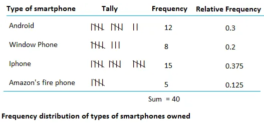
With these quantities in mind, a relative frequency table is similar, but it gives the percentages for each category instead of counts. Based on the relative frequency and percentage distributions of stress on job, we can state that the 33.3% of the employees answered that their jobs are very stressful. Another way to interpret the data is by combining the groups "very" and "somewhat" stressed and report that 80% of the employees answered that jobs are very or somewhat stressful.
The image below shows the difference between frequency and relative frequency. Unlike frequencies which typically add up to whatever total count of items/respondents there are, tThe sum of the relative frequencies should be 1.00 or close to 1.00 if the relative frequencies have been rounded. Similarly, the sum of the percentages is always 100 or close 100 if the percentages have been rounded as well.
Summary
- A frequency table is a list that shows how often each value occurs in a set of data. It shows the number of times (or frequency) that each value appears in the data.
For example, consider the following data set: 2, 3, 3, 5, 5, 5, 7, 7, 9. A frequency table for this data set would look like this:
Value ---- Frequency
2 ---- 1
3 ---- 2
5 ---- 3
7 ---- 2
9 ---- 1
- A relative frequency table is similar to a frequency table, but it shows the relative frequency of each value in the data set. This means that the frequencies are expressed as a proportion of the total number of values in the data set.
For example, the relative frequencies for the data set above would be:
Value ---- Relative Frequency
2 ---- 0.1
3 ---- 0.2
5 ---- 0.3
7 ---- 0.2
9 ---- 0.1
- The sum of the relative frequencies in a relative frequency table is always 1.
- Both frequency tables and relative frequency tables are useful tools for organizing and summarizing data. They can help you see patterns and trends in the distribution of the data, and they can be used to make predictions or draw conclusions about the data.
🎥 Watch: AP Stats - Analyzing Categorical Variables
Vocabulary
The following words are mentioned explicitly in the College Board Course and Exam Description for this topic.
| Term | Definition |
|---|---|
| categorical data | Data that represents categories or groups rather than numerical measurements, such as colors, types, or classifications. |
| frequency table | A table that displays the number of cases or observations falling into each category. |
| percentage | A proportion expressed as a number out of 100, calculated by multiplying the relative frequency by 100. |
| proportion | A part or share of a whole, expressed as a fraction, decimal, or percentage. |
| rate | A ratio that compares two quantities with different units, often used to express frequency or occurrence per unit. |
| relative frequency | The proportion of observations in a category, expressed as a decimal, fraction, or percentage of the total. |
| relative frequency table | A table that displays the proportion or percentage of cases falling into each category. |
Frequently Asked Questions
How do I make a frequency table for categorical data?
Make a frequency table in 4 easy steps: 1. List the categories (clear labels) in one column—that’s your categorical variable. 2. Count cases in each category and put those counts in a “Frequency” column (these are the counts the CED calls a frequency table). 3. Add a “Relative frequency” column: frequency ÷ total n (or multiply by 100 for percent). These give proportions/percentages (UNC-1.A.1, UNC-1.B.1). 4. Check totals: frequencies should sum to n and relative frequencies should sum to 1 (or ~100%). Highlight the modal category (largest frequency). If you have two categorical variables, make a two-way (contingency) table showing joint counts with row/column marginal totals and optionally row or column percentages to compare conditional distributions (row % / column %). Use these tables to describe patterns and support claims in context on the AP exam (Topic 1.3: represent categorical data with frequency/relative tables). For a quick walkthrough, see the Fiveable study guide (https://library.fiveable.me/ap-statistics/unit-1/representing-categorical-variable-with-tables/study-guide/JUZVd7cRAnbarZyNoEAg). For more practice, try problems at (https://library.fiveable.me/practice/ap-statistics).
What's the difference between frequency and relative frequency tables?
A frequency table shows counts (how many cases) in each category; a relative frequency table shows proportions or percentages of the total in each category. The CED’s essential knowledge (UNC-1.A.1) says frequency = number of cases, relative frequency = proportion of cases. Use counts when you need raw totals (e.g., how many students chose option A) and relative frequencies when you want to compare groups of different sizes or report percentages (they sum to 1 or 100%). Both can point out the modal category, and relative frequencies make it easier to compare distributions or describe rates on the exam. For contingency/two-way tables, you’ll often report row or column percentages (relative frequencies) to describe associations. Want more practice or a quick refresher? Check the Topic 1.3 study guide (https://library.fiveable.me/ap-statistics/unit-1/representing-categorical-variable-with-tables/study-guide/JUZVd7cRAnbarZyNoEAg) and grab practice problems at (https://library.fiveable.me/practice/ap-statistics).
When do I use a frequency table vs a relative frequency table?
Use a frequency table when you just need counts: how many cases fall into each category (CED UNC-1.A.1). Use a relative frequency table when you want proportions/percentages (same idea as rates) so you can compare categories on the same scale—especially when sample sizes differ or when you’re comparing groups (CED UNC-1.B.1). Quick rules: - If the question asks “how many,” make a frequency table. - If it asks “what percent” or you need fair comparisons across different-sized groups, make a relative frequency table (or convert counts to row/column percent in a contingency/two-way table). - On the AP exam you should be comfortable describing distributions from either table (center, mode, variability) and using proportions/percentages to justify claims (UNC-1.B). For a short practice refresher and examples, check the Topic 1.3 study guide (https://library.fiveable.me/ap-statistics/unit-1/representing-categorical-variable-with-tables/study-guide/JUZVd7cRAnbarZyNoEAg). For more practice questions, see the unit hub (https://library.fiveable.me/ap-statistics/unit-1) and the practice bank (https://library.fiveable.me/practice/ap-statistics).
How do I calculate relative frequency from a frequency table?
Relative frequency = the proportion of cases in a category. From a frequency table: 1) add up all counts to get the total n; 2) divide each category’s count by n. That quotient is the relative frequency (a proportion). Multiply by 100 to get a percent. Example: if “Blue” has frequency 30 and total n = 120, relative frequency = 30/120 = 0.25 = 25%. For two-way (contingency) tables you can compute joint (cell count ÷ total n), row (cell ÷ row total) or column (cell ÷ column total) relative frequencies—use row/column percentages to describe associations. Relative-frequency tables are what the CED calls for when representing categorical data (UNC-1.A.1) and are useful on the exam for describing distributions and justifying claims (UNC-1.B). For a quick review, check the Topic 1.3 study guide (https://library.fiveable.me/ap-statistics/unit-1/representing-categorical-variable-with-tables/study-guide/JUZVd7cRAnbarZyNoEAg). For broader unit review and lots of practice problems, see (https://library.fiveable.me/ap-statistics/unit-1) and (https://library.fiveable.me/practice/ap-statistics).
I'm confused about proportions vs percentages - are they the same thing?
Short answer: they’re the same information, just different ways to show it. A proportion is a number between 0 and 1 that describes the fraction of cases in a category (e.g., 0.25). A percentage is that same proportion multiplied by 100 (e.g., 25%). On the AP CED for Topic 1.3, relative frequency = proportion, and the CED explicitly says percentages, relative frequencies, and rates all provide the same information as proportions. So in a relative frequency table you might report 0.12 (proportion) or 12% (percentage)—both mean the same thing. Why it matters for the exam: many MC and FR questions ask for proportions (p or p̂) or give percentages; you should be comfortable converting (multiply proportion by 100 to get percent, divide percent by 100 to get proportion). For more practice and review of frequency vs relative frequency tables, see the Topic 1.3 study guide (https://library.fiveable.me/ap-statistics/unit-1/representing-categorical-variable-with-tables/study-guide/JUZVd7cRAnbarZyNoEAg) and thousands of practice problems (https://library.fiveable.me/practice/ap-statistics).
Can someone explain step by step how to convert frequencies to relative frequencies?
Step-by-step: converting frequencies → relative frequencies 1. Get your frequency table: list each category and its count (frequency). Example: A=30, B=50, C=20. 2. Find the total count (sum of frequencies). Example total = 30+50+20 = 100. 3. For each category divide its frequency by the total to get the relative frequency (a proportion). Example: A: 30/100 = 0.30, B: 50/100 = 0.50, C: 20/100 = 0.20. 4. (Optional) Convert to percent by multiplying by 100: 30%, 50%, 20%. AP exam often expects proportions or percents—both communicate the same info (UNC-1.A). 5. Quick checks: the relative frequencies should sum to 1 (or 100%). If working with two-way (contingency) tables, do this for joint cells and you can also compute row/column marginal relative frequencies (row/column percentages) to describe distributions. For practice and more examples tied to the CED, see the Topic 1.3 study guide (https://library.fiveable.me/ap-statistics/unit-1/representing-categorical-variable-with-tables/study-guide/JUZVd7cRAnbarZyNoEAg) and extra problems (https://library.fiveable.me/practice/ap-statistics).
What's the formula for finding relative frequency?
Relative frequency = (count in a category) ÷ (total number of cases). So if 30 students prefer pizza out of 120 total, the relative frequency = 30/120 = 0.25 (or 25% when you multiply by 100). A relative frequency table lists these proportions for every category and the proportions should sum to 1 (or 100%). This is exactly what the CED calls for: counts vs. proportions in frequency and relative frequency tables (UNC-1.A.1, UNC-1.B.1). If you want practice turning counts into relative frequencies and checking they add to 1, see the Topic 1.3 study guide (https://library.fiveable.me/ap-statistics/unit-1/representing-categorical-variable-with-tables/study-guide/JUZVd7cRAnbarZyNoEAg). For more unit review and lots of practice problems, check the unit page (https://library.fiveable.me/ap-statistics/unit-1) and practice set (https://library.fiveable.me/practice/ap-statistics).
How do I know if I should report my data as counts or percentages?
Use counts (frequency table) when you want the actual number of cases in each category; use percentages/relative frequencies when you want to compare proportions across groups or when sample sizes differ. The CED calls these frequency and relative frequency tables (UNC-1.A.1). Quick rules: - Report counts when context needs raw totals (how many students chose A?). - Report percentages when comparing groups with different sizes (percent of seniors vs percent of juniors), or when you want a sense of proportion (50% vs 30%). - For two-way tables, give row or column percentages to describe conditional distributions (helps avoid misleading comparisons from unequal margins). On the AP exam, you may be asked to represent categorical data with either type and to describe it (UNC-1.B). For a short refresher, see the Topic 1.3 study guide (https://library.fiveable.me/ap-statistics/unit-1/representing-categorical-variable-with-tables/study-guide/JUZVd7cRAnbarZyNoEAg). For more practice, check Fiveable’s AP Stats practice problems (https://library.fiveable.me/practice/ap-statistics).
I don't understand when to use rates vs proportions vs percentages - they all seem the same?
They really are the same information presented differently—the CED even says “percentages, relative frequencies, and rates all provide the same information as proportions.” Use whichever format fits the context: - Proportion: a fraction of the whole (e.g., 30/120 = 0.25). Good for math work and tables (relative frequency table). - Percentage: proportion × 100, shown with “%” (0.25 = 25%). Use this when communicating results to people—it’s clearer. - Rate: a proportion expressed per some standard size or time (e.g., 25 per 100, or 250 per 1,000, or 5 cases per year). Use rates when denominators differ or you need a “per unit” comparison (different population sizes, time windows). On the AP, you should be comfortable switching among them and reporting counts plus relative frequencies (or percentages) from frequency/contingency tables to justify claims in context (UNC-1.A.1, UNC-1.B.2). For practice, review Topic 1.3 study guide (https://library.fiveable.me/ap-statistics/unit-1/representing-categorical-variable-with-tables/study-guide/JUZVd7cRAnbarZyNoEAg) and hit practice problems (https://library.fiveable.me/practice/ap-statistics).
How do I describe patterns in a frequency table for an FRQ?
Start by naming the categorical variable and the sample (who/what and how many). Then describe the table using counts and relative frequencies (percentages): give the modal category (largest count/%) and report at least one or two other category percentages for comparison. Mention shape of the distribution of categories (e.g., “most are X, fewest are Y”) and any notable gaps. If it’s a two-way/contingency table, give relevant row or column percentages and state the marginal distributions; highlight any association (one category tends to occur more with another). Always speak in context (use the actual category labels and units) and justify claims with numbers from the table (counts or %). Use proportions/percentages rather than vague words, and be concise—AP FRQs reward clear, contextual statements tied to data (Skill 2.A). For a quick refresher, check the Topic 1.3 study guide (https://library.fiveable.me/ap-statistics/unit-1/representing-categorical-variable-with-tables/study-guide/JUZVd7cRAnbarZyNoEAg) and practice plenty of table problems (https://library.fiveable.me/practice/ap-statistics).
What does it mean to justify claims about categorical data using frequencies?
“Justify claims using frequencies” means you use the counts (or proportions/percentages) in a frequency or relative-frequency table to support a specific statement about the data in context. For example: “30 of 120 students (25%) prefer online classes,” or “category A has the largest count, so it’s the modal category.” Good justification does three things: (1) names the relevant counts or relative frequencies, (2) compares categories (e.g., bigger/smaller, or X is twice as common as Y), and (3) ties it back to context (what that difference means). On the AP exam this is Skill 2.A/Skill 4 territory: you’re expected to describe and defend conclusions using counts, proportions, row/column percentages (or margins and joint distributions in two-way tables). Practice phrasing: “Because 60% (48/80) of respondents chose B versus 20% (16/80) for C, the data support the claim that B is more common in this population.” For extra practice and examples, see the Topic 1.3 study guide (https://library.fiveable.me/ap-statistics/unit-1/representing-categorical-variable-with-tables/study-guide/JUZVd7cRAnbarZyNoEAg) and the Unit 1 overview (https://library.fiveable.me/ap-statistics/unit-1). For more practice problems, try (https://library.fiveable.me/practice/ap-statistics).
How do I convert relative frequencies back to actual counts?
If you have relative frequencies and want counts, multiply each relative frequency by the total sample size: count = (relative frequency) × n. If the relative frequency is a percent, convert it first by dividing by 100. Example: RF = 0.25 (or 25%) and n = 200 → count = 0.25×200 = 50. A few practical notes for AP-style questions (UNC-1.A): - If the table is a two-way (joint/row/column) and you’re given a marginal total, use that marginal n for the appropriate conversion (e.g., row percent × row total). - Because counts must be integers, round carefully and check that all counts sum to n; if they don’t, adjust logically (usually by distributing rounding differences to the largest categories). - This is exactly the skill tested when moving between frequency and relative frequency tables on the AP (see the Topic 1.3 study guide) (https://library.fiveable.me/ap-statistics/unit-1/representing-categorical-variable-with-tables/study-guide/JUZVd7cRAnbarZyNoEAg). For more practice, try problems at (https://library.fiveable.me/practice/ap-statistics).
When analyzing categorical data, should I focus more on the frequencies or relative frequencies?
Use relative frequencies (percentages/proportions) most of the time. Counts (frequencies) tell you how many cases are in each category (UNC-1.A.1), which matters for context and checking sample size, but relative frequencies let you compare categories and different-sized groups directly—e.g., 30 students out of 60 (50%) vs 30 out of 120 (25%). For AP tasks you’ll often report proportions/percentages when describing categorical distributions or justifying claims (UNC-1.B.1–B.2, Skill 2.A/B). Quick rules: - Use counts when you need actual totals or to check whether inference conditions (sample size, expected counts) are met. - Use relative frequencies (or percentages) to compare categories, describe marginal/joint/conditional distributions, or present results on the exam. Want examples and practice? Review Topic 1.3 (study guide) (https://library.fiveable.me/ap-statistics/unit-1/representing-categorical-variable-with-tables/study-guide/JUZVd7cRAnbarZyNoEAg) and try practice problems (https://library.fiveable.me/practice/ap-statistics).
What's the difference between a proportion and a rate in statistics?
A proportion is a relative frequency: part ÷ whole (like 30 students wearing glasses out of 120 → 30/120 = 0.25 or 25%). In Topic 1.3 the CED calls these “relative frequencies” and shows they’re used in relative frequency tables and percentages. A rate gives the same kind of comparative idea but with a specified unit (often time or population size): e.g., 25 cases per 1,000 people or 3 accidents per month. Practically, proportions are unitless (0 to 1) and good for categorical distributions; rates include a denominator with units and are used when you need to standardize across different-sized groups or time periods. Both convey the same basic information as proportions/percentages (CED UNC-1.B.1), but choose “rate” when you want to emphasize “per ___” (per 100, per 1,000, per year). For more on making and interpreting relative frequency tables, check the Topic 1.3 study guide (https://library.fiveable.me/ap-statistics/unit-1/representing-categorical-variable-with-tables/study-guide/JUZVd7cRAnbarZyNoEAg) and try practice problems (https://library.fiveable.me/practice/ap-statistics).
I missed class - can someone explain what UNC-1.A and UNC-1.B are asking me to do with tables?
UNC-1.A asks you to make frequency or relative-frequency tables for a categorical variable: count how many observations fall in each category (frequency table) or convert those counts to proportions/percentages (relative-frequency table). Use clear category labels and make sure the probabilities (relative frequencies) sum to 1 (or 100%). UNC-1.B wants you to describe what those tables tell you. That means reading counts, proportions, modal category, and using them to justify claims in context—e.g., “40% of students prefer A, so A is the modal category” or comparing row/column percentages in a two-way (contingency) table to discuss associations. Mention marginal, joint, and conditional distributions when you have two categorical variables. On the AP exam they expect you to build and interpret these tables (Skill 2.A and 2.B), and to use counts vs. proportions appropriately. For a quick review, see the Topic 1.3 study guide (https://library.fiveable.me/ap-statistics/unit-1/representing-categorical-variable-with-tables/study-guide/JUZVd7cRAnbarZyNoEAg). For broader review and lots of practice, check the Unit 1 overview (https://library.fiveable.me/ap-statistics/unit-1) and practice problems (https://library.fiveable.me/practice/ap-statistics).