Static visualizations are essential tools in data science, allowing us to present complex information clearly and effectively. They help us identify patterns, trends, and outliers in datasets, supporting data-driven decision-making and hypothesis generation.
Understanding different types of static visualizations enables us to choose the best method for presenting our findings. From bar charts and histograms to scatter plots and heatmaps, each type serves a specific purpose in data representation and analysis.
Types of static visualizations
- Static visualizations play a crucial role in Reproducible and Collaborative Statistical Data Science by providing clear, fixed representations of data for analysis and communication
- These visualizations serve as powerful tools for identifying patterns, trends, and outliers in datasets, facilitating data-driven decision-making and hypothesis generation
- Understanding various types of static visualizations enables data scientists to choose the most appropriate method for presenting their findings effectively
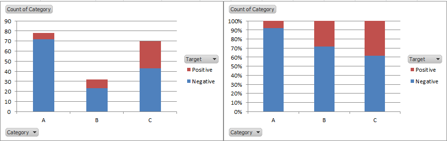
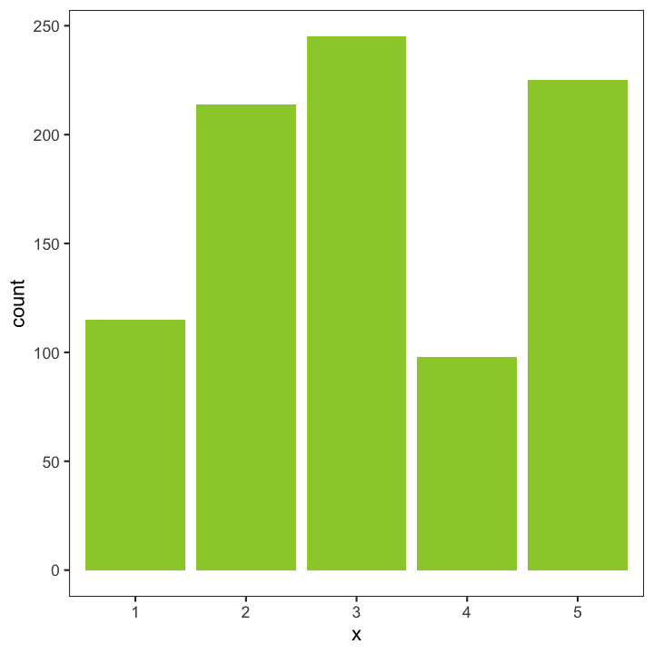
Bar charts vs histograms
- Bar charts display categorical data using rectangular bars with heights proportional to the values they represent
- Use bar charts to compare discrete categories or groups (age groups, product types)
- Histograms visualize the distribution of continuous numerical data by dividing it into bins
- Apply histograms to show frequency distributions and identify patterns in data (income distribution, test scores)
- Key difference lies in data type represented bar charts for categorical, histograms for continuous
Scatter plots and line graphs
- Scatter plots display the relationship between two continuous variables using individual data points
- Utilize scatter plots to identify correlations, clusters, or outliers in datasets (height vs. weight, advertising spend vs. sales)
- Line graphs connect data points with lines to show trends over time or continuous variables
- Implement line graphs for visualizing time series data or comparing multiple variables (stock prices over time, temperature changes)
- Both plot types can incorporate additional dimensions through color, size, or shape of markers
Box plots and violin plots
- Box plots (box-and-whisker plots) summarize the distribution of numerical data using quartiles
- Display median, interquartile range, and potential outliers in a compact form
- Violin plots combine box plot features with kernel density estimation to show the full distribution shape
- Use violin plots to visualize the probability density of the data at different values
- Both plot types excel at comparing distributions across multiple categories or groups
Heatmaps and choropleth maps
- Heatmaps use color-coding to represent data values in a two-dimensional grid
- Apply heatmaps to visualize correlations between variables or patterns in large datasets (gene expression data, customer behavior)
- Choropleth maps display statistical variables across geographic regions using color gradients
- Utilize choropleth maps for spatial data analysis and regional comparisons (population density, election results by state)
- Both types effectively communicate complex data patterns through color variations
Pie charts and donut charts
- Pie charts represent parts of a whole using slices of a circular graph
- Use pie charts sparingly, best for displaying proportions of a limited number of categories (market share, budget allocation)
- Donut charts are similar to pie charts but with a hollow center
- Apply donut charts when you want to emphasize the total value or include additional information in the center
- Both chart types can be effective for showing composition but may become difficult to interpret with too many categories
Elements of effective visualizations
- Effective visualizations in Reproducible and Collaborative Statistical Data Science enhance data comprehension and facilitate clear communication of findings
- These elements work together to create visually appealing and informative graphics that support data-driven decision-making
- Mastering these elements enables data scientists to produce consistent, high-quality visualizations across various projects and collaborations
Color schemes and palettes
- Choose color schemes that enhance data readability and interpretation
- Use colorblind-friendly palettes to ensure accessibility (viridis, RColorBrewer)
- Apply sequential color scales for continuous data (light to dark shades)
- Implement diverging color scales for data with a meaningful midpoint (positive and negative values)
- Consider cultural associations and emotional responses to colors when designing visualizations
Typography and labeling
- Select clear, legible fonts for all text elements in the visualization
- Use consistent font sizes and styles for different levels of information (titles, axis labels, annotations)
- Implement proper alignment and spacing of labels to enhance readability
- Apply meaningful and concise titles, subtitles, and axis labels to provide context
- Consider using direct labeling instead of legends when appropriate to reduce cognitive load
Scales and axes
- Choose appropriate scales (linear, logarithmic, categorical) based on the data and visualization goals
- Ensure axes start at zero for bar charts to avoid misrepresentation of data
- Use consistent scales across multiple plots for easy comparison
- Implement clear and informative tick marks and labels on axes
- Consider breaking axes or using inset plots for data with extreme outliers
Legends and annotations
- Design clear and concise legends that explain all visual elements (colors, shapes, sizes)
- Position legends to minimize interference with the main visualization
- Use annotations to highlight key points or provide additional context
- Implement data labels directly on the visualization when appropriate
- Consider using interactive tooltips for detailed information in digital formats
Data-ink ratio
- Maximize the data-ink ratio by removing non-essential elements (chartjunk)
- Eliminate redundant information and decorative elements that do not contribute to data understanding
- Use minimal gridlines and axis lines to reduce visual clutter
- Consider using white space effectively to enhance readability and focus attention
- Balance simplicity with necessary context to create clear and informative visualizations
Tools for static visualizations
- Various tools for creating static visualizations support Reproducible and Collaborative Statistical Data Science workflows
- These tools offer different levels of customization, integration with data analysis pipelines, and reproducibility features
- Choosing the appropriate tool depends on the specific project requirements, team expertise, and desired output format
Base R graphics
- Built-in graphics system in R programming language
- Provides low-level control over plot elements
- Offers a wide range of plot types and customization options
- Requires more code for complex visualizations compared to ggplot2
- Useful for quick exploratory data analysis and custom plot creation
ggplot2 fundamentals
- Popular R package for creating static visualizations based on the Grammar of Graphics
- Implements a layered approach to building plots
- Offers consistent syntax and theming capabilities
- Provides extensive customization options and extensions
- Integrates well with other tidyverse packages for data manipulation and analysis
Python's matplotlib and seaborn
- Matplotlib serves as the foundation for most Python plotting libraries
- Offers low-level control similar to base R graphics
- Seaborn builds on matplotlib to provide statistical visualizations
- Both libraries support a wide range of plot types and customization options
- Integrate well with data analysis workflows in Jupyter notebooks
JavaScript's D3.js
- Powerful library for creating interactive and static visualizations on the web
- Offers fine-grained control over visual elements and animations
- Supports creation of custom, highly interactive visualizations
- Requires more programming knowledge compared to other tools
- Useful for creating web-based dashboards and interactive reports
Tableau for static exports
- User-friendly data visualization software with drag-and-drop interface
- Supports creation of a wide range of chart types and dashboards
- Offers options to export static visualizations for reports and presentations
- Provides integration with various data sources and analysis tools
- Useful for quick exploration and creation of polished visualizations without coding
Best practices in visualization
- Adhering to best practices in visualization ensures clarity, accuracy, and effectiveness in communicating data insights
- These practices support the goals of Reproducible and Collaborative Statistical Data Science by promoting consistent and reliable visual representations
- Implementing these best practices helps create visualizations that are both informative and accessible to diverse audiences
Choosing appropriate chart types
- Select chart types based on the nature of the data and the message to be conveyed
- Use bar charts for comparing categories, line charts for trends over time
- Apply scatter plots for exploring relationships between variables
- Implement heat maps for visualizing patterns in large datasets
- Consider the audience's familiarity with different chart types when making selections
Handling missing or outlier data
- Clearly indicate missing data in visualizations (gaps in line charts, distinct color for NA values)
- Use appropriate techniques to handle outliers (log scales, winsorization)
- Consider creating separate visualizations to focus on outliers or extreme values
- Implement box plots or violin plots to show distribution and identify potential outliers
- Provide context and explanations for how missing data and outliers are treated
Accessibility considerations
- Design visualizations with color-blind friendly palettes (avoid red-green combinations)
- Use patterns or textures in addition to color to differentiate data points
- Ensure sufficient contrast between text and background colors
- Provide alternative text descriptions for images in digital formats
- Consider creating multiple versions of complex visualizations for different accessibility needs
Avoiding visual deception
- Start y-axes at zero for bar charts to avoid misrepresentation of differences
- Use consistent scales when comparing multiple charts
- Avoid 3D effects that can distort perception of values
- Be cautious with truncated axes and provide clear indications when used
- Use appropriate aspect ratios to accurately represent data relationships
Balancing aesthetics and information
- Prioritize clarity and accuracy of data representation over decorative elements
- Use color and design elements to enhance understanding, not distract from it
- Implement a consistent visual style across related visualizations
- Consider the context and medium of presentation (print, digital, presentation)
- Iterate on designs to find the optimal balance between visual appeal and information content
Statistical considerations
- Incorporating statistical considerations in visualizations is crucial for accurate and meaningful data representation in Reproducible and Collaborative Statistical Data Science
- These considerations help communicate the reliability and significance of findings, supporting informed decision-making
- Understanding and implementing these statistical aspects enhances the credibility and interpretability of visual data presentations
Visualizing uncertainty
- Incorporate error bars or confidence intervals in bar charts and line graphs
- Use shaded regions to represent uncertainty in time series or trend lines
- Implement violin plots or box plots to show distribution alongside point estimates
- Consider using gradient colors to indicate levels of certainty in heat maps or choropleth maps
- Provide clear explanations of how uncertainty is represented in the visualization
Confidence intervals in plots
- Display confidence intervals as error bars or shaded regions around point estimates
- Use consistent methods for calculating and representing confidence intervals across related visualizations
- Consider asymmetric confidence intervals when appropriate (bootstrapped intervals)
- Implement interactive features to show exact confidence interval values on hover or click
- Explain the interpretation of confidence intervals in the context of the data and analysis
Effect sizes and visual comparisons
- Use appropriate visual encodings to represent effect sizes (bar lengths, point sizes)
- Implement forest plots for meta-analyses or comparing multiple effect sizes
- Consider using standardized effect sizes for easier comparison across different measures
- Provide visual references or benchmarks to help interpret the magnitude of effects
- Include explanations of how effect sizes are calculated and what they represent in the context of the study
Sample size and visual representations
- Adjust point sizes or opacity in scatter plots to reflect sample sizes
- Use weighted averages in line charts when aggregating data from different sample sizes
- Implement funnel plots to visualize the relationship between effect size and sample size
- Provide clear indications of sample sizes in legends or annotations
- Consider creating separate visualizations for subgroups with significantly different sample sizes
Multiple comparisons in graphics
- Use appropriate correction methods for multiple comparisons (Bonferroni, false discovery rate)
- Implement visual cues to indicate statistically significant differences (asterisks, connecting lines)
- Consider using adjusted p-values or q-values in visualizations of multiple hypothesis tests
- Provide clear explanations of how multiple comparisons are handled in the analysis
- Use techniques like small multiples to facilitate comparisons across multiple groups or variables
Reproducibility in visualizations
- Ensuring reproducibility in visualizations is a core principle of Reproducible and Collaborative Statistical Data Science
- Reproducible visualizations allow for verification, replication, and extension of research findings
- Implementing these practices facilitates collaboration, enhances transparency, and improves the overall quality of data-driven research
Version control for plots
- Use version control systems (Git) to track changes in visualization code and output
- Implement meaningful commit messages to document changes and rationale
- Create branches for experimental visualizations or different project stages
- Use tags to mark specific versions of visualizations for publications or presentations
- Consider using tools like GitHub or GitLab for collaborative version control
Parameterized reports
- Create dynamic reports using tools like R Markdown or Jupyter Notebooks
- Implement parameters to allow easy updating of visualizations with new data
- Use conditional statements to create flexible visualizations based on input parameters
- Provide clear documentation of all parameters and their effects on the visualizations
- Consider creating interactive dashboards for exploring different parameter combinations
Consistent styling across projects
- Develop and maintain a style guide for visualizations within a team or organization
- Create custom themes or templates that can be easily applied across different projects
- Use consistent color palettes, fonts, and layouts for related visualizations
- Implement standardized naming conventions for files, variables, and functions
- Consider creating a shared library of commonly used visualization functions
Documentation of visualization code
- Provide clear and comprehensive comments in visualization code
- Create README files explaining the purpose, data sources, and dependencies of visualization projects
- Use literate programming techniques to combine code, visualizations, and explanations
- Document any data preprocessing steps that affect the final visualization
- Consider creating flowcharts or diagrams to illustrate complex visualization pipelines
Sharing and collaborating on visuals
- Use collaborative platforms (GitHub, GitLab) to share visualization code and outputs
- Implement clear guidelines for contributing to shared visualization projects
- Consider using containerization (Docker) to ensure consistent environments for reproduction
- Provide licenses and usage instructions for shared visualizations and code
- Use tools like Binder or RStudio Connect to create interactive, shareable versions of visualizations
Advanced techniques
- Advanced visualization techniques in Reproducible and Collaborative Statistical Data Science enable more complex and informative data representations
- These techniques allow for the exploration and communication of multidimensional data and complex relationships
- Mastering these advanced methods enhances the ability to extract and convey deeper insights from complex datasets
Small multiples and faceting
- Create multiple small plots of the same type to compare across categories or time periods
- Use faceting in ggplot2 to automatically create small multiples based on data variables
- Apply consistent scales and axes across all small multiples for easy comparison
- Consider the arrangement and ordering of small multiples to highlight patterns or trends
- Use small multiples to reduce the need for complex, multi-variable single plots
Combining multiple plot types
- Overlay different plot types to show multiple aspects of data simultaneously (scatter plot with trend line)
- Use dual y-axes carefully to display related variables with different scales
- Implement marginal histograms or box plots alongside scatter plots to show distributions
- Create dashboard-style layouts combining different chart types for comprehensive data views
- Consider using interactive techniques to allow switching between different plot types
Custom themes and styles
- Develop personalized themes that reflect brand identity or project-specific requirements
- Create reusable theme functions in R or Python to ensure consistency across projects
- Customize color palettes to enhance data representation and accessibility
- Implement typography choices that improve readability and visual appeal
- Consider creating theme variations for different output formats (print, web, presentation)
Geospatial visualizations
- Use appropriate map projections based on the geographic area and purpose of the visualization
- Implement choropleth maps to show variations of a variable across geographic regions
- Apply point maps or heat maps to visualize density or intensity of events in space
- Consider using cartograms to represent data values through distortion of geographic areas
- Integrate interactive features for zooming, panning, and exploring geospatial data
Network and graph visualizations
- Represent complex relationships between entities using nodes and edges
- Apply force-directed layouts to automatically position nodes based on their connections
- Use edge thickness or color to represent strength or type of relationships
- Implement interactive features to explore large networks (zooming, filtering, highlighting)
- Consider using hierarchical layouts for visualizing organizational structures or taxonomies
Ethical considerations
- Ethical considerations in data visualization are paramount in Reproducible and Collaborative Statistical Data Science
- These considerations ensure that visualizations accurately and fairly represent data without introducing bias or misleading interpretations
- Adhering to ethical principles in visualization promotes trust, transparency, and responsible use of data in research and decision-making
Representing diverse populations
- Ensure visualizations accurately represent the diversity of studied populations
- Use inclusive language and imagery in labels and annotations
- Consider disaggregating data to show outcomes for different demographic groups
- Avoid reinforcing stereotypes through visual representations or color choices
- Provide context about the composition and limitations of the represented population
Cultural sensitivity in visuals
- Be aware of cultural differences in color symbolism and imagery
- Avoid using culturally insensitive icons or symbols in visualizations
- Consider localization of visualizations for international audiences
- Use neutral and inclusive terminology in labels and descriptions
- Seek feedback from diverse stakeholders to identify potential cultural issues
Transparency in data sources
- Clearly cite and attribute all data sources used in visualizations
- Provide information about data collection methods and limitations
- Include links or references to original datasets when possible
- Disclose any data transformations or preprocessing steps
- Consider creating data provenance visualizations for complex data pipelines
Avoiding misleading visualizations
- Use appropriate scales and axes to accurately represent data relationships
- Avoid cherry-picking data or time periods to support a particular narrative
- Clearly indicate when data has been extrapolated or estimated
- Use consistent comparisons and benchmarks across related visualizations
- Provide context and explanations for potentially surprising or counterintuitive findings
Privacy concerns in data display
- Ensure individual data points cannot be used to identify specific persons
- Use aggregation or anonymization techniques when working with sensitive data
- Consider the implications of combining multiple data sources that could lead to re-identification
- Obtain necessary permissions and consents for displaying personal or sensitive information
- Implement appropriate access controls for visualizations containing confidential data