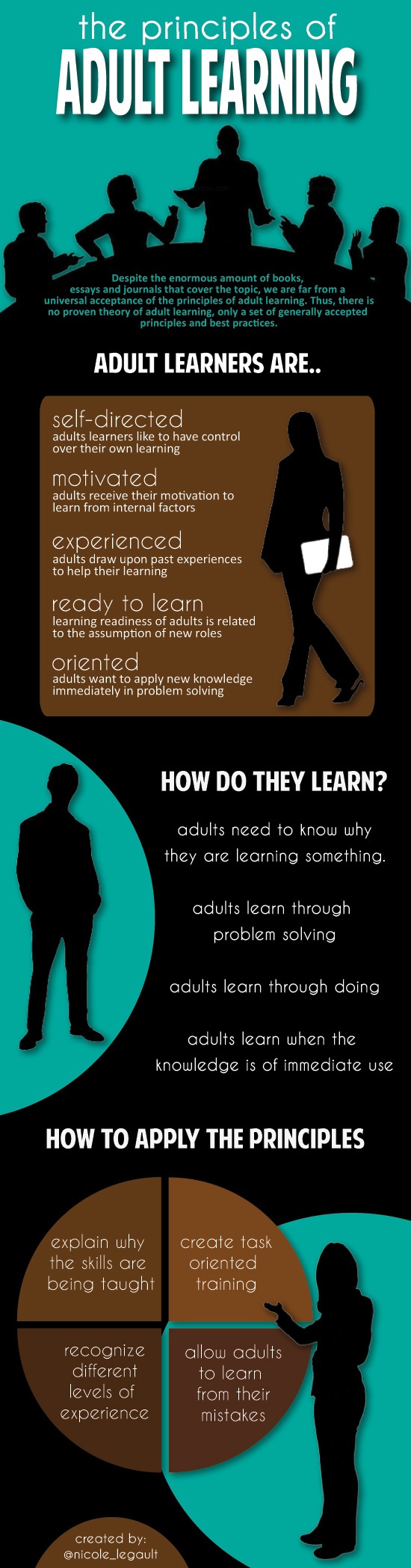
Infographics are visual powerhouses that make complex info easy to digest. They combine text, images, and charts to tell a story that sticks in your mind. When done right, they're like visual candy that feeds your brain.
Creating effective infographics is all about nailing the perfect mix of design and data. You need a clear message, eye-catching visuals, and a logical flow that guides viewers through the info. It's like being a chef, but instead of food, you're cooking up knowledge.
Purpose and Characteristics of Infographics
Definition and Purpose
- Infographics are visual representations of information, data or knowledge intended to present information quickly and clearly
- They combine text, images, charts, diagrams and other visual elements in an engaging format
- The purpose of infographics is to improve cognition and enhance the ability of the viewer to see patterns and trends in complex data or concepts
- They make information more accessible, understandable and usable for the intended audience
Key Characteristics
- Effective infographics have a visually engaging design that attracts attention and draws the viewer in
- They present a clear and concise message or story that is easy to understand and remember
- Information is organized in a logical way that creates a intuitive flow and guides the viewer through the content
- Infographics are based on accurate and reliable data from trustworthy sources to establish credibility
- Many use compelling storytelling techniques to add interest and an emotional connection with the audience
- The design and delivery of the infographic is optimized for the specific audience and communication channel
Types and Uses
- Common types of infographics include statistical, informational, timeline, process, geographic, comparison, hierarchical, and list-based
- The type of infographic selected depends on the nature of the information being presented and the communication goals
- Infographics are frequently used in fields like journalism (news stories), education (learning materials), marketing (product info), technical communication (user instructions) and scientific visualization (research findings)
- When used effectively, infographics can quickly convey knowledge on complex topics and increase audience understanding and retention of the key information
Narrative for Infographics
Narrative Structure
- Infographics should be structured around a central thesis, key message or story you are trying to communicate to the audience
- The narrative provides focus for the content and guides design decisions on what to include and how to present it
- Effective narratives have a clear beginning, middle and end that take the audience on a logical journey through the information
- Storytelling techniques like characters, setting, plot, conflict and resolution can be used in infographics to add interest and emotion
Developing the Narrative
- Conduct research to identify interesting and newsworthy insights, trends or stories in the data and information that will resonate with the target audience
- Outline the major points of the narrative and logically organize them into a compelling story arc
- Use the narrative to determine the most important information and data to highlight in the infographic and what can be edited out to keep it focused
- Be selective about what to include and keep the information simple and concise to avoid overwhelming the audience

Narrative Language
- Write compelling titles, headers, captions, labels and text that reinforce the narrative and guide the viewer through the content in an intuitive way
- Language should be concise, jargon-free and appropriate for the target audience's knowledge level
- Use active voice and vivid language that engages the reader and brings the story to life
- Consider using visual storytelling techniques like metaphors, contrasts, foreshadowing, reveals and emotional cues in the language to add interest
Design Cohesion in Infographics
Visual Theme and Style
- Create a unifying visual theme and style for the infographic that aligns with the narrative and engages the target audience
- Consider what fonts, colors, graphic styles and images will work together to create visual interest and consistency
- Develop a layout grid and visual hierarchy for the infographic that organizes the content in a logical way and guides the viewer's attention
- Use principles of design like balance, contrast, emphasis, repetition, proportion, movement, and white space to create a visually harmonious composition
Integrating Text and Visuals
- Select appropriate data visualizations like charts, graphs, maps, diagrams and tables that accurately represent the data and align with the narrative
- Ensure data visualizations are clearly labeled and easy to interpret the key insights
- Use illustrations, icons and images to visualize concepts, add visual interest, improve comprehension and reinforce the theme
- Ensure visuals are high quality, properly formatted and legally sourced
- Integrate the text content with the visuals in a way that creates a logical flow and visual balance
- Use typography best practices like legible font selections, proper hierarchies and white space to ensure readability
Design Testing and Iteration
- Test different design options to evaluate their effectiveness in communicating the narrative and information
- Gather feedback from others on the design to identify areas of confusion or improvement
- Iterate and refine the design to ensure all the elements are working together effectively and achieving the communication goals
- Continue to make improvements to the design until it is fully optimized for the audience and delivery channel
Effectiveness of Infographics
Achieving Communication Goals
- Assess how well the infographic achieves its intended communication goals and delivers on the purpose
- Evaluate whether it effectively conveys the key messages and narrative to the target audience
- Determine if the call to action or desired outcome from the audience is clear and compelling
Information Accuracy and Reliability
- Evaluate whether the information and data presented is accurate, current and comes from reliable and verifiable sources
- Ensure that the data is not misleading or misrepresented in how it is visualized or communicated
- Provide references and source citations for the information and data when possible to establish credibility
Audience Suitability
- Analyze whether the infographic is appropriate for the target audience in terms of subject matter, language, visuals, complexity and delivery channel
- Assess if the content, language and design meet the audience's needs, expectations and knowledge level
- Ensure the infographic is culturally sensitive and avoids any offensive or alienating content
Design Effectiveness
- Determine if the design and layout of the infographic is visually appealing, uncluttered and easy to follow
- Evaluate whether the infographic is accessible and legible in the delivery format, especially for users with disabilities
- Review if the data visualizations are the best fit for the data and narrative and if they provide meaningful insights
Engagement Techniques
- Consider whether the infographic effectively leverages visual storytelling, metaphors and other techniques to make the content more engaging and memorable
- Assess how well the infographic encourages audience interaction and sharing with others
- Evaluate the potential for the infographic to change audience perceptions or behaviors on the topic
Measuring Success
- Gather feedback from the target audience to understand what is working, what's confusing, and where the infographic could be improved to better meet their needs
- Use analytics and tracking tools when possible to measure engagement metrics like views, average viewing time, interactions and shares
- Interview audience members to gather qualitative feedback on the impact and effectiveness of the infographic in communicating the key messages
- Set goals and success metrics for the infographic and evaluate performance against them to determine return on investment