Responsive design adapts websites to different screen sizes and devices. It uses , , and to create layouts that look great on phones, tablets, and desktops.

Implementing responsive design involves flexible elements like grids and images. Testing across devices, optimizing performance, and ensuring are crucial for creating a seamless user experience on all platforms.

Understanding Responsive Design

Concept of responsive design

Top images from around the web for Concept of responsive design
  • Web design approach creates dynamic changes to appearance adapts to different screen sizes, platforms, and orientations
  • Accommodates increasing variety of devices used to access web content improves user experience across platforms reduces need for separate mobile sites
  • Key principles include fluid grids enable flexible layouts, flexible images scale proportionally, and media queries apply different styles based on device characteristics
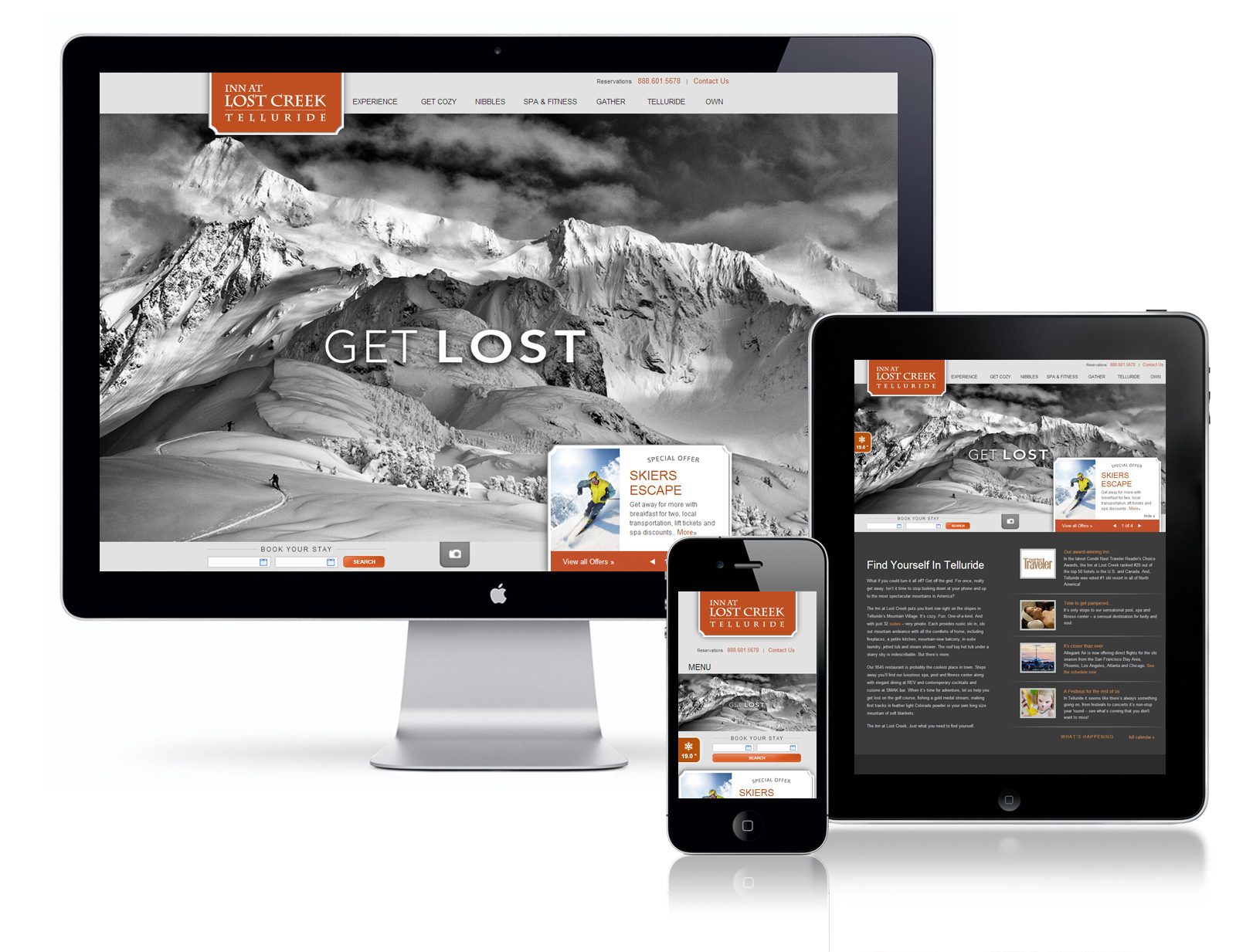
Application of responsive principles

  • Fluid grid systems use relative units (%, em, rem) create flexible columns that resize proportionally
  • define points where layout changes to accommodate different screen sizes (mobile, tablet, desktop)
  • Mobile-first approach designs for smallest screen first then progressively enhances for larger screens
  • Content prioritization determines essential content for each screen size adjusts layout to highlight crucial information on smaller screens

Implementing Responsive Design

Flexible elements for adaptability

  • Flexible grids use CSS Flexbox or Grid for responsive layouts implement column-based designs that adapt to screen width
  • Responsive images use maxwidth:100max-width: 100% to ensure images don't exceed their container implement srcset attribute for serving different image sizes consider using picture element for art direction
  • Flexible typography uses relative units (em, rem) for font sizes implements responsive font sizes with viewport units (vw) adjusts line height and letter spacing for readability on different devices

Testing for cross-device compatibility

  • Cross-device testing uses browser developer tools to simulate different screen sizes tests on actual devices when possible
  • minimizes HTTP requests optimizes images for different screen resolutions implements for images and content
  • Accessibility considerations ensure are large enough for mobile devices maintain sufficient color contrast across all screen sizes
  • Usability testing conducts user testing on various devices gathers feedback and iterates on design

Key Terms to Review (13)

Accessibility: Accessibility refers to the design of products, devices, services, or environments for people with disabilities. It's about ensuring that everyone, regardless of their abilities, can access and benefit from a design. This concept is crucial in various fields like graphic design, as it influences how designs are created to accommodate diverse user needs, making sure that visual communication is inclusive and effective.
Breakpoints: Breakpoints are specific points in the responsive design process where the layout of a website adjusts to accommodate different screen sizes or resolutions. They are crucial for ensuring that a web design is flexible and user-friendly across various devices, including desktops, tablets, and smartphones. By defining breakpoints in CSS, designers can create media queries that apply different styles at specified widths, leading to an optimal viewing experience.
Contrast Ratio: Contrast ratio is a measure of the difference in luminance between the lightest and darkest parts of an image or screen. It plays a crucial role in ensuring readability and accessibility, particularly in design, where the visibility of visual elements can significantly impact user experience. A high contrast ratio helps create a clear distinction between different elements, making it easier for users to navigate and understand content.
Cross-browser testing: Cross-browser testing is the process of evaluating how a website or web application functions across different web browsers and their versions. This testing ensures that users have a consistent experience regardless of the browser they use, as various browsers can render HTML, CSS, and JavaScript differently. It plays a crucial role in responsive design and web development, ensuring that designs appear and operate as intended on all platforms.
Css grid: CSS Grid is a powerful layout system in CSS that allows web designers to create complex, responsive web layouts easily and efficiently. It enables the creation of a grid-based design, which is useful for aligning and positioning elements on a webpage, providing flexibility and control over the layout. By defining rows and columns, CSS Grid helps in designing layouts that can adapt to different screen sizes, making it an essential tool in modern responsive web design.
Device emulation: Device emulation refers to the technology that allows a software program to mimic the functionality of a hardware device. This process is crucial for testing and designing responsive web applications, ensuring they perform correctly across various devices, operating systems, and screen sizes. By using device emulation, designers can simulate different user environments without needing the physical devices, making it a vital tool in responsive design workflows.
Flexible Images: Flexible images are graphic elements in web design that adjust in size according to the dimensions of the viewport or screen they are displayed on. This adaptability ensures that images maintain their quality and aspect ratio, enhancing the overall user experience across various devices. The ability to resize images seamlessly is critical for responsive design, as it allows for consistency and clarity whether viewed on a mobile device, tablet, or desktop.
Fluid Grids: Fluid grids are a foundational component of responsive web design, allowing layouts to adapt fluidly to various screen sizes by using proportional units rather than fixed dimensions. This approach ensures that elements within a design maintain their relative proportions as the viewport changes, creating a seamless user experience across devices. By implementing fluid grids, designers can ensure their websites look good on anything from mobile phones to large desktop monitors.
Lazy loading: Lazy loading is a design technique that postpones the loading of non-essential resources at the initial load of a web page, improving performance and user experience. This approach allows for faster page rendering and reduced bandwidth consumption by only loading images, videos, or other elements when they are needed, such as when they enter the viewport. By incorporating lazy loading, developers can create more efficient and responsive interfaces that adapt to varying network conditions and device capabilities.
Media queries: Media queries are a fundamental feature of CSS that allow web designers to apply different styles based on the characteristics of the device or viewport, such as its width, height, resolution, and orientation. This technique is essential for creating responsive designs that adapt to various screen sizes, enhancing user experience across different devices. Media queries enable designers to control the presentation of content and layout dynamically, ensuring that websites look good and function well whether viewed on a desktop, tablet, or smartphone.
Mobile-first design: Mobile-first design is an approach to web development that prioritizes designing for mobile devices before scaling up to larger screens. This strategy focuses on creating a seamless user experience on smaller screens, which often have limited resources and functionalities, and then progressively enhancing the design for tablets and desktops. By starting with mobile, designers can ensure that essential content and functionality are accessible to users regardless of their device.
Performance optimization: Performance optimization refers to the process of improving the speed, responsiveness, and overall efficiency of a website or application. It involves techniques that enhance user experience by reducing loading times, ensuring smooth interactions, and minimizing resource usage. This is especially crucial in responsive design, where content must adapt seamlessly across various devices and screen sizes.
Touch Targets: Touch targets refer to the specific areas on a touchscreen interface that users interact with, such as buttons or icons. These targets are crucial for user experience, particularly in responsive design, as they must be large enough and spaced appropriately to ensure ease of use on various devices. Properly designed touch targets enhance accessibility and user engagement by allowing users to interact intuitively with digital content, regardless of their device size or screen resolution.
© 2024 Fiveable Inc. All rights reserved.
AP® and SAT® are trademarks registered by the College Board, which is not affiliated with, and does not endorse this website.