Descriptive statistics are crucial for understanding data's core characteristics. They help summarize large datasets, revealing central tendencies, spread, and relationships between variables. These tools are essential for initial data exploration and forming hypotheses.
In data preprocessing and exploratory analysis, descriptive statistics guide decision-making. They help identify outliers, assess data quality, and choose appropriate analysis methods. This foundation enables more advanced techniques and ensures meaningful insights from the data.
Measures of central tendency and dispersion
Central tendency measures
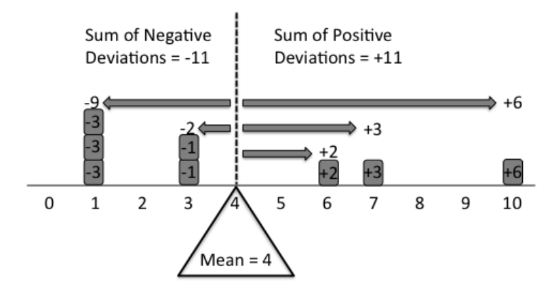
- Mean calculates the average value by summing all values and dividing by the number of observations
- Sensitive to extreme values (outliers)
- Most appropriate for normally distributed data
- Median represents the middle value when data is ordered from smallest to largest
- Less affected by outliers compared to the mean
- Useful for skewed distributions (asymmetric)
- Mode identifies the most frequently occurring value
- Can be used for categorical or discrete data
- Not influenced by extreme values
Dispersion measures
- Range calculates the difference between the maximum and minimum values
- Provides a simple measure of dispersion
- Sensitive to outliers
- Variance measures the average squared deviation from the mean
- Gives more weight to extreme values
- Calculated as the average of the squared differences from the mean
- Standard deviation is the square root of the variance
- Expressed in the same units as the original data
- More interpretable than variance
- Coefficient of variation (CV) is the ratio of the standard deviation to the mean, expressed as a percentage
- Allows for comparison of variability across datasets with different units or means
- Useful for comparing the relative dispersion of different variables
Data distribution visualization

Histograms
- Divide the range of a continuous variable into bins and display the frequency or count of observations within each bin as vertical bars
- Width of each bar represents the bin width
- Height of each bar represents the frequency or count
- Shape of a histogram reveals characteristics of the distribution
- Symmetry: balanced shape with mean, median, and mode coinciding at the center (normal distribution, uniform distribution)
- Skewness: asymmetric with a longer tail on one side (right-skewed/positively skewed or left-skewed/negatively skewed)
- Modality: number of distinct peaks (unimodal, bimodal, multimodal)
- Presence of outliers
Density plots
- Smoothed versions of histograms that estimate the probability density function of a continuous variable
- Provide a clearer representation of the distribution shape
- Not affected by bin width
- Kernel density estimation (KDE) is a non-parametric method used to create density plots
- Places a kernel function (Gaussian) at each data point
- Sums the contributions to estimate the density at each point
- Useful for comparing the distribution of multiple variables or groups
Relationships between variables
Covariance
- Measures the direction and strength of the linear relationship between two variables
- Positive covariance indicates a positive linear relationship (higher values of one variable associated with higher values of the other)
- Negative covariance indicates a negative linear relationship (higher values of one variable associated with lower values of the other)
- Calculated as the average of the product of the deviations of each variable from their respective means
- Sensitive to the scale of the variables, making it difficult to compare across different datasets
- Not bounded, which limits its interpretability
Correlation
- Standardizes covariance to a range between -1 and 1
- Correlation coefficient of 1 indicates a perfect positive linear relationship
- Correlation coefficient of -1 indicates a perfect negative linear relationship
- Correlation coefficient of 0 indicates no linear relationship
- Pearson's correlation coefficient assumes a linear relationship and is sensitive to outliers
- Spearman's rank correlation and Kendall's tau are non-parametric alternatives
- More robust to outliers
- Can capture monotonic relationships
- Correlation does not imply causation
- Other factors (confounding variables, reverse causality) may be responsible for the observed relationship
Summarizing descriptive statistics
Effective communication
- Present main findings in a clear, concise, and meaningful way to the target audience
- Use appropriate terminology and interpret results in the context of the data and research question
- Describe the shape, center, and spread of the distribution
- Note unusual features (outliers, multiple modes)
- Use graphical representations (histograms, density plots) to visually communicate the distribution
- Ensure proper labeling, scaling, and formatting for clarity
- Report the direction, strength, and significance of correlations
- Use scatterplots to visually depict relationships
- Acknowledge limitations and assumptions of the descriptive statistics
- Sensitivity of certain measures to outliers
- Assumption of linearity in correlation
- Connect insights to the broader context of the research question or problem
- Discuss implications and potential applications of the findings
Presentation techniques
- Use summary tables, bullet points, and visual aids to enhance clarity and impact
- Adjust the level of technical detail based on the background and needs of the audience
- Provide clear explanations and interpretations of the descriptive statistics
- Highlight key takeaways and actionable insights