Interactive heatmaps are powerful tools for exploring large datasets. They let you zoom, pan, and interact with data points, revealing patterns and insights at different scales. These features make it easier to analyze complex information and uncover hidden relationships.
Optimizing performance is crucial for smooth interactions with big datasets. Techniques like efficient preprocessing, hardware acceleration, and caching help handle large amounts of data without sacrificing responsiveness. This allows for seamless exploration of even the most massive datasets.
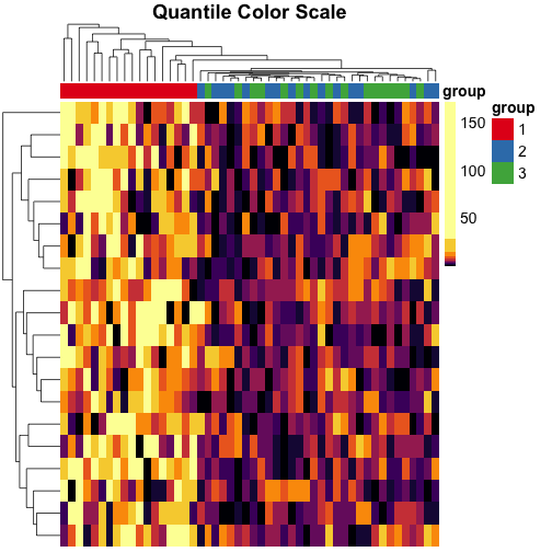
Interactive Exploration of Heatmaps
Zooming and Panning for Multi-Scale Analysis
- Zooming interactions allow users to dynamically change the scale and level of detail displayed in the heatmap, enabling them to drill down into specific areas (cell clusters) or zoom out for a broader perspective (overall patterns)
- Panning functionality enables users to navigate and explore different regions of the heatmap while maintaining the current zoom level, providing flexibility in data exploration
- Users can smoothly scroll or drag the visible area of the heatmap to focus on regions of interest (high-density areas, outliers)
- Panning can be combined with zooming to progressively explore and analyze the data at different scales
Tooltips and Hover Interactions for Detailed Insights
- Tooltips or hover interactions display additional details or context about specific data points or cells in the heatmap when users interact with them, providing on-demand information
- Hovering over a cell can reveal the exact value, category, or other relevant metadata associated with that data point
- Tooltips can include summary statistics, annotations, or links to external resources for further exploration
- Selecting or highlighting specific regions, rows, or columns in the heatmap allows users to focus on particular subsets of the data for in-depth analysis or comparison
- Users can click or drag to select a range of cells, rows, or columns, visually emphasizing the selected area
- Selected regions can be temporarily isolated or extracted for separate analysis or export
Customizable Visual Representation
- Interactive color scale adjustments, such as dynamic range sliders or color scheme selectors, enable users to customize the visual representation of the data according to their preferences or analysis requirements
- Users can interactively modify the color scale range to emphasize specific value ranges or reveal subtle patterns
- Different color schemes (sequential, diverging, qualitative) can be selected to suit the nature of the data or the user's perceptual needs
- Linked highlighting or brushing establishes a connection between the heatmap and other coordinated views (scatter plots, line charts), allowing users to explore relationships and patterns across multiple visualizations simultaneously
- Selecting or hovering over data points in one visualization can highlight the corresponding cells or regions in the heatmap
- Brushing in the heatmap can filter or highlight related data points in the linked visualizations, facilitating multi-dimensional data exploration
Performance Optimization for Heatmaps

Efficient Data Preprocessing Techniques
- Data preprocessing techniques, such as aggregation or binning, reduce the volume of data that needs to be rendered, improving performance and minimizing memory overhead
- Aggregating data points into larger cells or bins based on spatial proximity or value ranges can simplify the heatmap representation
- Binning can be applied dynamically based on the zoom level, ensuring optimal data resolution and rendering speed
- Lazy loading or progressive rendering strategies load and display data incrementally as users interact with the heatmap, ensuring that only the visible or relevant portions are rendered
- Data is divided into smaller chunks or tiles, and only the visible tiles are loaded and rendered initially
- As users zoom or pan, additional tiles are dynamically loaded and rendered, minimizing the upfront loading time and memory usage
Leveraging Hardware Acceleration
- Canvas or WebGL-based rendering harnesses the power of the GPU to efficiently draw and update large numbers of cells or pixels in the heatmap, providing smooth and responsive interactions
- Canvas API allows for direct pixel manipulation and can handle large datasets with high performance
- WebGL enables hardware-accelerated rendering, utilizing the GPU's parallel processing capabilities for complex heatmap visualizations
- Virtualized scrolling or pagination techniques optimize memory usage and rendering performance by dynamically loading and unloading data as users navigate through the heatmap
- Only the visible portion of the heatmap is rendered in memory, while off-screen data is dynamically loaded and unloaded as needed
- This approach minimizes memory consumption and ensures smooth scrolling performance, even for extremely large datasets
Caching and Asynchronous Processing
- Caching and memoization strategies store previously computed or rendered results to avoid redundant calculations and improve responsiveness during user interactions
- Frequently accessed data or rendered tiles can be cached in memory or local storage for quick retrieval
- Memoization techniques cache the results of expensive computations, such as aggregations or statistical calculations, to speed up subsequent requests
- Asynchronous data loading and processing decouple the rendering pipeline from data retrieval, allowing the user interface to remain responsive while data is being fetched or processed in the background
- Data fetching and preprocessing tasks are performed asynchronously, preventing blocking of the main rendering thread
- Progress indicators or placeholders can be displayed while data is being loaded, providing visual feedback to the user
User-Driven Data Manipulation in Heatmaps
Flexible Filtering Capabilities
- User-driven data filtering allows users to dynamically subset or refine the displayed data based on specific criteria or conditions, enabling focused analysis
- Filters can be applied to rows, columns, or individual cells in the heatmap, allowing users to isolate specific data points or regions of interest
- Multiple filters can be combined using logical operators (AND, OR) to create complex filtering conditions (age > 30 AND income < 50,000)
- Interactive controls, such as dropdown menus, sliders, or checkboxes, provide intuitive interfaces for users to specify filtering criteria or adjust filter parameters
- Dropdown menus can be used to select categorical filters (product category, customer segment)
- Sliders enable users to define numerical ranges for continuous variables (price range, date range)
- Checkboxes allow users to toggle the inclusion or exclusion of specific data subsets
Aggregation and Granularity Control
- Data aggregation enables users to summarize or roll up the data at different levels of granularity, reducing the level of detail and potentially improving rendering performance
- Users can specify aggregation functions (sum, average, min, max) to compute summary values for groups of cells or data points
- Aggregation can be applied hierarchically, allowing users to drill down or roll up the data along different dimensions or categories (country > state > city)
- Real-time updating of the heatmap reflects the changes in data filtering or aggregation immediately, providing users with instant feedback on their actions
- As users modify filter criteria or aggregation settings, the heatmap dynamically updates to reflect the filtered or aggregated data
- Smooth transitions or animations can be employed to provide visual continuity and help users maintain context during data updates
- Visual indicators, such as highlighted cells or modified color scales, communicate the effects of data filtering or aggregation to users
- Filtered out cells can be dimmed or grayed out to differentiate them from the remaining data points
- Color scales can be dynamically adjusted to accommodate the range of values in the filtered or aggregated data
Heatmaps Integration with Other Visualizations
Coordinated Views and Linked Interactions
- Coordinated views synchronize interactions and selections across multiple visualizations, allowing users to analyze data from different perspectives simultaneously
- Selecting a region in the heatmap can highlight corresponding data points in linked scatter plots, line charts, or other visualizations
- Filtering or aggregating data in one visualization can automatically update the displayed data in the heatmap and other linked views
- Brushing and linking techniques enable users to select and highlight specific data points or regions across the heatmap and other linked visualizations, facilitating data exploration and comparison
- Brushing in the heatmap can highlight related data points in a scatter plot or line chart, revealing patterns or outliers
- Linking selections across visualizations allows users to identify and analyze data points that satisfy multiple criteria
Enhancing Heatmaps with Overlays and Small Multiples
- Overlay visualizations, such as contour lines or annotations, can be superimposed on the heatmap to provide additional context or highlight specific features of interest
- Contour lines can delineate regions of similar values or identify gradients within the heatmap
- Annotations or labels can be added to mark significant data points, outliers, or regions of interest
- Small multiples or faceted displays create a grid of heatmaps, each representing a different subset or dimension of the data, enabling users to compare patterns and trends across categories
- Each heatmap in the grid can represent a different time period, geographic region, or categorical variable
- Small multiples allow users to visually compare and contrast the heatmaps, identifying similarities, differences, or trends across the subsets
Customizable Visual Encoding and Legends
- Interactive legends or color scale controls allow users to modify the mapping between data values and colors, customizing the visual representation to suit their analysis needs
- Users can interactively adjust the color scale range, midpoint, or distribution to emphasize specific value ranges or highlight patterns
- Legends can be dynamically updated to reflect the current color scale and provide a clear mapping between colors and data values
- Visual encoding options, such as color schemes or cell shapes, can be customized by users to enhance the interpretability and aesthetics of the heatmap
- Different color schemes (sequential, diverging, qualitative) can be selected based on the nature of the data or the desired visual emphasis
- Cell shapes or sizes can be modified to represent additional dimensions or attributes of the data