Interactive data visualization is a game-changer in data journalism. It lets readers dive deep into complex datasets, uncovering hidden patterns and trends. By allowing users to explore data dynamically, these visualizations make stories more engaging and accessible.
Creating interactive visualizations requires a mix of design skills and technical know-how. From choosing the right chart types to implementing user-friendly interfaces, journalists must consider various factors to effectively communicate their data-driven stories and keep readers hooked.
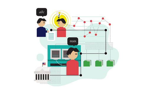
Interactive Data Visualizations for Data Journalism
Benefits of Interactive Data Visualizations
- Enable users to explore and engage with data dynamically uncovering insights and patterns not apparent in static visualizations
- Present complex datasets in a more accessible and understandable format facilitating audience comprehension of key concepts and trends
- Enhance storytelling by allowing readers to dive deeper into the data and explore different aspects of a story at their own pace
- Provide context and additional information to support data-driven stories
- Allow users to filter data by specific criteria
- View data from different perspectives
- Increase engagement and encourage readers to spend more time exploring a story through user interaction with data
Use Cases for Interactive Data Visualizations
- Explore large datasets (census data, social media data)
- Compare multiple variables (income levels across different regions, crime rates over time)
- Track changes over time (stock prices, population growth)
- Present geographic data (election results by state, climate patterns across a continent)
- Visualize data with strong spatial or temporal components
- Maps (population density, resource distribution)
- Timelines (historical events, project milestones)
Creating Interactive Visualizations
Fundamental Concepts
- Understand data visualization principles
- Choose appropriate chart types (bar charts for comparisons, line charts for trends over time)
- Use color effectively (consistent color schemes, consider color blindness)
- Design for clarity and readability (legible fonts, avoid clutter)
- Utilize web technologies to create dynamic and responsive user interfaces
- HTML for structure
- CSS for styling
- JavaScript for interactivity
- Implement data binding linking data to visual elements
- Shapes
- Colors
- Positions on a chart or map
- Incorporate interaction techniques for data exploration
- Hovering to reveal tooltips
- Clicking to drill down into data
- Dragging to pan or zoom
- Apply filtering and sorting to focus on data subsets or view data in different orders
- Filter by date range or category
- Sort by value or alphabetically
- Use animations and transitions to guide users and highlight changes or trends
- Animate chart elements appearing or updating
- Transition between different data views smoothly
- Employ responsive design techniques for cross-device compatibility
- Adapt layout and sizing for different screen sizes
- Optimize performance for mobile devices
- Process and transform data for use in interactive visualizations
- Aggregate data (sum values, calculate averages)
- Convert data types (parse dates, convert strings to numbers)
Static vs Interactive Visualizations
Design Differences
- Static visualizations are fixed, while interactive visualizations enable user exploration through interaction techniques
- Interactive visualizations require more complex design considerations
- Designing for different screen sizes and devices
- Creating clear and intuitive user interfaces
- Static visualizations convey a specific message, while interactive visualizations allow users to draw their own conclusions
- Interactive visualizations may require more data processing and transformation
- Larger datasets
- More complex data structures
User Experience Differences
- User experience is key in interactive visualization design
- Effectiveness depends on ease of navigation and interaction
- Interactive visualizations may require more user testing and iteration to ensure intuitive and effective design
- Static visualizations are often faster and easier to create than interactive ones
- Interactive visualizations require more development time
- Interactive visualizations require more testing and refinement
Effectiveness of Interactive Visualizations
Evaluating Engagement and Communication
- Measure how well it engages users and communicates key insights and messages
- Track user engagement metrics
- Time spent interacting
- Number of interactions
- Depth of exploration
- Assess clarity and intuitiveness of user interface
- Users should navigate and interact without confusion or frustration
- Evaluate visual appeal and engagement of design
- Use color, typography, and design elements to draw users in
- Encourage exploration through engaging visuals
- Analyze how well it supports the narrative and key messages of the data-driven story
- Ensure key insights and trends are highlighted, not just raw data presented without context
Gathering User Feedback
- Conduct user testing to evaluate effectiveness
- Gain insights into user interaction patterns
- Identify areas for improvement based on user feedback
- Consider target audience's data literacy and subject matter familiarity
- Design visualizations with intended audience in mind
- Provide appropriate context and explanations for less familiar audiences