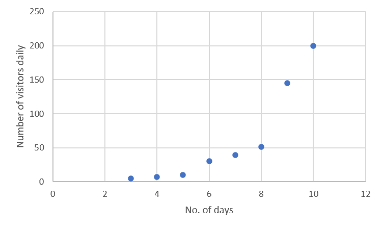
Scatter plots help us visualize relationships between two variables. By plotting points on a graph, we can see patterns and trends in data. This visual representation is crucial for understanding how different factors might be connected.
Correlation coefficients and regression lines take scatter plots a step further. These tools let us quantify relationships and make predictions based on data. Understanding these concepts helps us interpret real-world information and make informed decisions.
Scatter Plots and Correlation
Creation of scatter plots
- Visualize relationships between two quantitative variables by plotting data points on a coordinate plane
- Each point represents a single observation (student's height and weight)
- Independent variable plotted on x-axis (hours studied)
- Dependent variable plotted on y-axis (exam score)
- Construct scatter plots by hand or using technology (Excel, graphing calculator)
- Choose appropriate scales for x and y axes to accurately represent data
- Label axes clearly with variable names and units (time in minutes, distance in kilometers)
Interpretation of correlation coefficients
- Correlation coefficient () quantifies strength and direction of linear relationships between variables
- ranges from -1 to 1
- : perfect positive linear relationship (income and education level)
- : perfect negative linear relationship (car's value and age)
- : no linear relationship (shoe size and IQ)
- Stronger linear relationships indicated by values closer to 1 (0.9 vs 0.2)
- ranges from -1 to 1
- Positive : variables increase together (hours of exercise and cardiovascular health)
- Negative : one variable increases as the other decreases (product price and demand)
- Coefficient of determination () is proportion of variation in dependent variable explained by independent variable
- ranges from 0 to 1
- : 81% of variation in test scores explained by study time
- Correlation does not imply causation; other factors may influence the relationship

Regression Lines
Regression lines for predictions
- Regression line (least-squares line) best fits data points in scatter plot
- Minimizes sum of squared vertical distances between points and line
- Equation of regression line:
- : predicted value of dependent variable
- : slope, change in per one-unit increase in
- : y-intercept, value when
- Make predictions by substituting value into equation and solving for
- Predict test score () for 5 hours of studying ():
- Interpret slope in context of problem
- Slope of 1.5 with dependent variable of sales (thousands) and independent variable of advertising expenditure (thousands): each 1,500 increase in sales
Analyzing Regression Models
- Interpolation: Making predictions within the range of observed data
- Extrapolation: Making predictions outside the range of observed data (less reliable)
- Residual: Difference between observed and predicted values, used to assess model fit
- Variance: Measure of spread in data points, affects reliability of regression model