8.5 Percentiles

3 min readjune 18, 2024

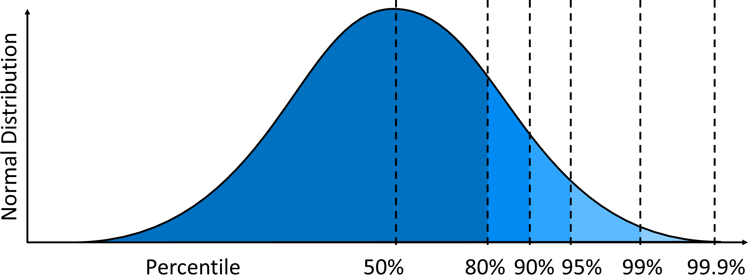
Percentiles are a powerful tool for understanding and comparing values within datasets. They represent the percentage of data points falling below a specific value, allowing us to contextualize individual data points and make meaningful comparisons across different populations.

Calculating percentiles involves arranging data in ascending order and using formulas to determine ranks. Interpreting rankings helps identify and compare data points within and across populations. Percentiles are widely used in college admissions, sports analytics, and income distribution analysis.

Understanding Percentiles

Calculation of percentiles

Top images from around the web for Calculation of percentiles
  • Percentiles represent the percentage of data points falling below a specific value in a dataset
    • 60th percentile is the value below which 60% of the data points are found (test scores, income levels)
  • Manually calculate percentiles by:
    • Arranging the dataset in ascending order
    • Calculating the rank of the desired percentile using the formula: rank=p(n+1)100rank = \frac{p(n+1)}{100}, where pp is the percentile and nn is the total number of data points
      • If the rank is a whole number, average the values at that rank and the next rank to find the percentile
      • If the rank is not a whole number, round up to the nearest whole number and use the value at that rank as the percentile
  • Calculate percentiles using spreadsheet functions:
    • In Microsoft Excel, use the PERCENTILE.INC function: =PERCENTILE.INC(array,k)=PERCENTILE.INC(array, k)
      • arrayarray is the dataset
      • kk is the percentile as a decimal (0.6 for 60th percentile)
    • In Google Sheets, use the PERCENTILE function: =PERCENTILE(range,k)=PERCENTILE(range, k)
      • rangerange is the dataset
      • kk is the percentile as a decimal

Interpretation of percentile rankings

  • Percentiles provide context for individual data points within a dataset
    • Data point at the 75th percentile is higher than 75% of the other data points in the same dataset (test scores, salaries)
  • Compare data points within the same population using percentiles
    • Allows for direct comparison regardless of specific values
    • Student scoring at the 90th percentile on a test performed better than 90% of their classmates
  • Compare data points across different populations using percentiles
    • Enables comparison even if datasets have different scales or distributions
    • Compare a child's height to their age group's percentiles and then to the adult population's percentiles
  • Percentiles help identify outliers in a dataset, which are extreme values that fall far from the typical range

Application of percentiles to data

  • College admissions statistics
    • Colleges report 25th, 50th, and 75th percentile scores for admitted students' SAT or ACT exams
    • Prospective students compare their scores to these percentiles to gauge admission chances
    • Student's SAT score falling between the 25th and 50th percentiles indicates they are in the middle 50% of admitted students
  • Sports team performance
    • Compare individual player statistics within a team or across different teams using percentiles
    • Basketball player's points per game compared to percentiles of their team or the entire league
    • Player consistently performing above the 90th percentile in various statistical categories considered a top performer (rebounds, assists)
  • Analyzing income distribution
    • Percentiles describe income inequality within a population
    • 50th percentile ( income) represents the middle of the income distribution
    • Comparing 90th or 95th percentile income to income reveals extent of income inequality (wealth gap, poverty rates)

Data Distribution and Statistical Measures

  • is used to calculate percentiles by determining the number of data points below a certain value
  • The data distribution affects how percentiles are interpreted and can reveal patterns such as in the dataset
  • is often used alongside percentiles to provide a more complete picture of data spread and variability

Key Terms to Review (20)

Box plot: A box plot is a graphical representation of a dataset that summarizes its key statistics, including the minimum, first quartile (Q1), median, third quartile (Q3), and maximum values. It visually displays the spread and skewness of the data while highlighting outliers, making it easier to understand the distribution. Box plots are particularly useful when comparing multiple datasets, allowing for quick visual insights into their central tendencies and variabilities.
Cumulative frequency: Cumulative frequency is a running total of frequencies in a dataset, showing how many data points fall below or at a certain value. This concept helps to analyze data distribution and understand how values accumulate across different ranges, making it easier to determine percentiles, medians, and other statistical measures.
Data distribution: Data distribution refers to the way in which data values are spread or arranged across a range of possible values. Understanding data distribution is crucial for interpreting the shape, center, and spread of the data, which can reveal important patterns and trends. It encompasses various statistical measures and visual representations that help analyze how individual data points relate to the overall dataset.
Decile: A decile is a statistical term that divides a dataset into ten equal parts, each representing 10% of the population or data points. This concept helps in understanding the distribution of data and allows for easy identification of specific portions of a dataset. By analyzing deciles, one can gain insights into the relative standing of data points, which is particularly useful in fields like finance, education, and social sciences.
Histogram: A histogram is a type of bar graph that represents the frequency distribution of numerical data by dividing the data into intervals, called bins, and counting how many observations fall into each bin. It visually summarizes the distribution of data, making it easier to identify patterns, trends, and outliers. By using a histogram, one can quickly grasp how values are spread across a range, which is essential for understanding data in various contexts.
Histograms: A histogram is a graphical representation of data using bars of different heights. It shows the frequency distribution of a dataset and is used to visualize the shape and spread of continuous data.
Interquartile Range: The interquartile range (IQR) is a measure of statistical dispersion that represents the range within which the middle 50% of a data set lies. It is calculated by subtracting the first quartile (Q1) from the third quartile (Q3), effectively capturing the spread of the central portion of the data while ignoring extreme values. This makes the IQR particularly useful in identifying outliers and understanding variability in data distributions.
Median: The median is the middle value in a data set when the numbers are arranged in ascending or descending order. If there is an even number of observations, the median is the average of the two middle numbers.
Median: The median is the middle value in a data set when the numbers are arranged in ascending or descending order. It effectively divides the data into two equal halves, making it a useful measure of central tendency, especially when dealing with skewed distributions. The median helps to represent the typical value in a dataset and can be more informative than the mean when there are outliers or extreme values present.
Normal Distribution: Normal distribution is a statistical concept that describes how data points are spread out around the mean, forming a symmetric, bell-shaped curve. This curve illustrates that most observations cluster around the central peak, with probabilities tapering off symmetrically on either side, making it essential for understanding probability and variability in data analysis.
Normal distributions: A normal distribution is a probability distribution that is symmetric around the mean, showing that data near the mean are more frequent in occurrence. It forms a bell-shaped curve where most of the observations cluster around the central peak.
Outliers: Outliers are data points that differ significantly from the other observations in a dataset. They can skew results and affect the calculations of key statistics like range, standard deviation, and percentiles. Identifying outliers is essential because they can indicate variability in measurement, experimental errors, or novel phenomena.
Percentile: A percentile is a statistical measure that indicates the relative standing of a value within a dataset, representing the percentage of data points that fall below it. For example, being in the 70th percentile means that 70% of the data points are lower than that specific value. This concept is essential for understanding distributions and comparing scores across different datasets.
Percentile rank formula: The percentile rank formula is a statistical tool used to determine the relative standing of a score within a distribution. It calculates the percentage of scores that fall below a particular value, helping to understand how a specific score compares to others in the same dataset. This formula is crucial for interpreting data, especially in educational assessments and standardized tests, where knowing one's position relative to peers can be very informative.
Quantiles: Quantiles are cut points that divide a probability distribution into contiguous intervals with equal probabilities. They are used to understand the distribution of data by segmenting it into equal-sized, ordered subgroups.
Quartile: A quartile is a statistical term that refers to the division of a dataset into four equal parts, with each part containing 25% of the data. This concept helps in understanding the distribution of data by identifying the values that separate these segments, which can provide insights into the spread and central tendency of the dataset. Quartiles are particularly useful in descriptive statistics as they help summarize large datasets and highlight significant data points.
Quintile: A quintile is a statistical term that divides a data set into five equal parts, each containing 20% of the total observations. This division allows for an easy comparison of different segments within the data, helping to identify patterns and trends. Quintiles are commonly used in various fields, including economics, education, and social sciences, to analyze distributions and assess relative standings among groups or individuals.
Skewness: Skewness is a statistical measure that describes the asymmetry of a probability distribution around its mean. It indicates whether the data points tend to be more concentrated on one side of the mean, giving insight into the shape and behavior of the distribution. A positive skewness indicates that the tail on the right side is longer or fatter than the left side, while a negative skewness indicates the opposite. Understanding skewness helps in analyzing data distributions and their percentiles, as well as comparing them to the normal distribution.
Standard Deviation: Standard deviation is a statistical measure that quantifies the amount of variation or dispersion in a set of data values. It indicates how much individual data points deviate from the mean, helping to understand the distribution and spread of data. A low standard deviation means that the values tend to be close to the mean, while a high standard deviation indicates that the values are spread out over a wider range. This concept is crucial for interpreting expected values, analyzing central tendencies like the mean, median, and mode, and assessing data distributions, including normal distributions.
Z-score: A z-score is a statistical measure that indicates how many standard deviations a data point is from the mean of a dataset. It helps to understand the relative position of an individual score within a distribution, making it essential for comparing scores from different datasets and analyzing their distributions.
© 2024 Fiveable Inc. All rights reserved.
AP® and SAT® are trademarks registered by the College Board, which is not affiliated with, and does not endorse this website.
Glossary
Glossary