Scatter Plots
Scatter plots let you visualize the relationship between two quantitative variables. By plotting data as individual points on a graph, you can quickly spot patterns, trends, and outliers that would be hard to see in a raw data table. This skill is the foundation for regression analysis, which you'll use throughout statistics.
Scatter Plot Construction
A scatter plot places two variables on a coordinate plane so you can see how they relate to each other.
- The independent variable (also called the explanatory variable) goes on the x-axis. This is the variable you think might influence the other (e.g., age, study time).
- The dependent variable (also called the response variable) goes on the y-axis. This is the variable you think might be affected (e.g., height, test score).
- Each point on the plot represents one observation. Its position is determined by that observation's x and y values.
To create a scatter plot:
- Choose your scales for each axis based on the range of your data. Make sure the scale covers all values without too much empty space.
- Plot each data point at its corresponding (x, y) location.
- Label both axes with the variable name and units (e.g., x-axis: Age (years), y-axis: Height (cm)).
- Give the plot a descriptive title (e.g., "Relationship between Age and Height").
Interpreting Scatter Plot Relationships
When you look at a scatter plot, you're evaluating three things: direction, strength, and pattern.
Direction tells you whether the variables move together or in opposite ways:
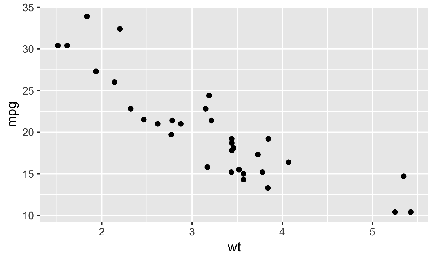
- Positive relationship: As x increases, y also increases. Points trend from the bottom-left to the top-right. Example: height tends to increase with age in children.
- Negative relationship: As x increases, y decreases. Points trend from the top-left to the bottom-right. Example: test scores tend to decrease as the number of distractions increases.
- No relationship: Points are scattered randomly with no clear trend. Example: shoe size and IQ have no meaningful connection.
Strength describes how tightly the points cluster around a pattern:
- Strong: Points closely follow a clear pattern, with little scatter. Example: weight and daily calorie intake.
- Moderate: A trend is visible, but points spread out more around it.
- Weak: Points are loosely scattered, and the trend is hard to see. Example: hours of sleep and exam grades.
Strength can be quantified using the correlation coefficient (covered in detail in later sections), which gives a numerical value for how strong and in what direction the linear relationship is.
Pattern describes the shape the points form:
- Linear: Points roughly follow a straight line. Example: income tends to rise with years of education.
- Nonlinear: Points follow a curve. Example: running speed improves with age in childhood, peaks, then declines.
- Outliers are data points that fall far from the overall pattern. Even a single outlier can shift your interpretation of the relationship, so always note them. For instance, a few individuals with extremely high incomes could distort the apparent trend in a dataset about income and education.
Appropriateness of Regression Lines
A regression line (or line of best fit) summarizes the linear trend in a scatter plot. But it's not always the right tool. Before fitting one, check whether it actually makes sense for your data.
A regression line is appropriate when:
- The scatter plot shows a roughly linear relationship (not curved).
- There's a logical reason to think the independent variable influences the dependent variable (e.g., study time affecting test scores).
- Your goal is to predict values of the dependent variable from the independent variable (e.g., predicting sales from advertising spending).
A regression line is NOT appropriate when:
- The relationship is nonlinear. Fitting a straight line to curved data gives misleading results. Example: age vs. physical strength follows a curve, not a line.
- There's no clear relationship at all. If the points are randomly scattered, a line through them is meaningless.
- The relationship has no logical basis. Even if two variables happen to correlate, a regression line is misleading if there's no reason one would predict the other (e.g., number of cars owned and GPA).
- Significant outliers are pulling the line away from where most of the data sits.
Before calculating a regression line, also verify these assumptions:
- Linearity: The relationship between the variables is actually linear.
- Independence: The data points are independent of each other (one observation doesn't influence another).
- Constant variance of residuals: The spread of points around the line stays roughly the same across the entire range of x-values. If the spread fans out or narrows, the regression line may not be reliable.
Advanced Scatter Plot Analysis
A few additional features are worth noticing when you examine scatter plots:
- Clustering occurs when groups of data points bunch together in distinct areas of the plot. This can signal subgroups in your data. For example, a scatter plot of height vs. weight might show two clusters if the data includes both children and adults.
- Strength of association can be assessed visually by how tightly points hug a trend line. The tighter the clustering around the line, the stronger the association.
- A scatterplot matrix is a grid that displays scatter plots for every pair of variables in a dataset. It's useful when you have more than two variables and want to quickly scan for relationships across all of them.