Data visualization transforms complex information into accessible visual formats, enabling quick insights and effective communication. It leverages our natural ability to process visual information, making it an essential skill for anyone working with data in business and analytics.

Effective visualizations follow key design principles, use color and text strategically, and match data types to appropriate chart formats. Avoiding common pitfalls like clutter and misrepresentation ensures visualizations accurately convey insights, supporting better decision-making in organizations.

Data Visualization for Insights

Communicating with Data Visualization

Top images from around the web for Communicating with Data Visualization
  • Data visualization is the graphical representation of information and data using visual elements (charts, graphs, maps) to provide an accessible way to see and understand trends, outliers, and patterns in data
  • Effective data visualization helps to tell stories by curating data into a form easier to understand, highlighting the trends and outliers
  • Data visualization is an essential skill for anyone working with data as it can significantly influence decision-making in businesses and organizations
  • Well-designed data visualizations make complex data more accessible, understandable and usable, allowing decision makers to gain insight from large volumes of data quickly (dashboards, infographics)

Benefits of Visual Representations

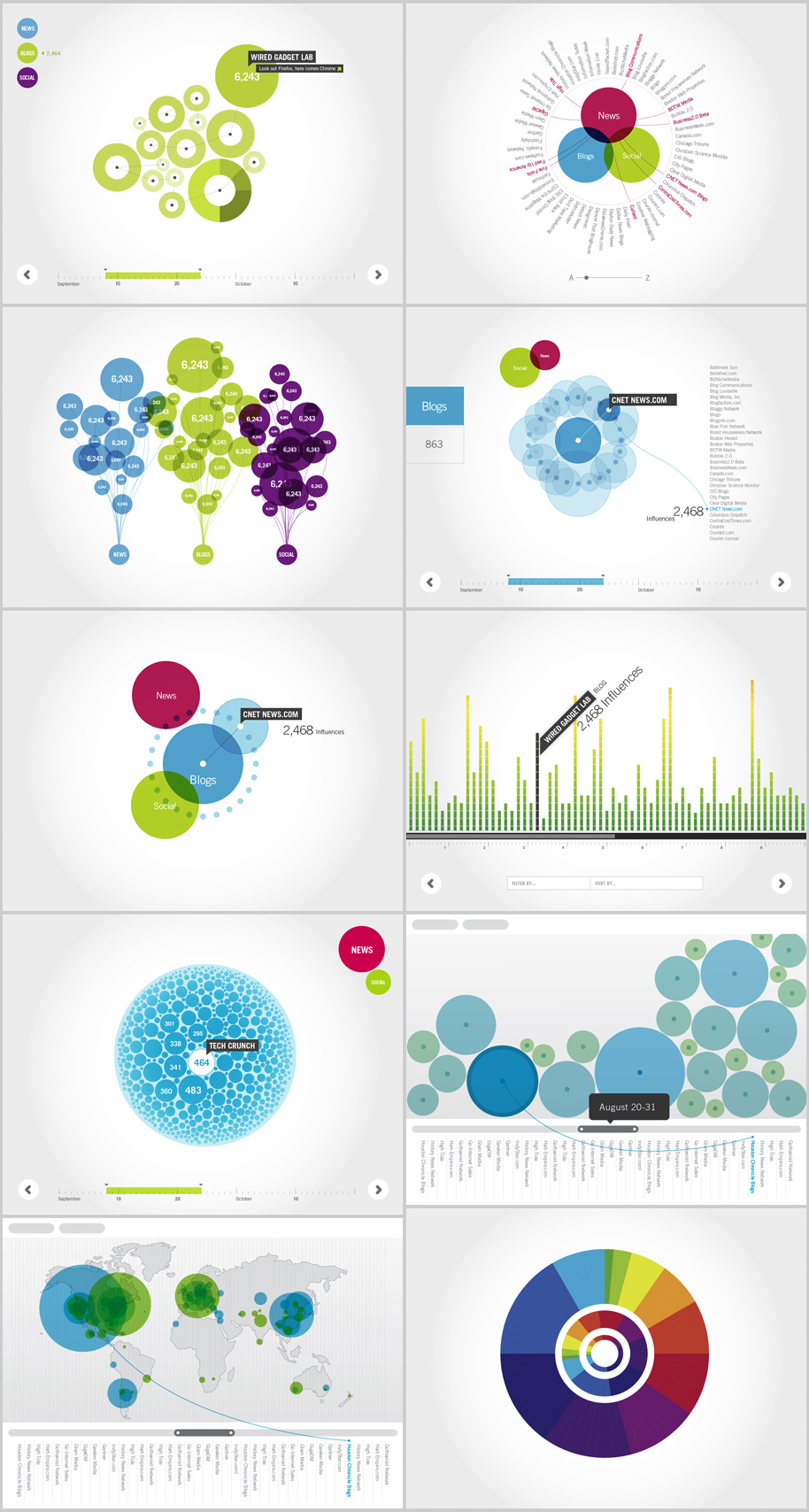
  • Effective data visualization should be visually engaging, easy to interpret, and clearly communicate key insights or messages to the intended audience
  • The human visual system is highly developed to recognize patterns, spot trends and identify outliers, which means that visual representations of data can be processed and understood very quickly compared to raw numbers or text
  • Visualizations leverage the human ability to process visual information and identify patterns, which enables faster insights compared to tables or text (heatmaps, scatter plots)
  • Interactive visualizations allow users to explore the data and gain insights specific to their needs (drill-downs, filters)

Design Principles for Visualizations

Fundamental Design Principles

  • The fundamental principles of design for data visualization include balance, emphasis, movement, pattern, repetition, proportion, rhythm, variety and unity
  • Visualizations should maintain a clear , with the most important information being the most prominent
  • Gestalt principles describe how humans group similar elements, recognize patterns and simplify complex images when perceiving visual information
  • Effective use of empty or "white" space in a visualization helps to avoid clutter, enhances the visibility of the data, and guides the reader's attention to the most important information

Strategic Use of Design Elements

  • Color is an important design tool in data visualization and should be used sparingly and intentionally to highlight key patterns or insights
    • The use of color should consider color blind accessibility and cultural perceptions of color
    • Color can be used to encode categories (departments) or sequential values (revenue)
  • Text elements (titles, labels, annotations) should be used strategically to aid interpretation of the visualization without distracting from the data itself
    • Text should be legible and kept to a minimum
    • Callout labels can highlight key data points
  • Interaction techniques (filtering, zooming, hovering, selections) can be incorporated to enable exploration of the data and enhance understanding, but should be implemented purposefully
  • Design aesthetics should be balanced with the functionality and interpretability of the visualization
    • Decorative elements that do not contribute to understanding should be avoided (3D effects, background images)

Choosing Visualization Techniques

Matching Data Types to Visualizations

  • The type of data being visualized and the relationship between data points should inform the choice of visualization technique
    • Categorical data that can be divided into distinct groups (regions, product categories)
    • Numerical data that can take any value within a range (sales, temperature)
    • Temporal data with values changing over time (stock prices, website traffic)
    • Geospatial data with values tied to geographical areas (population density, election results)
  • Hierarchical or part-to-whole data is represented with tree diagrams (org charts, treemaps)
  • Network data showing connections between entities is represented with node-link diagrams or matrix views

Common Chart Types and Use Cases

  • Categorical data is often visualized using:
    • Bar charts to compare values across categories
    • Pie charts to show how a whole is divided into parts, but can be difficult to interpret
    • Donut charts as an alternative to pie charts
  • Numerical data is visualized using:
    • Histograms to show distribution
    • Scatter plots to show relationship between two variables
    • Line graphs to show temporal trends
  • Temporal data can be shown with:
    • Line graphs to view overall and seasonal trends
    • Stream graphs to view changes in composition over time (energy sources over decades)
  • Geospatial data is typically shown on maps using techniques like:
    • Choropleths that encode values using color (population density)
    • Heat maps showing "hot spots" of activity (crime incidents)
    • Proportional symbols scaling symbols based on data values (earthquake magnitudes)

Pitfalls in Data Visualization

Cognitive Overload and Clutter

  • Clutter is a common pitfall where a visualization includes too many data points, visual elements or decorations, making it difficult to interpret the key message
  • Clutter can be reduced by:
    • Removing unnecessary elements (gridlines, borders, redundant labels)
    • Leveraging white space to create visual groupings
    • Splitting the visualization into multiple focused views
  • Encoding too much information using color can lead to cognitive overload for the viewer
    • Color should be used strategically to highlight key insights rather than to encode multiple data points
  • Overcomplicating a visualization with advanced techniques (3D plots, complex interactions) can lead to more confusion than insight
    • Visualizations should be kept as simple as possible while still conveying the intended message

Misrepresenting Data

  • Using an inappropriate visualization type for the data or message is a common mistake
    • Using a pie chart to compare values is less effective than a bar chart
    • Using a line chart for categorical data suggests false continuity between groups
  • Improperly scaling or skewing the axes of a graph can distort the data and mislead the viewer
    • The y-axis should always start at zero
    • The aspect ratio should be chosen to accurately represent the data
  • Truncated or manipulated axis values can be used to deceive the audience, for example by making small changes appear more significant
    • Visualizations should always strive for honesty and transparency in the representation of data
  • Lack of proper labeling, titles, annotations, and legends can leave a visualization open to misinterpretation
    • All elements should be properly labeled and described
    • Data sources and limitations should be disclosed

Key Terms to Review (17)

Accuracy: Accuracy refers to the degree to which a measurement, prediction, or classification is correct and aligns with the true value or outcome. It plays a crucial role in ensuring that data visualizations are reliable, that data is processed effectively, and that models predict outcomes with precision. Achieving high accuracy is essential for meaningful analysis and insights across various applications, from data mining to machine learning and sentiment analysis.
Avoid chartjunk: Avoiding chartjunk refers to the practice of eliminating unnecessary visual elements in data visualizations that do not convey meaningful information and may distract or confuse the viewer. This concept emphasizes the importance of clarity and simplicity in presenting data, ensuring that the focus remains on the essential information being conveyed rather than on decorative elements that can obscure or mislead.
Cognitive Load: Cognitive load refers to the amount of mental effort being used in the working memory while processing information. It's crucial to consider this concept in the design of information presentation, as excessive cognitive load can hinder understanding and retention. By optimizing cognitive load, data visualization can enhance comprehension and facilitate quicker decision-making.
D3.js: d3.js is a JavaScript library designed for producing dynamic, interactive data visualizations in web browsers. It leverages HTML, SVG, and CSS to create complex visual representations of data that can respond to user interactions, making it a powerful tool for developing engaging visual analytics. This flexibility allows developers to create tailored visualizations that adhere to the core principles of data visualization, enhancing the storytelling aspect of data.
Dashboard: A dashboard is a visual display of key performance indicators (KPIs) and other relevant data that provides a quick overview of the current state of a business or project. Dashboards consolidate and present complex data in an easily digestible format, allowing users to monitor performance, identify trends, and make informed decisions at a glance. They serve as powerful tools for data visualization and play a crucial role in developing actionable insights.
Data literacy: Data literacy is the ability to read, understand, create, and communicate data as information. It involves skills in interpreting data, analyzing results, and making data-driven decisions, which are crucial for navigating today's data-rich environment. Being data literate empowers individuals and organizations to leverage insights from data, leading to better decision-making, improved strategies, and a stronger competitive edge.
Data-Ink Ratio: The data-ink ratio is a concept introduced by Edward Tufte that measures the proportion of ink used in a graphic to represent actual data versus the ink used for non-essential elements. A high data-ink ratio indicates that most of the ink used in a visualization conveys valuable information, while a low ratio suggests clutter and extraneous details that distract from the main message. This principle emphasizes the importance of clarity and simplicity in data visualization, ensuring that the viewer can easily interpret the information being presented.
Efficiency: Efficiency refers to the ability to achieve a desired outcome with minimal waste of resources, such as time, money, or effort. In both sampling and estimation, it focuses on obtaining accurate results without unnecessary expenditure of resources. In data visualization, efficiency emphasizes the clarity and impact of visual representations, ensuring that information is communicated effectively without overwhelming the audience.
Heat Map: A heat map is a data visualization technique that uses color coding to represent different values in a dataset, allowing for quick identification of patterns, trends, and areas of interest. By visually representing data in a way that highlights intensity or density, heat maps can effectively convey complex information and support decision-making processes in various contexts such as analytics and risk management.
Infographic: An infographic is a visual representation of information or data designed to present complex information quickly and clearly. By combining graphics, charts, and minimal text, infographics effectively communicate trends, patterns, and insights, making them essential in the field of data visualization. They enhance understanding and retention of information by transforming dense data into engaging visuals that are easier to comprehend.
Legend: In data visualization, a legend is a visual guide that helps viewers understand the meaning of symbols, colors, or patterns used in a chart or graph. It clarifies the representation of data points and categories, making it easier for the audience to interpret the visualized information accurately. A well-designed legend enhances the overall readability of a visualization and supports effective data storytelling.
Power BI: Power BI is a powerful business analytics tool developed by Microsoft that enables users to visualize data, share insights, and make data-driven decisions through interactive reports and dashboards. It connects to various data sources, allowing for real-time analytics and collaboration in cloud environments, making it an essential resource for modern data visualization and communication.
Scatter plot: A scatter plot is a graphical representation that uses dots to display values for two different variables, with one variable plotted along the x-axis and the other along the y-axis. This visualization helps in identifying relationships, correlations, or trends between the variables, making it a powerful tool for data analysis and storytelling.
Tableau: Tableau is a powerful data visualization tool that helps users understand their data through interactive and shareable dashboards. It allows users to create a variety of visual representations of their data, making complex information easier to digest and analyze, which is crucial for making informed business decisions.
Tufte's Principles: Tufte's Principles refer to a set of guidelines for effective data visualization created by Edward Tufte, emphasizing clarity, precision, and efficiency in presenting information. These principles help ensure that visual data representations communicate the intended message without distortion, enhancing the viewer's understanding and decision-making process. By following these guidelines, designers can create visuals that prioritize data over decoration, allowing the audience to focus on the essential information.
Use of whitespace: The use of whitespace refers to the intentional empty space in a visual layout that separates different elements, helping to enhance readability and comprehension. By strategically placing whitespace, designers can direct attention, create a balanced composition, and improve the overall user experience. It plays a critical role in data visualization as it can significantly affect how information is perceived and understood by the audience.
Visual Hierarchy: Visual hierarchy is the arrangement of elements in a way that clearly signifies their importance and guides the viewer’s eye through the content. It’s essential in conveying messages effectively and helps in organizing information so that viewers can easily understand and retain it. By utilizing size, color, contrast, and placement, visual hierarchy plays a crucial role in data storytelling, chart creation, effective communication, and impactful presentations.
© 2024 Fiveable Inc. All rights reserved.
AP® and SAT® are trademarks registered by the College Board, which is not affiliated with, and does not endorse this website.