Magazine covers are the face of a publication, grabbing attention and conveying its essence. Effective covers blend compelling , engaging headlines, and balanced composition to create a that guides the reader's eye.

Color, , and strategic design elements establish while enticing readers. Successful covers strike a between consistency and fresh appeal, using market research to refine their approach and boost sales.

Magazine Cover Design Elements

Key Components of Effective Covers

Top images from around the web for Key Components of Effective Covers
  • Compelling image sets the tone and theme for the issue (high-quality photograph, emotionally evocative illustration)
  • Engaging headlines tease inside stories (concise, intriguing cover lines strategically placed without overwhelming the primary image)
  • Well-balanced composition directs the eye through the cover in a logical hierarchy (rule of thirds, symmetry/asymmetry, negative space, visual "flow")
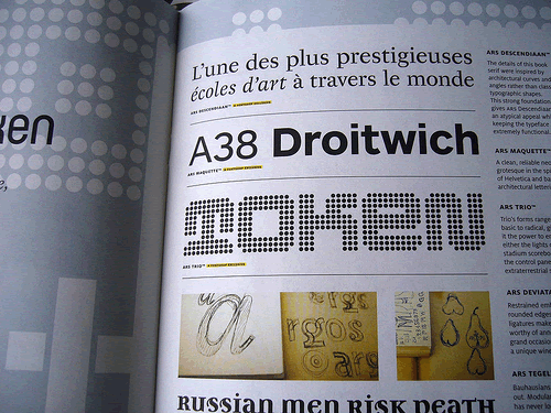
  • Legible, expressive aligns with the magazine's brand identity (font choice, size, weight, color, placement)
    • Distinct, memorable masthead consistently displays the magazine title
    • Secondary cover lines concisely highlight inside stories

Establishing Brand Identity and Consistency

  • Consistencies in and style make the magazine instantly recognizable (distinguishes from competitors on the newsstand)
  • Recurring design elements establish a consistent brand identity across issues (colors, shapes, spatial relationships)
    • Masthead consistency is especially important for brand recognition
  • Each issue's cover varies while maintaining the magazine's overall look and feel

Compelling Cover Design Principles

Creating Visual Interest and Hierarchy

  • Contrast captures attention and guides the reader's eye (contrasting colors, sizes, shapes, fonts)
    • Masthead contrasts with the background image
    • Cover lines contrast sufficiently with the background for legibility
  • Alignment of elements creates a clean, organized look (masthead, cover lines, price, special labels)
  • Repetition of design elements establishes brand identity (colors, shapes, spatial relationships)
  • Proximity groups related elements together (cover lines for the same story, ample negative space separates distinct groupings to avoid clutter)

Simplicity and Refinement in Design

  • Main cover image has a strong singular focus without too many competing elements (complex images can be difficult to discern at a glance)
  • Grid system maintains proportions and consistency, especially for recurring text elements
  • Multiple options and refinements are tested in the design process (many cover mockups created and critiqued before final selection)

Cover Design Impact on Sales

Covers as the Face of the Brand

  • Engaging covers are essential to attract readers and drive impulse purchases (especially for newsstand sales)
  • Covers build brand recognition and establish a distinct identity in the marketplace
    • Consistency of design elements across issues fosters familiarity (especially the masthead)
  • Effective covers distill the magazine's theme or personality into a singular visual impression (readers sense the tone and content with just a glance)

Engaging Readers with Compelling Visuals and Headlines

  • Cover image choice significantly impacts engagement
    • Images with people's faces tend to perform well (well-known figures or models making eye contact)
    • Unusual images can provoke curiosity
  • Cover lines advertise the most interesting stories within (convince readers the content is worth their time and money)
    • Main cover line works in tandem with the primary image
  • Special design treatments help magazines stand out and convey value (foil stamping, embossing, unique finishes or trim sizes justify a higher price point)

Market Research and Testing

  • Magazines conduct research to gauge reader response to different cover options prior to publication (focus groups, A/B testing)
  • Data on newsstand sales and subscriber engagement informs future cover design decisions

Color, Contrast, and Visual Hierarchy in Covers

Strategic Use of Color

  • Color evokes emotion, captures attention, and communicates the magazine's tone
    • Successful covers often employ a deliberately limited color palette for maximum impact
  • Complementary colors create strong contrast and visual interest (colors opposite on the color wheel like blue and orange)
  • Analogous colors create a sense of harmony (colors adjacent on the color wheel, various tints or shades of one color)
  • Dominant cover image often sets the color scheme (text elements draw from that palette for consistency)

Establishing a Visual Hierarchy

  • Color helps create a visual hierarchy, drawing attention to the most important elements (main headline, special offer)
  • Upper half of the cover is the focal point (contains key elements like masthead and main image or headline)
    • Lower half is secondary
  • Masthead is often the most prominent element as the brand identity (consistent size and placement across issues)
  • Main cover image and headline are the next most noticeable elements (often positioned centrally)
  • Cover lines are arranged by importance
    • Most interesting or newsworthy stories get priority positioning and larger font sizes
    • Less important stories may be smaller or placed near the bottom
  • Fine details enhance the composition without distracting from the main hierarchy (background texture, photography treatments, subtle graphic elements)

Key Terms to Review (18)

Adobe InDesign: Adobe InDesign is a professional desktop publishing software used to create and design layouts for print and digital publications. It serves as a vital tool for editorial designers, enabling them to combine text, images, and graphics seamlessly, while maintaining consistency and quality across various formats.
Art deco: Art Deco is a visual arts style that emerged in the early 20th century, characterized by its bold geometric shapes, vibrant colors, and luxurious materials. It reflects the cultural shifts of the time, embracing modernity while celebrating craftsmanship, making it an influential movement in design, architecture, and graphics.
Balance: Balance refers to the distribution of visual weight within a design, creating a sense of stability and harmony. It is crucial in guiding the viewer's eye and ensuring that no single element overwhelms the overall composition. Achieving balance involves considering the arrangement of text, images, colors, and white space to create an aesthetically pleasing layout.
Brand identity: Brand identity is the collection of elements that a company creates to portray the right image to its consumer. It includes components like logos, color schemes, typography, and overall design style that work together to communicate a brand's values and personality. A strong brand identity helps ensure consistency across various mediums, reinforcing recognition and loyalty among the audience.
Color Theory: Color theory is a set of principles and guidelines that explain how colors interact, mix, and can be combined to create visually appealing designs. Understanding color theory helps designers evoke emotions, establish hierarchies, and guide viewer attention, making it essential in various aspects of design work.
Contrast: Contrast is the design principle that refers to the difference between elements, such as color, size, shape, and texture, that makes each element stand out. It plays a critical role in creating visual interest and guiding the viewer's eye through a design, helping to establish hierarchy and balance.
David Carson: David Carson is a groundbreaking graphic designer known for his innovative and unconventional approach to typography and layout in editorial design. His work often defies traditional design rules, utilizing fragmented text and dynamic compositions that create a strong visual impact. Carson's style has significantly influenced the evolution of editorial design, particularly in how text and images are integrated, the principles of cover design, and the balance between consistency and variation in magazine layouts.
Emotional resonance: Emotional resonance refers to the ability of a design or visual narrative to evoke feelings and connect deeply with the audience's emotions. This connection is essential in conveying messages that resonate personally with viewers, making the content memorable and impactful. Through carefully chosen imagery, color palettes, typography, and overall composition, emotional resonance enhances engagement and encourages reflection on the subject matter.
Graphic novel: A graphic novel is a book-length work of fiction or nonfiction that uses a combination of illustrations and text to tell a story, often resembling a comic book format but with more complex narratives. This medium allows for artistic expression and storytelling techniques that engage readers in unique ways, making it an important form of literature and art.
Hardcover: A hardcover is a book that has a rigid protective cover, typically made from cardboard, and is often bound with cloth or leather. This type of binding provides durability and longevity, making it a popular choice for both literary works and reference materials. Hardcovers are designed to withstand wear and tear better than softcover books, offering a more premium presentation, which is especially important in cover design principles and techniques.
Imagery: Imagery refers to the visual representation of ideas, concepts, or narratives through the use of pictures, illustrations, and graphics in design. It plays a crucial role in enhancing communication by evoking emotions, setting the tone, and providing context to the content. Effective imagery can capture attention, reinforce messages, and create a cohesive visual experience that resonates with the audience.
Layout: Layout refers to the arrangement of visual elements on a page or screen, designed to effectively present information and guide the viewer's eye. It plays a crucial role in communicating a message, ensuring readability, and creating a cohesive visual experience. An effective layout uses principles such as alignment, proximity, and hierarchy to create balance and direct attention, while also considering the use of white space and negative space to enhance overall design.
Market Positioning: Market positioning is the process of establishing a brand or product in a specific niche within the marketplace, aiming to create a unique identity and value proposition that resonates with a target audience. This involves understanding consumer perceptions and competitor offerings, which allows designers to create cover designs that effectively communicate the intended message and appeal to the desired demographic.
Milton Glaser: Milton Glaser was a highly influential American graphic designer and illustrator, best known for his iconic work in the field of visual communication. He is widely recognized for his innovative cover designs, particularly the famous 'I ♥ NY' logo, which embodies principles of simplicity, clarity, and emotional connection in design. His approach emphasizes the importance of understanding the audience and creating visually engaging designs that resonate with viewers.
Minimalism: Minimalism is a design philosophy that emphasizes simplicity and the removal of unnecessary elements to create a clean, uncluttered aesthetic. This approach allows the core message or function of a design to stand out, enhancing the user's experience and focus. By stripping away distractions, minimalism creates an environment that fosters clarity and purpose in visual communication.
Photoshop: Photoshop is a powerful image editing software developed by Adobe Systems, widely used in graphic design, photography, and digital art for manipulating and enhancing images. It allows designers to create stunning visuals, adjust colors, combine multiple elements, and apply effects, making it essential for tasks ranging from layout design to promotional materials.
Typography: Typography is the art and technique of arranging type to make written language legible, readable, and visually appealing. It encompasses various elements such as font selection, line spacing, letter spacing, and the overall composition of text within a design. Effective typography enhances the communication of the message and impacts the aesthetic quality of a publication.
Visual hierarchy: Visual hierarchy refers to the arrangement of elements in a way that clearly indicates their importance and guides the viewer's eye through the design. This concept is crucial for effective communication, as it helps organize information and enhances user experience by making it easier to navigate through visual content.
© 2024 Fiveable Inc. All rights reserved.
AP® and SAT® are trademarks registered by the College Board, which is not affiliated with, and does not endorse this website.